Project Management
This week, I worked on setting up my development environment, configuring version control, and creating my documentation website. Here's a detailed breakdown of what I accomplished:
Tools Used
For this setup, I already had Git Bash installed. However, in VS Code, I primarily use the default terminal without choosing the git bash. After a lecture with our local instructor, Mr. Lambert, I realized the importance of being aware of which terminal I’m working with:
- Consistency: Ensures commands behave uniformly.
- Compatibility: Some tools only work in specific terminals.
- Efficiency: Leverage terminal-specific features to work faster.
Setting Up GitLab SSH and Git
Let me share how I set up my GitLab SSH and Git workflow! I'm a developer, and in one of my projects, I was asked to work with GitHub. So, when I needed to set up GitLab, I felt pretty confident about the process. Let me walk you through how I did it!
SSH Key Generation
I chose to use RSA encryption for SSH keys because:
- It's widely trusted and tested
- The 4096-bit keys provide great security
- It works with basically everything
- Both GitLab and GitHub support it well
# Generated SSH key with rsa
ssh-keygen -t rsa -b 4096 -C "a.manzi@ur.ac.rw"
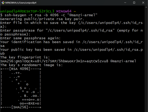
- When prompted, I went with the default save location (~/.ssh/id_rsa)
- Added a secure passphrase (important for security!)
- Started up the SSH agent: It's not strictly necessary for Git, but it makes working with remote repositories easier.
GitLab Repository Setup
# Cloned repository
git clone git@gitlab.fabcloud.org:academany/fabacademy/2025/labs/rwanda/students/manzi-armel.git
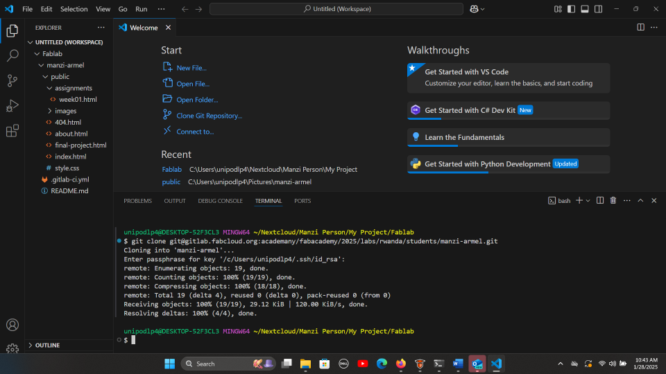
# After completing feature on the web, i did the command to add and commit
.png)
# this where i pushed for the first time
.png)
Essential Git Commands Used:
- git status - Check file status
- git add . - Stage changes
- git commit -m "Description" - Commit changes
- git push origin main - Upload to GitLab
- git pull origin main - Get latest updates
Web Development Process
After setting up version control, I focused on creating my documentation website. Here's my step-by-step journey of transforming the Virtual Folio template into my Fab Academy site:
My Web Development Process for Fab Academy 2025
Step 1: Development Environment Setup
I started by setting up Visual Studio Code (VS Code) as my primary development environment. Here's what I installed and configured:
- Live Server: For real-time preview of my changes
- HTML CSS Support: For better code completion
- Prettier: To keep my code formatted nicely
💡 Pro Tip: Using Live Server saves a lot of time as you don't need to refresh your browser manually!
Step 2: File Structure Creation
I didn't want to change the file structure from the GitLab or provided template.
public/
├── index.html
├── about.html
├── final-project.html
├── weekly-assignments.html
├── assignments/
│   └── week01.html
├── style.css
└── images/
🗂️ Understanding your file structure from the start makes it easier to organize content later!
Step 3: Template Selection & Download
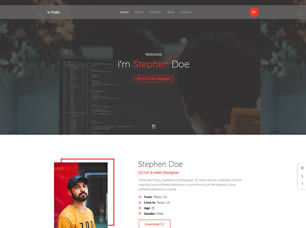
After searching through various options, I downloaded the Virtual Folio template from Free-CSS.com. My reasons for choosing it:
- Clean, professional design that could be easily adapted
- Portfolio layout perfect for documenting Fab Academy projects
- Built with Bootstrap, making it responsive and modifiable
Step 4: Template Cleanup
I simplified the template by removing unnecessary components:
- Removed jQuery dependencies
- Eliminated unused CSS files
- Stripped out complex animations
- Simplified the navigation structure
Navigation Simplification
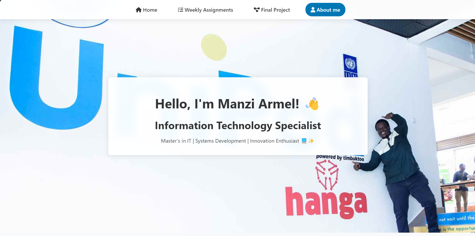
One of the first major changes was simplifying the navigation system:
- Removed complex navigation menus
- Created focused navigation with 4 main sections:
- Home
- Weekly Assignments
- Final Project
- About Me
CSS Modernization
- Removed dependency on multiple CSS files
- Consolidated all styles into a single
style.css - Modernized CSS with:
- CSS variables for consistent theming
- Flexbox and Grid layouts
- Modern animations using CSS transitions
- Improved responsive design
/* Example of modernized CSS */
:root {
    --primary-color: #0077b5;
    --text-color: #333;
    --bg-color: #f5f7fa;
}

.assignments-grid {
    display: grid;
    grid-template-columns: repeat(auto-fit, minmax(300px, 1fr));
    gap: 2rem;
}
Stripped Out Dependencies
- Removed jQuery dependency
- Eliminated unnecessary libraries:
- owl-carousel
- perfect-scrollbar
- nice-select
- fancybox
- Kept only Font Awesome for icons
// Old jQuery code
$('.navbar').on('click', function() {
    $(this).toggleClass('active');
});

// New vanilla JavaScript
document.querySelector('.navbar').addEventListener('click', function() {
    this.classList.toggle('active');
});
💡 By removing these dependencies, the site loads faster and is easier to maintain!
Step 5: Progress Tracking Implementation
Added a status tracking system for assignments using badges:
<div class="status-wrapper">
  <span class="status-badge status-completed">
      <i class="fas fa-check-circle"></i>
      Completed
  </span>
</div>

The CSS for these badges:

.status-badge {
  display: inline-block;
  padding: 0.25rem 0.75rem;
  border-radius: 15px;
  font-size: 0.875rem;
}

.status-completed {
  background: #e8f5e9;
  color: #2e7d32;
}
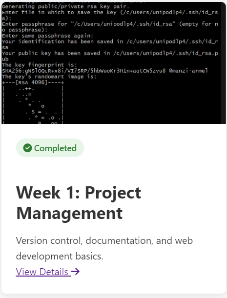
🎯 Using status badges helps visitors quickly see my progress through the course.
Step 6: Interactive Features
Added useful interactive elements like the modal window for additional explanations:
.png)
This helps keep the main content clean while providing access to detailed information when needed.
Step 7: Attribution and Footer
Maintained proper credits and added contact information:
.png)
🤝 Always important to give credit where it's due!
Step 8: Setting Up Weekly Assignment Pages
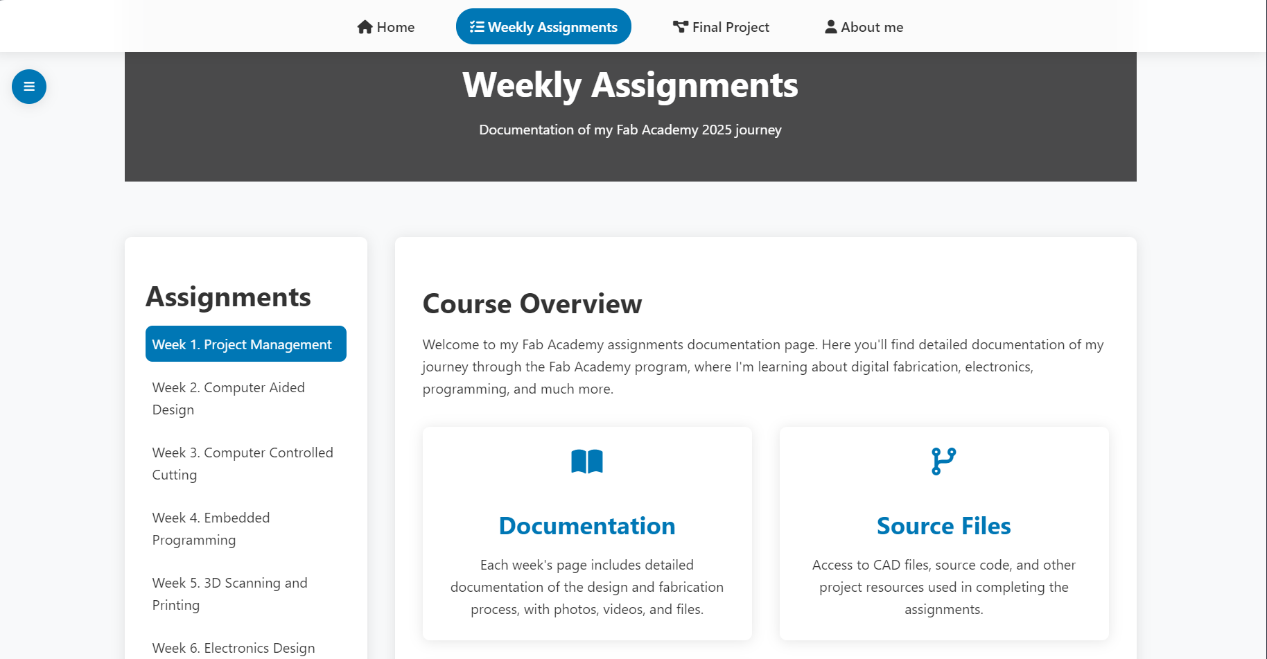
For each weekly assignment, I created a template in assignments/week01.html. The key was maintaining a consistent structure:
- Copy the navigation from
index.html. - Add a sidebar for easy navigation between weeks.
- Create sections for:
- Learning objectives
- Process documentation
Some Challenges I Faced
The Sidebar Drama
Getting the sidebar to work smoothly on both mobile and desktop was tricky. I ended up using different CSS for each:
/* Desktop Styles */
.sidebar {
  width: 250px;
  position: fixed;
  top: 0;
  left: 0;
  height: 100vh;
  background-color: #f4f4f4;
}

/* Mobile Styles */
@media (max-width: 768px) {
  .sidebar {
    width: 100%;
    height: auto;
    position: relative;
  }
}
Additional modifications included content arrangement and various CSS/HTML/JS tweaks to improve the overall user experience and maintainability of the site.