Computer-aided Design
This week's assignment was to model a possible final project idea using both 2d and 3d softwares. Since I still haven't decided what my final project will be, I'm just making random stuff!
3D Design
To start, I worked with a program that I was familiar with.Fusion 360
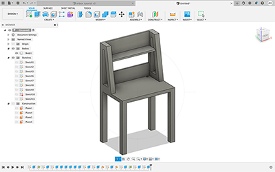
I was introduced to Fusion360 last semester, and am pretty comfortable using it, so for this assignment, I decided to just make a simple desk with shelving and a hole for cords. I started by creating and extruding the legs.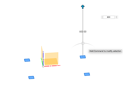
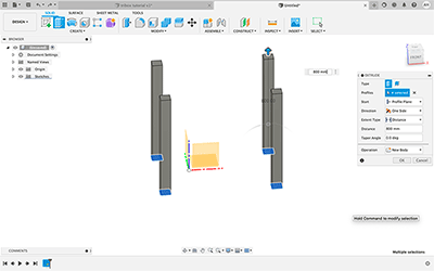
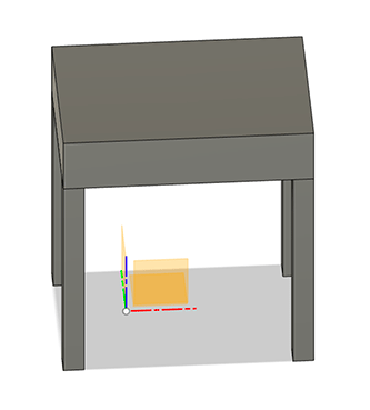
I then created an offset plane from my initial sketch that was at the top of the extruded legs, and used that to create the tabletop of my desk.
I decided to add a hole to the corner of the tabletop to put a computer charger or other electrical cords, along with some shelving overhead. I started by creating a backing and the supports for the upper shelves by simply making and extruding different sized rectangles on the tabletop plane. In order to create an angled support for the shelf, I created an angled plane using the rectangles I had extruded prior.
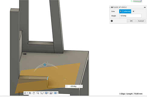
Once I had created the supports, I offset the plane of the backing piece, and copied that rectangle higher up aling the supports. Once I created the back of the shelf, I used the front face as a new sketch area, and created the bottom of the shelf, extruding it until it was just slightly shorter than the supports. After a bit of adjustment, my desk was done!
Sketchup
For exploring a new software, I decided to go with Sketchup, a free browser based CAD program. There are upgrades that cost money, but for my purposes, the free version was just fine. After creating an account and making my file, I started to play around with the tools they had. I ended up making a play structure that was a rainbow shaped slide. To start this process, I created two rectangles on the z plane and added an arc from one outside edge to the other. I then used the follow me tool to create a 3d rectangle shape along that arc.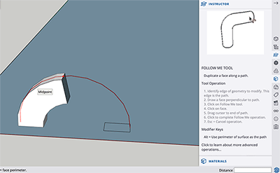
After that, I used the offset tool to create rectangles along the curved surface, which I connected together with lines. This would create the border edge of my rainbow slide. After I connected all of the offset rectangles, I deleted them, leaving the edges.
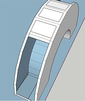
I then used the push pull tool to fill in the border wall of my rainbow by extruding the rectangles from the previous step. After that, I went to work on creating the stripes of my rainbow. I used the offset tool on the arc shape, creating 7 equal stripes. Because the offset tool offsets on all sides, in order to turn these shapes into the stripes I wanted, I used lines to extend the edge to the bottom, and deleted the excess horizontal lines.
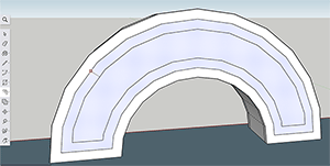
After that I added color to my design.
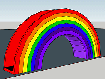
To make the steps up to what would be the slide, I used the free draw tool to create shapes similar to a rock wall, and used the push pull tool to extend them out as hand and foot holds. I colored these to match the rainbow theme as well.
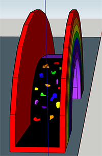
To create the slide, I added a rectangle vertically along the other half of my rainbow, and drew circles along that to create a slide shape. I then deleted the faces of the rectangle so only the curve created by the intersecting circles remained, and used the push pull tool to extend that shape across the width of my rainbow. I then added color to the slide shape.
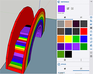
My rainbow slide was finished!
2D Design
I mainly use Adobe Illustrator and Photoshop for projects that use 2D software. I have prior experience with the programs from classes I've taken in high school and at Wheaton, along with personal use. Since these products are pretty expensive to use out of your own pocket, I figured it would be a good idea to learn a new software while I have the opportunity.Inkscape
The program I decided to use to do this was Inkscape. Since I'm completely new to this software, I decided to watch some tutorials and try something easy. My plan was to do a simple logo with my name. I really enjoy typography and wanted to try and put my name in a shape. I followed this tutorial to figure out to make my text into a shape. Instead of turning it into a more complicated figure, I liked the clean look of a circle, so I went with that. The following picture is me altering my text to match the curve of the circle.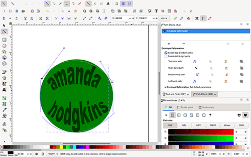
I changed the colors and decided it needed more, so I came up with the idea to wrap text around the circle as well. I found another tutorial from the YouTube channel I had used originally, which was great because his tutorials were very easy to follow! I added the words fab academy and selected both the text, and the circle from the before.
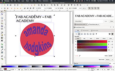
Following the tutorial, I went under the text bar and clicked text to path, which made my writing line up with the circle.
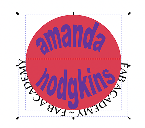
I rotated it around so the fab academy was readable, but didn't really like how it looked. I thought that the words were too close to my initial circle, so I decided to add a border between them. I deleted the text from before and did all the steps again, this time using a circle that I added behind the pink one.
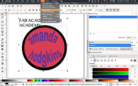
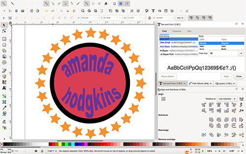
While this was better, I still wasn't crazy about how it came out. I decided that the text was my issue, so I thought I'd replace it with stars. I found another tutorial from that channel, this time about wrapping shapes around a circle. Inkscape has a tool to make stars, so they were easy to add. I followed the tutorial and duplicated my shapes around the center point, which i had moved to match the border circle. This is my final product!
