Computer aided design
This week it is time to learn some things about computer aided design. Goal? Trying out some new things in 2D and 3D software.
2D
For most of my design work in the past I have used Illustrator. The biggest down side for me is that it's pretty expensive. But the upside is that it's well documented, it is very powerfull, it works on all platforms and most (other) designers use it.
The best alternative that I would recommend to others is Gimp - it's free and can do most things Illustrator can. Downside, it's not that user friendly.

Not all 2D drawings or designs are the same. There are many different formats and not all can be used for the things we will be making during the fabacademy. I made three guinea pigs to illustrate the difference. The first one is the one we see and the other two are the same guinea pig vector based and raster based. We can tell them apart by the way they look quite easily. The thirth guinea pig clearly shows pixels, the image is constructed with hundreds of differently colored squares. Raster images have .jpg, .gif, .png extensions. Raster images are great to show pictures but are not that great at showing us very detailed drawings. The second guinea pig is a vector, vectors are constructed with calculations and have infinite percission because of this. Raster are constructed of points and these can easily be manipulated to change the way our shape looks. The lines can also have thicknesses, color or infill colors to change the appearance. Vector images have .dxf, .ai, .eps extensions.
Illustrator
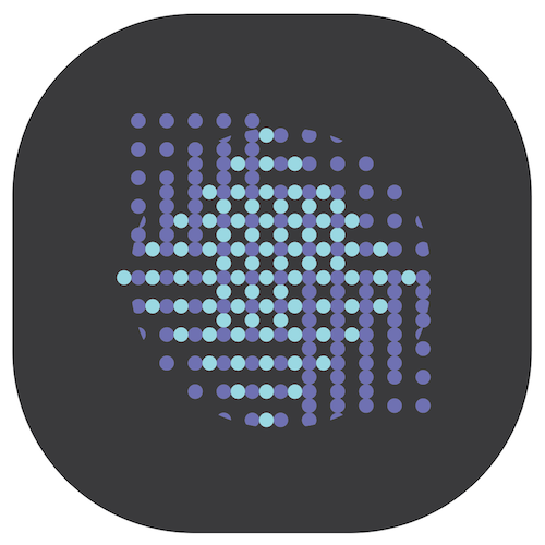
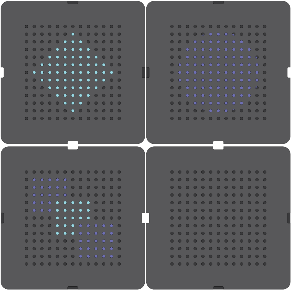
The objective this week was to draw our final project in Illustrator. Since I have a fairly simple shape in mind for this I chose to make someting a bit more challenging. A bi-directional scanimation sleeve + insert. Lets start with the result (this is a digital drawing now I started with a messy sketch) and analyise how it is made.
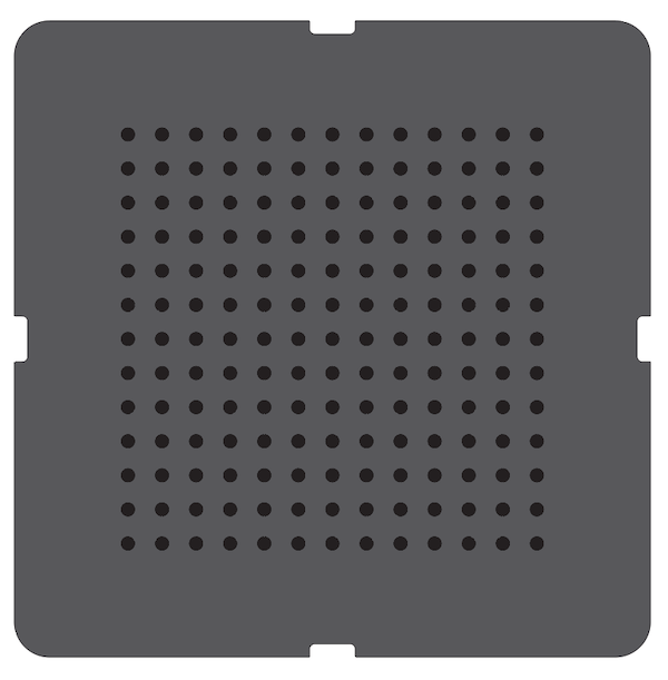
The drawing is made out of two parts, the outer shape and the dotted grid. Let's start with the outershape and ignore the grid for now. It is a rounded rectangle with 4 other rounded rectangles. See? By drawing shapes on top of eachother it is possible to unify, substract or cut them. Before we do this it is important to align everything using the align tool sin the top bar. For the substracting I drew a large rounded rectangle and 4 small ones and substracted the small ones from the larger ones. You can find this setting in the Pathfinder toolbar (window > pathfinder). In the layer preview lock this shape by clicking the Lock in the second column. This way we will protect it from changing.
Now lets move on to the grid, this only consists of a single shape. Let's start by drawing a cirkle (5mm). Copy the cirkle by selecting it and copy it by pressing CMD+C or CTRL+C. Now let's paste it again by pressing CMD+V or CTRL+V (13 times). Select everything by pressing CMD+A or CTRL+A and open the alignment window (window > align). Make sure to check Align To Key Object in the bottom right corner. Than horizontally distribute with a spacing of 10mm on the left side. The circkles should now move apart.
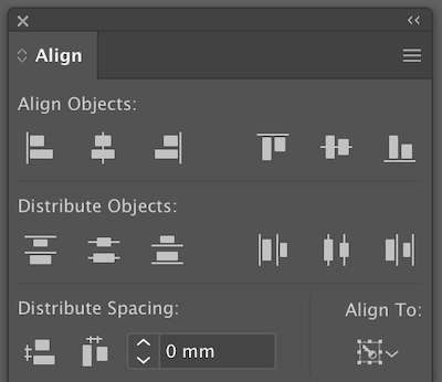
Keep everything selected and let's make this a group using CMD+G or CTRL+G. This keeps them in a group. Now we can copy and paste the group 13 times again and align them vertically just like we did before. Also group the whole grid so we are sure they won't move again.
Now unlock the rounded rectangle and select it as well as the grid. Center align them both horizontally and vertically.
Now let's make a new file for the insert of the scanimation sleeve. There are four different ways of seeing a frame through the front part of the sleeve. The grid can move "1 cirkle" up, down, left or right. Copy the grid into the new file and paste it 4 times. Give each group a different color to easily tell them apart. Align them all horizontally and vertically. The first color we keep locked. The second one we move 5mm to the right. The thrith we move just below the first one and the last one below the second one. In the layers next panel we should now have 4 groups that we can all lock using the lock but alsow hide using the eye.
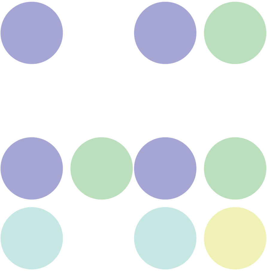
Now it's time to decide what we want each frame to show. I used two different methods. The first one was the most simple one, pick the layer you want to change and manually remove dots you don't want to be showing. For the second layer I used a clipping mask. This way it is also possible to cut through the 'pixels'.
I used these drawings for my vinyl cutter asignment in week 4.
Files
3D
A few years ago I bought a (broken) 3D printer, I didn't know how to use it or how to make a design for it. I installed a bunch of different CAD programms like SketchUp and Rhino and tried out some online tools like TinkerCad. I settled with Rhino and was kind of happy with what I could make but never got really comfortable with it.
That's when I started using Fusion360 - and it was love at first sight. The workflow works really well for me and it's super powerfull. Since Fusion is so elaborate I decided to learn more about it.
Goals for this week
- Learn more about working with constraints.
- Play around with 'assemble' and 'patch' and 'model'.
- Find a tool to display 3D in AR.
- Find a good way to display my designs online.
constraints
When I learned Fusion I followed a tutorial on Lynda. What I really liked was the part in the end where there are 1 minute video's on how different functions work. So to learn about constraints I decided to follow the same approach step by step.
Note to self: always pick destination first.
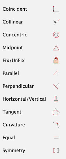
Brings two points or a path and point togeter. Works best with two points start with the destination and than select what point or line you want to move.
Collinear
Makes from two lines one long line. Choose two straight lines (or construction lines), rotates and moves both items to get an average.
Concentric
Centers two lines or objects.
Midpoint
Brings point, line or object to a mid point of a line or to a point.
Fix/UnFix
(Un)Fixes the location of a point, line or object. Makes them green to show it's fixed.
Parallel
Makes two lines parallel by rotating the second one that gets selected.
Perpendicular
Gives a 90 degrees angle between two lines or objects.
Horizontal/Vertical
Makes a line horizontal or vertical - sometimes in unexpected ways.
Tangent
A straight line or plane that touches a curve or curved surface at a point, but if extended does not cross it at that point.
Equal
Gives equal length.
Symmetry
Makes lines symetrical.
Making a bowl in fusion 360
For my final project I want to make a simple bowl. For this week I am going to draw a basic bowl. The bowl will be made from wood, with a inner hollow part where I fit in the electronics later. Also there will be a hollow part on the side where I can make all the wiring connections. It will be designed in such a way that I can mill it in 3D without having to turn it around. This saves me time in production.
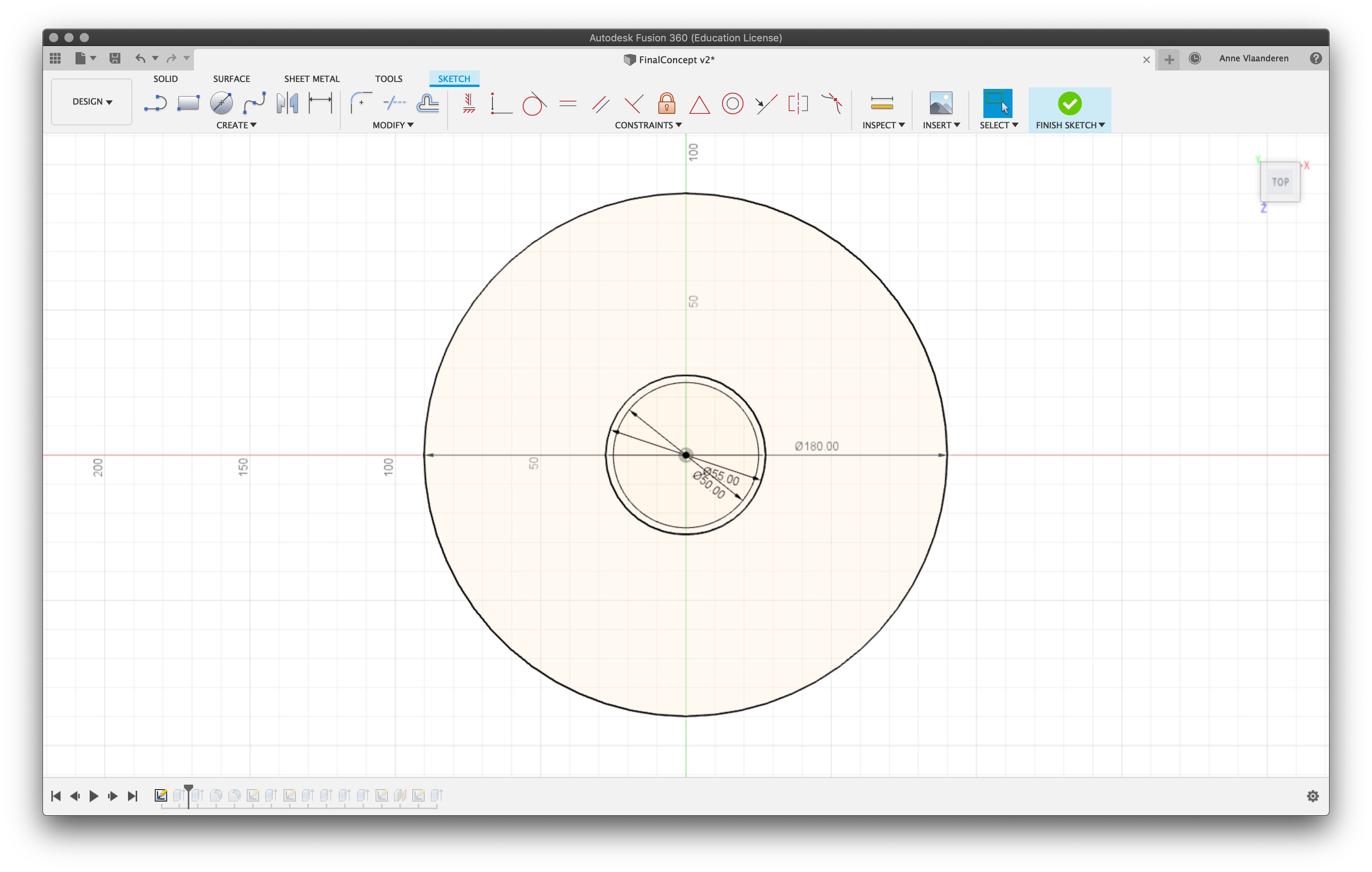
I begin with a sketch on the Z plane. By pressing hotkey "c" I drew 3 circkels, the first is the outer circle, since my material is only 190 mm wide I decided to make it a tiny bit smaller just in case I don't put my matterial in perfectly in the machine later. The other two circles are just for scale - they indicate the size of the neopixel ring. By pressing "stop sketch" I exit the sketching enviroment.
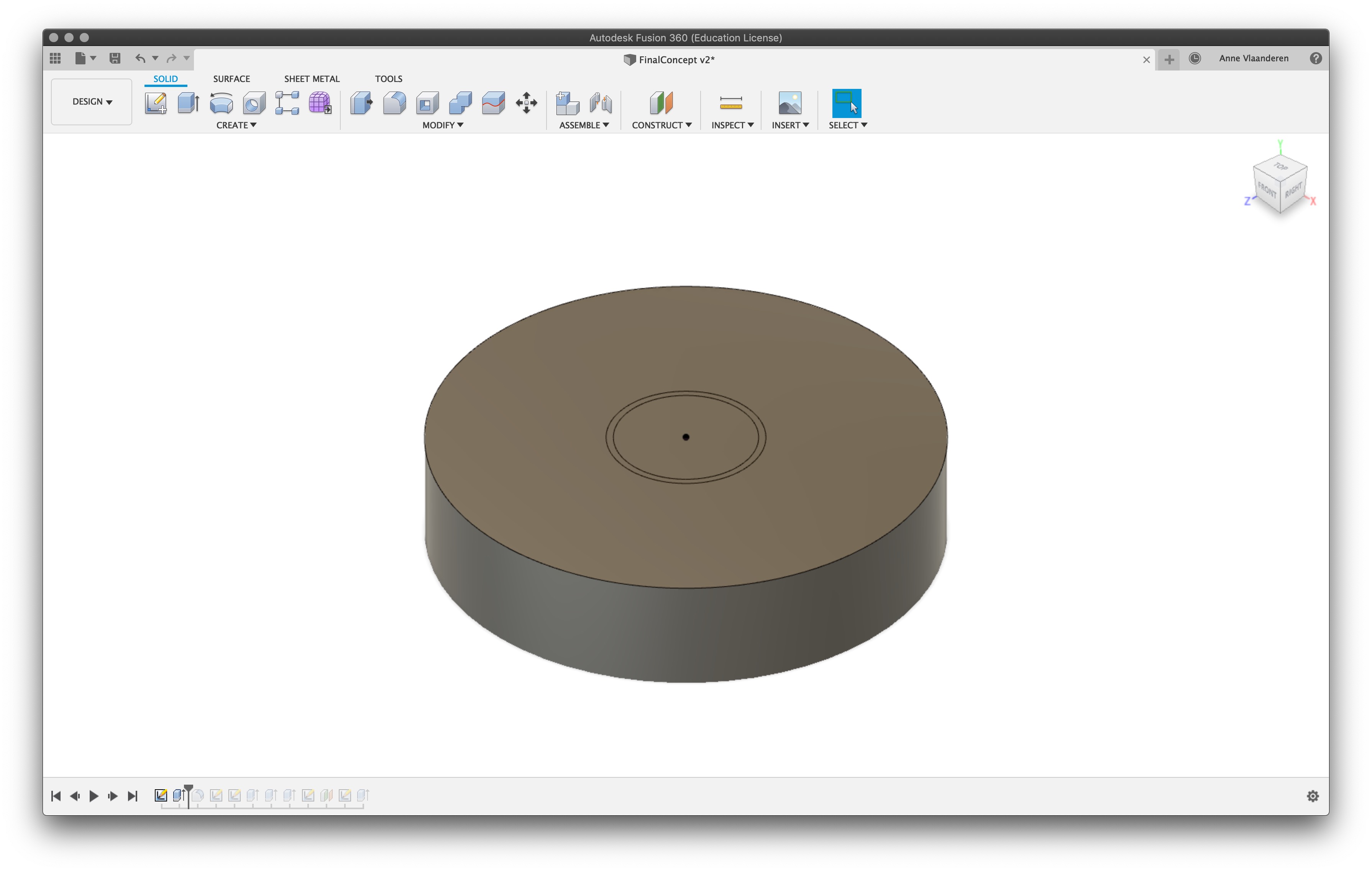
Now it's time to make some volume. Press hotkey "s" and type extrude. Select everything you want to extrude, in my case all circles, and type the thickness you want to add. For me it's 40mm, this is also the thickness of my material. Usually you might want to make it a few mm smaller than the thickness since your material might not be perfectly square.
To make it a bowl shape the bottom needs to be rounded, this can be done with a fillet ("s" & search fillet). By adding in different values you can see what looks best, I decided to go for a big round of with a 35mm radius.
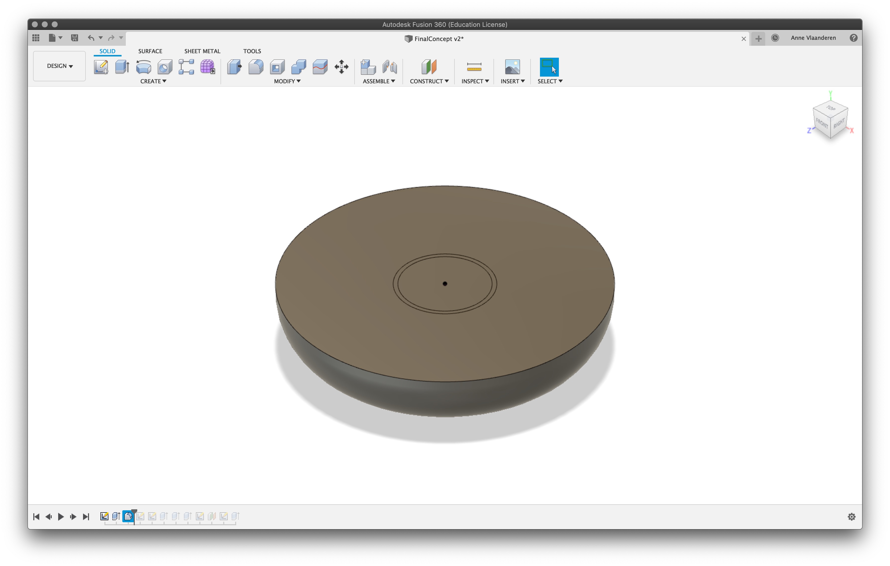
On the bottom I want a hollow area. To draw this I made a new sketch plane on the bottom of the bowl (select create plane and click on the bottom). Here I drew to circles, one of the actual size and the other one a little rim that I want to add to make a better fit for the electronics compartment.
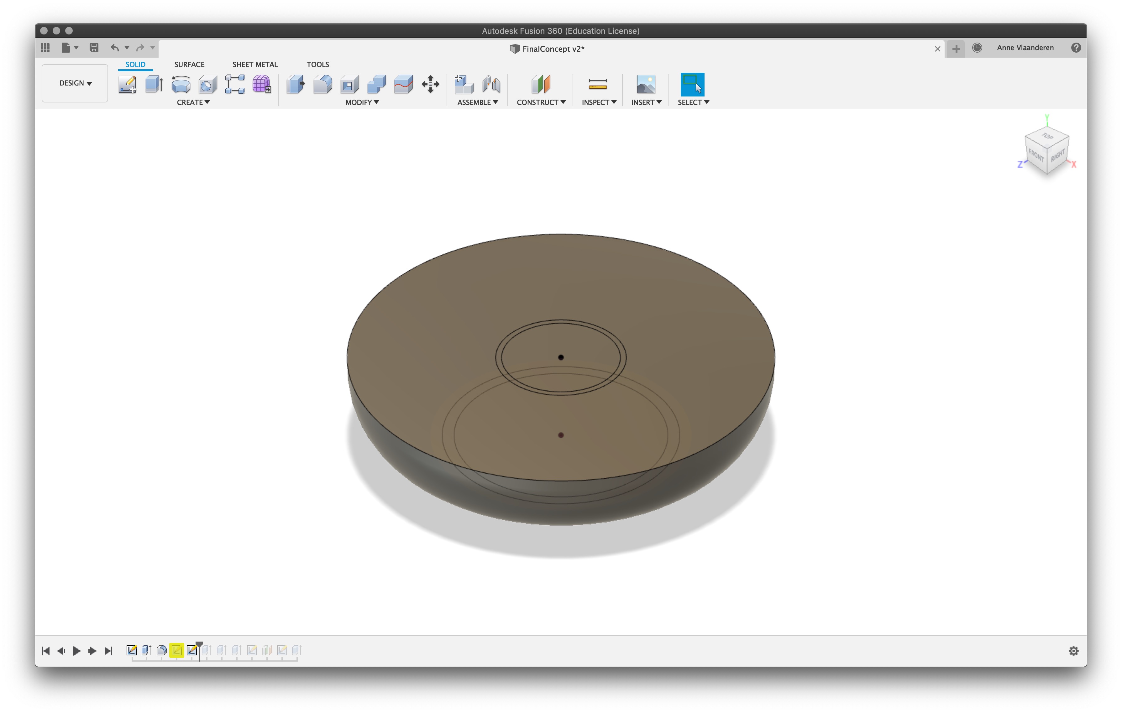
I extruded the smaller circle inwards and made sure to select the cutting operation. You can see the part that will be cut away becomes red.

Do the same for the larger circle but make this one a lot shallower. This helps with the registration of the inner cylinder that I will design later.
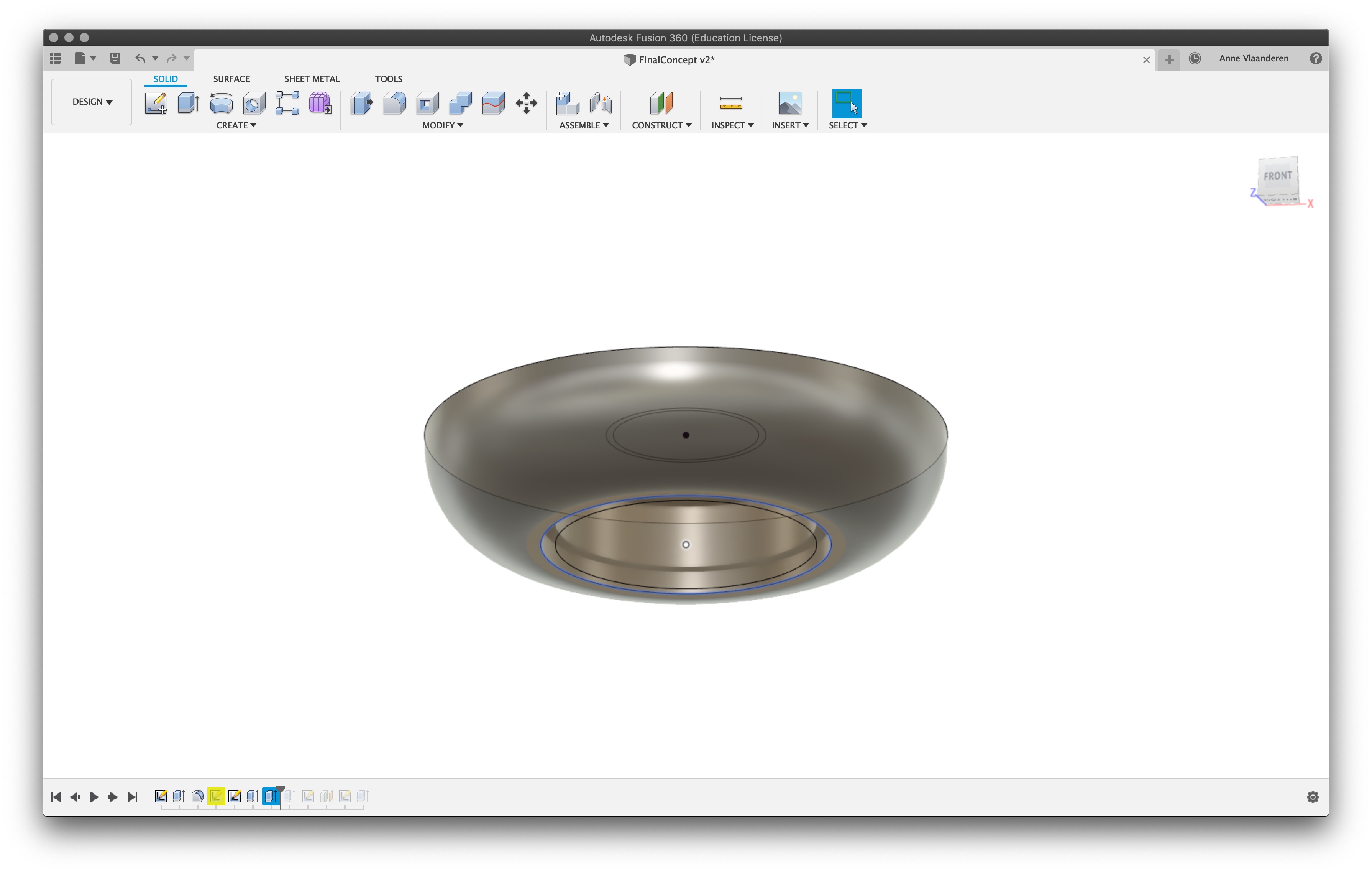
Now it's time for the little cavity where the electronics pluggs will be. Unfortunatly because of the angle I don't draw the through hole part since it cannot be milled anyways. Create an 'offset plane' fron the centre of the bowl and offset it 90 mm (half of the bowl) or eyeballing is also fine since it just needs to be outside of the bowl.
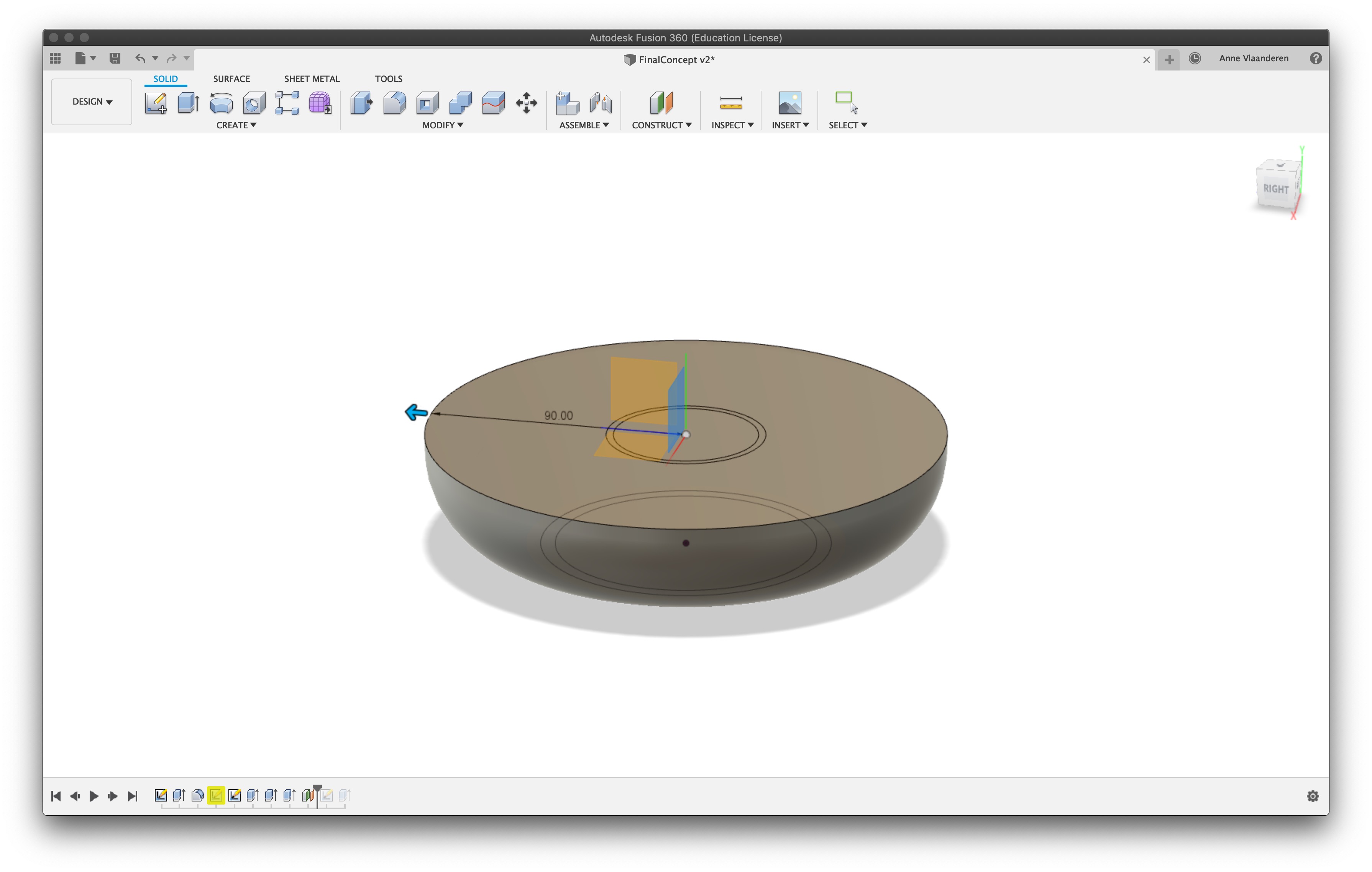
Create a sketch on the plane of the shape you want to remove. My shape is created drawing a cirkle and rectangle. For the dimensions I carefully measured all my components and added a little margin around it.
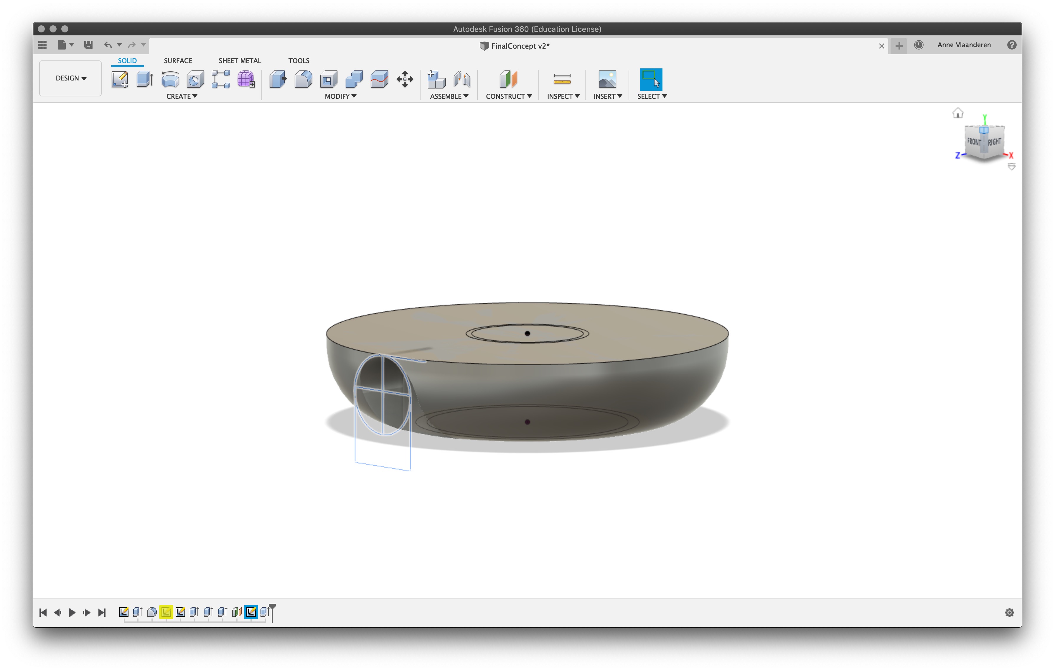
Extrude one more time using a cutting operation. Make sure there is enough material left between the centre cavity and this one. During milling a thin wall can easily break.

This is the final 3D shape ready for milling. It's pretty simple but I am pretty happy with the result.