2025
Stanley Amaechi

This site is my personal portfolio developed during Fab Academy 2025.
© 2025 Stanley Amaechi | Template by Bootstrapious

This work is licensed under a Creative Commons Attribution-NonCommercial-ShareAlike 4.0 International License.
Week 1. Project management
This week, I signed my student agreement, attended a refresher class on Git and version control and created my webpage
Tasks
- Plan and sketch a potential final project
- Read and sign student agreement
- Build a personal website
- Upload to the class archive
Process explanation
Project definition
Making a decision on what my final project would be, proved to be quite hectic, as much as I want to achieve a lot with the implementation of the anticpated skillset, time is of the essence. In Week 1, I was planning on taking up the challenge of a Smart Energy Monitoring and Optimization Hub, but decided in Week 2 to start with the TickTime Pomodoro. The sketches are on the page Final Project.
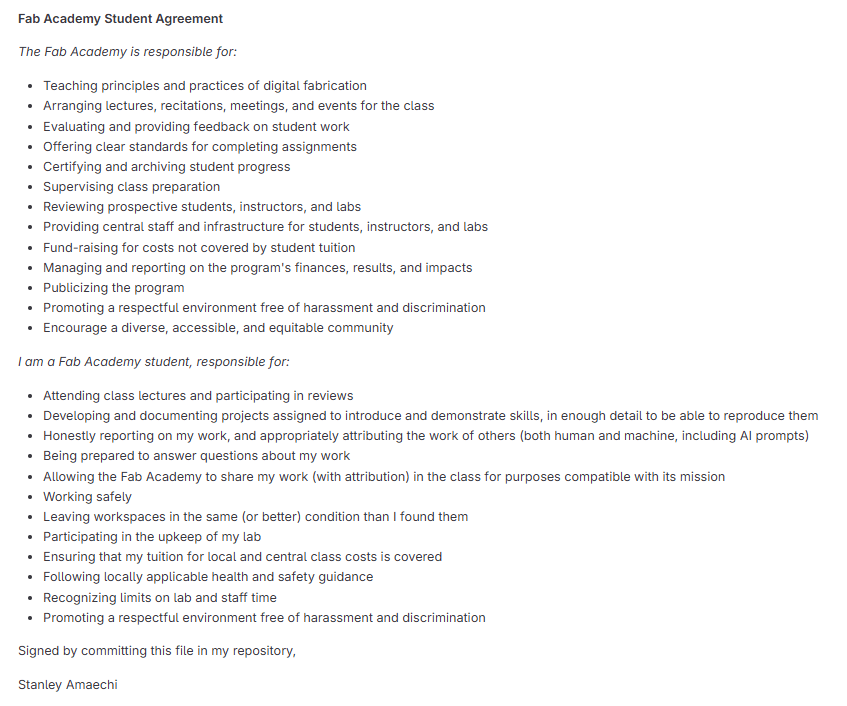
Signed student agreement
Every student of Fab Academy is required to read and sign an agreement, as we have obligations as students. See below a copy of my signed agreement:
Build the webpage
The journey of creating a personal website for Fab Academy was both challenging and rewarding. Initially, I was given a basic template, which, while functional, lacked the design and responsive features necessary to showcase my work effectively. Thus began the process of tailoring the site to better represent my learning, experiences, and progress throughout the Fab Academy program. As I continued refining my website, I found the balance between functionality, aesthetics, and a seamless user experience to be key in building the site.
Technologies and Tools Used
To begin with, I chose to build the site using a combination of modern web technologies, all aimed at creating a responsive, clean, and easily navigable experience. The main technologies I employed included:
- Bootstrap 5: I decided to use Bootstrap 5 due to its versatility and responsive grid system. I took inspiration from Net Ninja's Bootstrap 5 Crash Course Tutorial, which provided in-depth coverage of Bootstrap’s core components, such as the navbar, grid system, and layout utilities. The course helped me get up to speed and use these tools effectively to design a site that adapts beautifully to different screen sizes.
- Font Awesome: To enhance the user interface, I incorporated Font Awesome icons, which added visual clarity to the website’s navigation and layout, helping the user to easily identify sections or actions.
- Custom CSS: I crafted custom styles in a
custom.cssfile to further personalize the template and fine-tune the layout beyond the default Bootstrap styles. This allowed me to incorporate personal branding and Fab Academy's color scheme, making the website feel professional and aligned with the program's ethos. - Text Editors: For editing HTML, CSS, and JavaScript, I used Notepad++ and IntelliJ IDEA, both of which offered a good balance of lightweight functionality and powerful features for coding. They also provided quick ways to preview changes and iterate on the design efficiently.
- Google Chrome Developer Tools: These tools proved invaluable, allowing me to inspect and tweak the site’s layout and performance in real-time. This ensured a smooth user experience across all devices.
Responsive Layout Using Bootstrap's Grid System
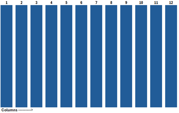
The first major hurdle I tackled was ensuring that the website was responsive—that is, it should look great on desktops, tablets, and smartphones. I knew that Bootstrap’s grid system would be a perfect fit, so I dove into learning how to structure the page with rows and columns that would adjust to the screen size.
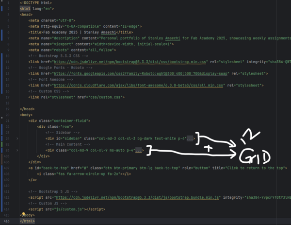
The grid system works by dividing the page into 12 columns, which can be flexibly resized across different breakpoints (from small screens like phones to large screens like desktops). This made it easy to achieve a balanced layout without needing to resort to complex media queries or custom CSS hacks.
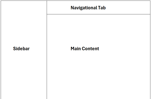
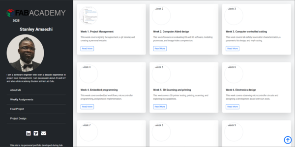
Website Structure Overview
The next step was mapping out the website’s structure. The goal was to design something that was not only visually appealing but also easy to navigate and logical in its flow. The final design consists of two main sections:
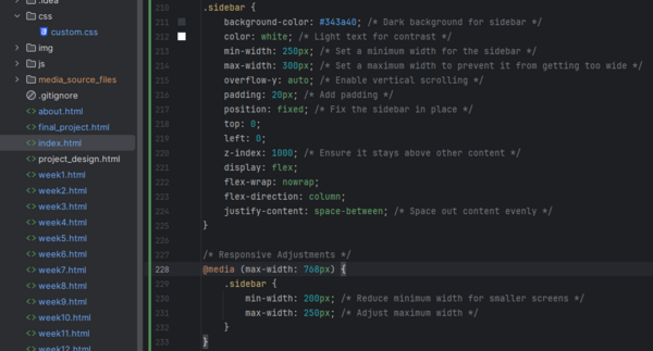
- Sidebar Navigation: The sidebar serves as a map to the different sections of the documentation. It’s a persistent feature that remains visible as you scroll down the page, providing quick access to other sections without losing the user’s place on the page. This makes the navigation smooth and intuitive.
- Main Content Area: This is where the documentation, project details, and additional content are displayed. The design allows for easy reading and interaction, with appropriate headings and subheadings guiding the user’s journey through the material. It is the heart of the website where users can engage with the content in a structured, organized manner.
The initial layout and design inspiration for this website was derived from https://archive.fabacademy.org/fabacademy2017/fablaboulu/students/77/. There are notable similarities between both layouts.
- Sidebar Navigation: The structure of this was adopted except the menu with CSS changed for my preferred coour reference
- Main Content Area: The structure of the columns for various screens were changed, with hyperlink clickable changed
- Navigational Tab Area: Tasks, Process, Resources and Reflection categorization was maintained.
Personalizing the Template
After settling on the overall structure, the fun part began—personalizing the template! The default template was clean, but I wanted it to reflect the Fab Academy ethos—modern, functional, and easy to navigate. I made several adjustments to bring it to life:
- Customizing the color scheme to match the Fab Academy branding, making the website look professional and in harmony with other Fab-related projects.
- Refining the sidebar with CSS to ensure it was both aesthetically pleasing and easy to use, with clear fonts and properly sized icons for navigation.
- Integrating Font Awesome icons into the sidebar and main content for intuitive, visual guidance through the pages.
Differences in Ivan's page and current page
| Ivan's Page | Current Page | Comment |
|---|---|---|
<div id="sidebar" class="col-xs-6 col-sm-4 col-md-3 sidebar-offcanvas"> |
<div id="sidebar" class="col-md-3 col-xl-3 bg-dark text-white p-4"> |
The current page uses Bootstrap 5 classes with fixed widths for different breakpoints (md and xl), adds dark background with white text, and includes padding. Original used Bootstrap 3 with responsive column sizes and offcanvas functionality. |
<div class="col-xs-12 col-sm-8 col-md-9 content-column white-background"><div class="small-navbar visible-xs"><button type="button" data-toggle="offcanvas" class="btn btn-ghost pull-left"> <i class="fa fa-align-left"> </i>Main Menu</button><h1 class="small-navbar-heading"> <a href="index.html">Week1</a></h1></div><div class="row"><div class="col-lg-11"><div class="content-column-content">
|
<div class="col-md-9 col-xl-9 ms-auto p-4"><div class="row"><div class="col-12"><div class="content-column-content">
|
The current page has a simplified structure without the mobile navbar and toggle button. Uses Bootstrap 5's ms-auto for margin-start auto (right-aligned content), includes padding, and has a simpler nested structure. The original had a mobile-specific navbar with offcanvas toggle and page title, plus more complex nesting with an 11-column inner container. |
Challenges and Solutions
As with any design process, there were a few challenges along the way. The main issue I faced was ensuring that the layout remained functional across different screen sizes. There were times when the layout components wouldn’t adjust properly on smaller devices. However, Bootstrap’s responsive classes made it easy to fix these issues:
- Challenge: The layout didn't scale well on mobile devices.
- Solution: By using Bootstrap’s grid system and applying the appropriate column classes like
col-md-andcol-sm-, I ensured that the website’s content rearranged itself according to the screen width. - Challenge: The sidebar was overlapping with the main content on narrower screens.
- Solution: I recalculated the containers of the sidebar and main content, ensuring they matched 12 grid.
Testing the Website
Once the initial design was in place, testing was the next critical step. I tested the website on various devices—smartphones, tablets, and desktops—using Chrome Developer Tools to simulate different screen sizes. This allowed me to make adjustments in real-time, ensuring the site maintained its integrity across all platforms. Cross-browser testing was also essential, and I ensured the site looked and worked well on all modern browsers like Chrome, Firefox, and Edge.
Feedback from peers was invaluable, as it provided insights into potential usability improvements. I made sure to adjust the site according to this feedback to ensure the best possible user experience.
Conclusion
Creating this website was an immensely satisfying process, blending creativity with technical skills. The use of Bootstrap 5 allowed me to create a responsive site that could scale across multiple devices, while custom CSS added a personal touch. By continually testing and refining the site, I was able to create a seamless user experience. Moving forward, I plan to further enhance the website by adding additional sections and features to better showcase my Fab Academy journey. This project has given me an opportunity to explore both the technical and creative aspects of web development, which will undoubtedly aid me in future projects.
Inspiration and Learning Resources
Along the way, I found valuable resources that helped me learn and grow in my web development journey. One such resource was Ivan Sanchez Milara’s Fab Academy page, whose site served as a pilot template. Using the google chrome developer tool, I explored his site and built upon it. Ivan’s journey through Fab Academy gave me practical insights into the whole process and motivated me to push my design and documentation skills further. I also explored other Fab Academy alumni pages, gathering insights on how they structured their websites and incorporating ideas into my own design process.
Git and Upload to Class Archive
My journey with the Global Fablab community began with the boot camp, followed by an introduction to Neil and the warm, collaborative network of Fab Academy participants worldwide.
Our first onsite meeting was with Ivan Sanchez Milara, our instructor for Principles and Practices / Project Management. Although I had prior experience with Git, Ivan provided deeper insights into the rationale behind our workflow and best practices from an advanced user’s perspective.
What is Git and GitLab?
Git is a distributed version control system that allows developers to track changes, collaborate on projects, and maintain code history efficiently. GitLab, on the other hand, is a web-based DevOps platform that provides Git repository management along with CI/CD pipelines and issue tracking.
Setting Up Git
We were introduced to different ways of creating and managing our Fab Academy website. Below is the workflow I followed:
-
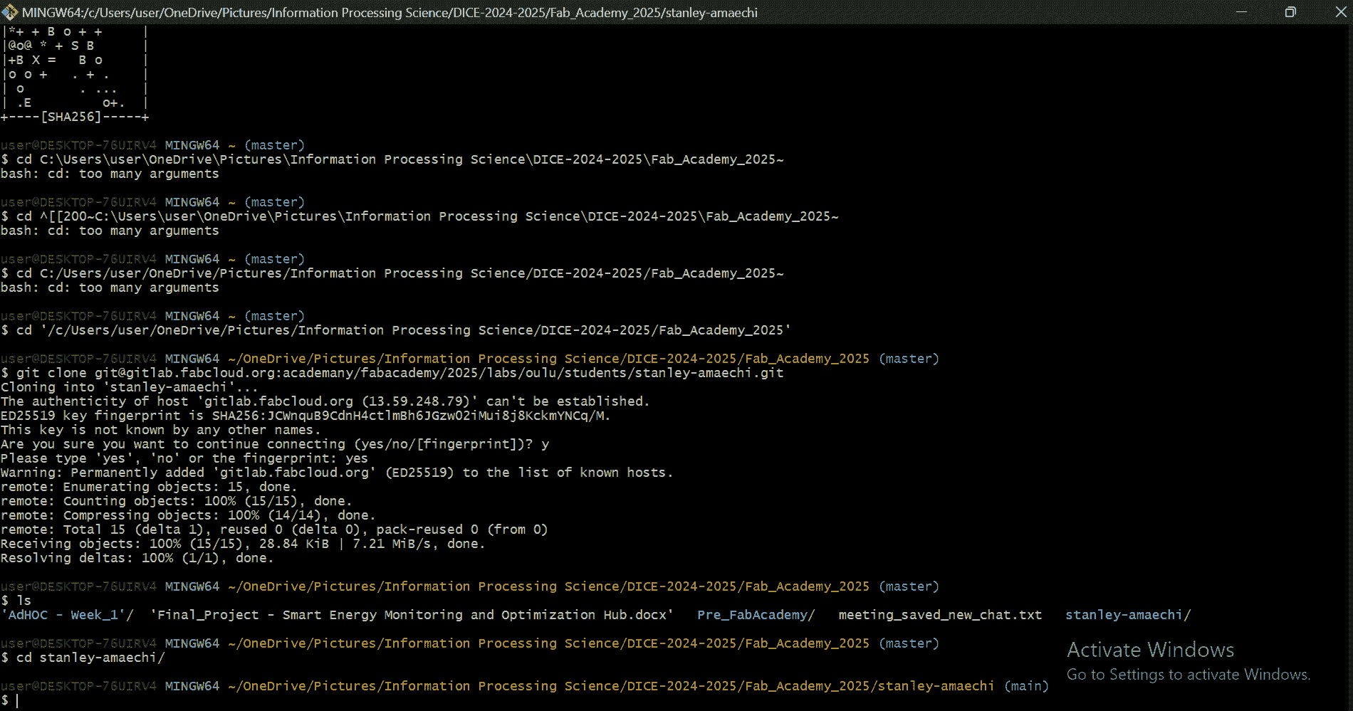
I already had Git Bash installed on my computer. If you need Git, you can download it from the official webpage.
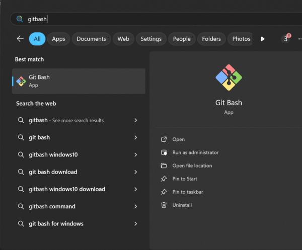
Figure 6: Searching for Git Bash. - I had previously created an account on GitLab FabCloud.
-
Generating an SSH Key
Since SSH keys are the only way to authenticate Git operations in FabCloud, I generated one using:
ssh-keygen -t rsa -b 4096 -C "samaechi22@student.oulu.fi"This command creates two files in the
~/.ssh/directory:id_rsa(the private key, which should never be shared)id_rsa.pub(the public key, which we copy and add to GitLab)
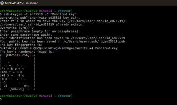
Figure 7: Generating an SSH key. -
Adding the SSH Key to GitLab
After generating the SSH key, I copied the contents of
id_rsa.pubusing:cat ~/.ssh/id_rsa.pubThen, I added it to GitLab under User settings → SSH Keys.
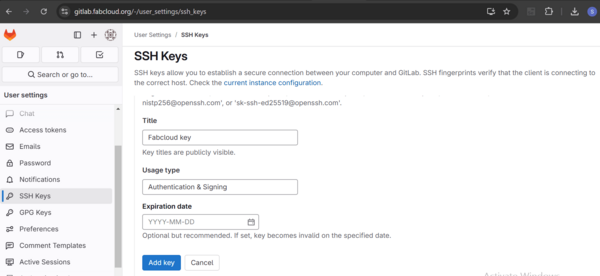
Figure 8: Adding the SSH key to GitLab. -
Testing the SSH Connection
To verify if GitLab recognized my SSH key, I used:
ssh -T git@gitlab.fabcloud.orgA successful setup returns a welcome message.
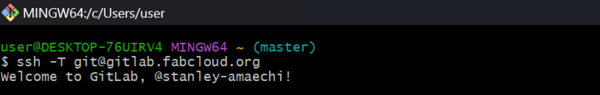
Figure 9: Welcome to GitLab, @stanley-amaechi!.
Git Workflow
Once the SSH key was set up, I followed this workflow for managing my repository:
git pull– Fetches and merges changes from the remote repository.git add .– Stages all modified and new files for the next commit.git commit -m "Descriptive message"– Saves the staged changes with a meaningful message.git push– Uploads local commits to the remote repository.git status– Displays the current state of the working directory and staging area.
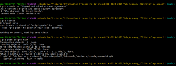
git status to check working directory status.Resizing Images for Documentation
To keep my repository lightweight, I used ResizePixel. ResizePixel is an online tool that allows users to resize, compress, crop, and optimize images without losing quality. I used it specifically to reduce the file size of my documentation images before uploading them to my repository, ensuring faster loading times and efficient storage use.
GitLab CI/CD Pipeline
My repository contained a .gitlab-ci.yml file, which is used for automating deployment and other tasks. Since I followed the standard Fab Academy setup, I did not need to modify it. This file ensures that my site is built and deployed automatically whenever I push changes.
Resources utilized
- Git: Version Control System
- Resize Pixel and Note pad ++: code editor
- Bootstrap: frontend framework
- IntelliJ_IDE: IntelliJ IDEA
Reflection
Summary
This has been an interesting week. I initially took the assignments for granted due to my previous knowledge of Git and website development. However, I paid for it by working extra hours to meet the deadline. This experience will help me plan better for Week 2, especially in topics where I face a higher learning curve. Grammarly an AI tool was used in spelling correction, and formatting the sentences.
Main Difficulties
-
Custom Web Development:I could have easily used the provided HTML page with limited styling provided by the academy, but I wanted to test my grasp of HTML, CSS and Javascript, by using the developer tool in creating a skeleton webpage from my Git teacher Ivan Sanchez with my own content and experience of my first week in Fab Academy.
-
Project Selection:Choosing my final project was challenging, so many questions in my head on do you have enough skillset to complete this?
-
Bootstrap Refresh:Relearning boot strap framework specifics delayed initial progress also.
Main Learnings
-
Dev Tools Mastery:Reverse-engineering website structures through browser inspection
-
Image Optimization:Effective use of ResizePixel for web-ready assets
-
Frontend Refresh:Reinforced HTML/CSS/JavaScript fundamentals through practical implementation
Documentation Assets
-
Git Repository: fabacademy/week1-website
-
Design System: bootstrap-5.3-custom