Concept
What We Covered in Class
This week focused on developing visual interfaces. In class we explored how to build desktop GUIs using the Python Qt library ecosystem. Here are my class notes on how to do a Virtual enviroment and a interface with Qt designer.
Interface Development Theory
There are many available libraries; we focused on Python Qt. Python alone cannot build visual interfaces, but with the right libraries it can. pyQt6 is the package used to create those interfaces.
VIRTUAL ENVIRONMENTS — CONCEPT
A virtual environment is a local directory where you can install libraries for a specific project, you create a bubble where you install all the versions you need. If you do not use it, the bubble only occupies memory. The advantage is that all the libraries the project needs are contained inside that bubble. Installing a library at the system level would affect all projects, but here it does not because the project's library is contained inside the bubble. You can have multiple bubbles.
SETUP STEPS — VIRTUAL ENVIRONMENT & PyQt6
-
01
Open the terminal. Windows: press
Windows + R, typecmd, press Enter. -
02
In the terminal, type
python3. If you see something likePython 3.14.4 … on darwin, it is installed. -
03
Navigate to where you want to create the folder using
cd(e.g., desktop).cdis used to enter folders. -
04
Create the project folder with
mkdir. Example:mkdir interfaces_fab.lsshows the files inside a folder;pwdshows your current location. -
05
Create the virtual environment. Windows:
python -m venv venv/ Mac:python3 -m venv venv. The second "venv" is the name given to the environment. If it succeeds, nothing is returned. - 06 ⚠ Never push venv to your GitLab — it only works at the local computer path.
-
07
Activate the environment. Mac:
source venv/bin/activate/ Windows:venv\scripts\activate. This step is done only once after the folder is created; you do not need to repeat the previous steps. -
08
Install PyQt6:
pip install PyQt6 -
09
Verify the installation:
pip freeze— shows the package name and what was installed directly in the virtual environment. -
10
Documentation tip: run
pip freeze > requirements.txtso that anyone who installs your project gets the same libraries you had on your machine.cat requirements.txtshows the file contents in the console. -
11
Install pyserial — enables serial communication with the microcontroller directly from Python:
pip install pyserial -
12
Open in Visual Studio Code:
code .
QT DESIGNER
- 01 Install Qt Designer: build-system.fman.io/qt-designer-download
-
02
The entire left side contains widgets. The center is the canvas where you drag and drop widgets. Press
Cmd + Rto preview the interface. - 03 Save the file in the same directory where the virtual environment folder was created, named "interfaz". Do not save it directly inside the venv folder — save it in the parent folder (e.g., interfaces_fab). The file is saved in XML format.
-
04
From the terminal, convert the UI file to Python:
pyuic6 -x interfaz.ui -o frontend.py. This changes the language from the UI file to Python and renames it. Super tip: never use spaces in file names. -
05
Run the interface from the terminal:
python frontend.py. If everything worked correctly, your interface will open from the terminal. - 06 Return to Qt Designer to rename the object names.
Frontend vs. Backend
Frontend file: stores the interface design, everything the user sees and interacts with directly. This file comes directly from Qt Designer. Do not modify it.
Backend file: uses the frontend file as a library. Stores the logic and data that make the application run. It runs on a web server and is invisible to the end user. This is where changes are made to adapt everything to the sensor.
CREATING THE BACKEND FILE — STARTER CODE
Create a new file in Visual Studio Code named backend.py and paste the following code:
from frontend import *

class MainWindow(QtWidgets.QMainWindow, Ui_MainWindow):
    def __init__(self, *args, **kwargs):
        QtWidgets.QMainWindow.__init__(self, *args, **kwargs)
        self.setupUi(self)

if __name__ == "__main__":
    app = QtWidgets.QApplication([])
    window = MainWindow()
    window.show()
app.exec()UART COMMUNICATION
If you want it to connect with your microcontroller you can use the backend communicates with the microcontroller through serial communication (UART). The pyserial library allows you to read the prints from the microcontroller.
This is a video of a parto of my Qt designing process:
Why I chose HTML Instead of Qt
This is what we covered in class. I found the part about creating a virtual environment and using Qt Designer to generate the UI file directly very interesting. However, when developing the idea for my project, I realized that even though the virtual environment approach could be useful, what they taught us ultimately creates a desktop application and I was looking for something more versatile that could be accessed from a web browser. Because of this I started looking for alternatives and found the solution: build the page in HTML format, as I had done during the communications week, and host it through a server.
Design Concept
From the interface design stage, I wanted to create something meaningful: I wanted the entire project to tell a story connected directly to the physical object. My process started with a brainstorm. At first, my intention was for the web page's aesthetic to be inspired by the origami flower. However, as I iterated on the idea, I realized that integrating a bee as the digital protagonist would add a beautiful and complementary dynamism to the project.
Why a Bee?
I chose a bee because it makes the perfect match with the physical origami flower I built. In nature, bees and flowers have an inseparable connection and furthermore, bees are extremely sensitive to air pollution. I found it an amazing idea that the bee acts as our guardian on screen: if the air is clean, she is happy and working; but if pollution levels rise, the bee alerts us digitally at exactly the moment the origami flower reacts and moves in the real world. It was the best way to connect what happens on the web with the physical mechanism, making the entire project feel alive.
I searched for dashboard design ideas and started experimenting in Canva to create an aesthetic dashboard aligned with the narrative. After testing different configurations, I settled on this design:
Bee Ideation
To create the bee graphic, I started by making several sketches. I explored different forms and the option I liked most was a bee built from geometric shapes, since it follows the same visual rhythm as the origami structure.
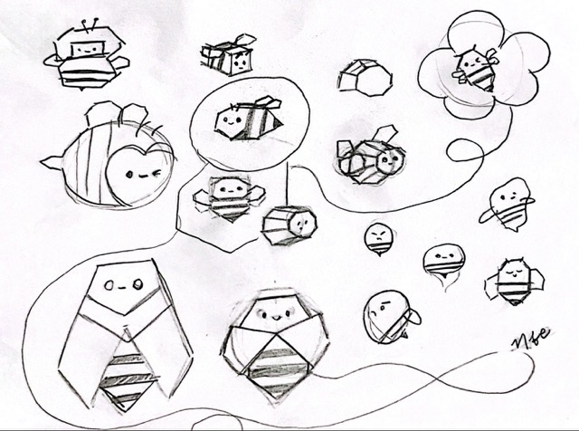
After choosing the one I liked best, I moved to Procreate to draw it and get a sense of how it would look on the web page. I made 4 different variants, each indicating a different air quality scenario: open the window because interior air quality is bad, everything is fine, or the window should stay closed and the air purifier should be turned on. I started them in Procreate.
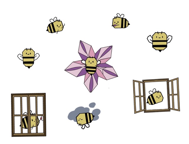
These Procreate drawings were then passed directly to Vizcom due to time constraints, to generate the images in the desired style. Afterwards, I traced over them in Affinity to achieve better quality.
I traced the logo myself in Affinity. Here is a video of the process:
System
How the Interface Works
To be able to get the best help from claude, i first defined everything I wanted for the proyect. The interface acts as a control and visualization center. Below is a breakdown of each major component of the system.
REAL-TIME COMMUNICATION
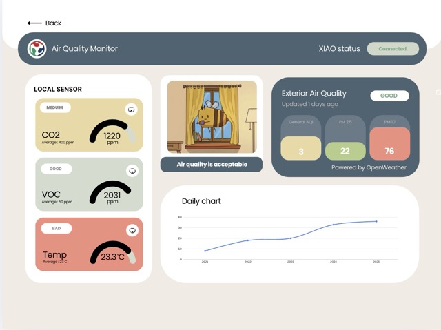
Uses MQTT over WebSockets to receive data from the XIAO and chart air quality throughout the day (Daily chart — bottom panel). This is reflected in 3 different values: CO2, VOC, and Temperature, found in the Local Sensor panel. The card color changes based on whether the value is good (green), medium (yellow), or bad (red).
EXTERIOR CONTEXT (EXTERIOR AIR QUALITY)
The web page consumes a government API to display the exterior air quality of the city, allowing a comparison of both environments on the same screen. In the Exterior Air Quality panel, you can see how long ago it was last updated, the general air quality in a white box reading Good, Medium or Bad. Below there are 3 progress charts representing the air quality data vertically: the first one shows the general air quality index, the second the PM 2.5 amount, and the third PM 10. As values rise, the progress chart changes color between green, yellow, and red.
AUTOMATIC ALERT RULES
The system evaluates danger based on two metrics obtained from the sensors, and based on this the panel in the right corner shows a phrase with an animation:
- Interior air quality is bad, exterior is good → bee and open window illustration appears. Message: "Open the Window".
- Interior air quality is bad, exterior is bad → bee inside the window pressing a button appears. Message: "Turn On Air Purifier".
- Interior air quality is good, exterior is good → happy bee on a flower appears. Message: "Enjoy the Indoor Air".
API Selection
Once I had the design, I searched for the API from which to pull exterior air quality data. These were my three finalist options: Ambee (getambee.com), OpenWeather (openweathermap.org), and OpenAQ (openaq.org).
I initially chose Ambee because it works through AI-based estimation, giving precise data for any given location. However, upon further research I found that it only provides a 15-day trial before requiring payment. Because of this I chose OpenWeather — its data is extremely stable and has global coverage, and its free tier is permanent and generous (up to 60 requests per minute).
SETTING UP THE OPENWEATHER API
- 01 Follow the steps on the OpenWeather API key page to create an account and obtain your API key. New keys take between 10 and 30 minutes to be generated.
- 02 Verify the API key works by opening a new browser tab and pasting the following URL, replacing the placeholders with your actual values:
http://api.openweathermap.org/data/2.5/air_pollution?lat=[YOUR_LATITUDE]&lon=[YOUR_LONGITUDE]&appid=[YOUR_API_KEY]To get your coordinates, open Google Maps, right-click on the blue dot on your location, and copy the data.
Spiral Development Phases
After having the design and the API, I moved on to building the interface prompt with the help of AI. I went through several iterations, from a complex, broken version to a clean, working dashboard.
PHASE 1 — FIRST ATTEMPT: SUPABASE DATABASE
At first I wanted the data to be stored in a database for the user login. I found Supabase, created my account, and generated my project URL. However, I spent a lot of time fighting with the AI to build the interface, and in the end it turned out too complex and did not work properly.
PHASE 2 — SIMPLIFIED LOGIN (LOCALSTORAGE)
To solve the login issue, I opted for a simpler approach. It works like this: when you fill in the SIGN UP form and click the button, the code takes everything you typed and saves it in your own browser with this line:
localStorage.setItem('aqm_user', JSON.stringify({ name, mail, pass, coords }));localStorage is like a small box that your browser has to save information even after you close the tab. Your name, email, password, and coordinates are stored there. When you open the page again, the code checks if that box has anything saved.
PHASE 3 — NAMING CONFLICT & SIMPLIFIED APPROACH
I had a naming conflict in the HTML that prevented the page from loading. I went back to the prompt and simplified it, I wanted to start from the basics to better understand what was happening and gradually fix the errors. This approach worked much better: it avoided having a very long piece of code and helped me understand overall what was being done. The first interface the AI gave me had all these errors, found by right-clicking on the page and selecting Inspect:
Failed to load resource: the server responded with a status of 404 (Not Found)

Outdoor fetch failed: TypeError: Cannot set properties of null (setting 'src')
  at updateRecommendation (TryInterfaces.html:639:53)
  at applyOutdoor (TryInterfaces.html:686:3)
  at fetchOutdoor (TryInterfaces.html:669:5)

Uncaught (in promise) TypeError: Cannot set properties of null (setting 'src')
  at updateRecommendation (TryInterfaces.html:639:53)
  at t.<anonymous> (mqtt.min.js:2:10257)

Uncaught Error: Canvas is already in use.
Chart with ID '0' must be destroyed before the canvas with ID 'gaugeCO2' can be reused.PHASE 4 — CONNECTING TO XIAO, NEW PROBLEMS
After resolving those errors, I managed to display the XIAO data on the page and have the panel change color based on the reading. However, several outstanding problems remained:
- The XIAO status badge did not change according to the actual status if disconnected, it still showed as connected.
- The page was not connecting correctly to the API and was not giving accurate exterior air quality data.
- The daily chart was not working properly; I defined that I wanted it to show the 5-minute average of local sensor air quality on a 1–3 scale, where 3 = bad and 1 = good.
- The local sensor gauge charts were not working.
- The dashboard recommendation panel was not changing based on local sensor and API data. Additionally, I did not want the user to be able to add the bee images. I wanted to add them myself from the HTML.
PHASE 5 — OPENWEATHER DATA FORMAT BUG
After simulating, I managed to connect to the XIAO, but the exterior air quality data looked wrong. I checked the OpenWeather values table and realized that the values on my page were appearing as decimals, while in reality they should appear as whole numbers the result was the number I was getting multiplied by two decimal places.
PHASE 6 — FINAL WORKING INTERFACE
After several iterations, I achieved the final working interface. Here is a video of how it works, in the video I used the candle fumes to demonstrate the air quality reading of the ENS 160 + AHT2 sensor changes:
Libraries Used
The libraries are imported at the beginning of the file in these three lines:
<link href="https://fonts.googleapis.com/css2?family=Poppins...">
<script src="https://unpkg.com/mqtt/dist/mqtt.min.js"></script>
<script src="https://cdn.jsdelivr.net/npm/chart.js"></script>WHAT EACH LIBRARY DOES
- Poppins Just the text font — the one that gives the rounded, clean style to everything.
- MQTT.js Allows connecting to the XIAO sensor over the internet and receiving data in real time.
- Chart.js Draws the semicircular gauge charts and the daily line chart.
THE EXTERIOR WEATHER API — CODE SETUP
The API key is defined at the beginning of the script:
const API_KEY = 'Your API key';And it is used in the line where the request is assembled:
const url = `https://api.openweathermap.org/data/2.5/air_pollution?lat=${lat}&lon=${lon}&appid=${API_KEY}`;It sends your latitude and longitude to OpenWeather along with the key that identifies you as a service user, and OpenWeather responds with the air quality data for that location.
Final Result: How the Application Works
The final code is contained entirely in one HTML file, with JavaScript and CSS integrated within it.
WHEN YOU OPEN THE PAGE
When you open the file in the browser, the first thing that loads are three external resources: the Poppins font, the library that allows connecting to the sensor over the internet, and the library that draws the charts. Without these three things, the dashboard would not work.
THE LOGIN SCREEN
The first thing you see is the login screen with two tabs: LOGIN and SIGN UP. If it is your first time, fill in the SIGN UP with your name, email, password, and the coordinates of where you are. Those coordinates are important because they are later used to query the exterior air quality of your exact location. All of that is saved in the browser, so the next time you open the page it does not ask you to fill it in again — it takes you directly to the dashboard.
THE DASHBOARD BUILDS ITSELF
As soon as you enter the dashboard, several things happen at the same time: the three semicircular gauge charts for the sensors are created, the bottom line chart is created, it connects to the XIAO sensor over the internet, and it requests exterior air quality data from OpenWeather using the coordinates you saved.
HOW IT CONNECTS TO THE SENSOR
The XIAO sensor publishes data continuously over the internet using a protocol called MQTT, basically a messaging system. The dashboard connects to that same system and subscribes to three channels: one for CO2, one for VOC, and one for temperature. Every time the sensor sends a new number, the dashboard receives it automatically and updates everything on screen.
THE XIAO STATUS BADGE
To know whether the sensor is on or off, the code uses a 45-second timer. Every time a sensor reading arrives, that timer resets. If 45 seconds go by without receiving anything, the badge changes to "No Signal" in yellow. If the sensor sends data, it stays on "Connected" in green. If the internet connection drops completely, it changes to "Disconnected" in red.
HOW SENSOR DATA IS PROCESSED
When a new CO2 or VOC number arrives, the code first calculates the cumulative average of all values that have arrived since the dashboard was opened. Then it compares against defined ranges:
- CO2: below 800 ppm = good; between 800 and 1000 = medium; above 1000 = bad.
- VOC: below 50 ppb = good; between 50 and 750 = medium; above 750 = bad.
Based on the result, the card changes color to green, yellow, or red and the badge reads GOOD, MEDIUM, or BAD.
OVERALL INTERIOR AIR QUALITY
The code combines the CO2 and VOC status to produce a single number representing indoor air quality. If either of them is red, the entire interior quality is bad. If neither is red but one is yellow, it is medium. It is only good if both are green at the same time.
THE LINE CHART
Every time a sensor reading arrives, the code records whether the interior quality at that moment was good (1), medium (2), or bad (3). It groups those records into 5-minute intervals and calculates the average for each. This way the chart grows on its own while the sensor is sending data, and you can see how air quality changed throughout the day.
EXTERIOR AIR QUALITY
When entering the dashboard, the code takes the coordinates saved during login and asks the OpenWeather API for the air quality at that point. OpenWeather responds with a number from 1 to 5 and the exact values of PM2.5 and PM10 in µg/m³. The code translates that number into text (GOOD, FAIR, MODERATE, POOR, or VERY POOR) and colors the three cards in the right panel according to the official ranges of the European Union air quality table. This query repeats automatically every 10 minutes.
THE BEE AND THE RECOMMENDATION
This is the part that brings everything together. The code takes the interior quality calculated from the sensor and the exterior quality obtained from the API, and decides which image to show and what text to display:
- Interior bad, exterior good → bee at the window; message: open it.
- Interior bad, exterior bad → bee with the purifier; message: turn it on.
- Interior medium, exterior good → bee watching; message: quality is acceptable.
- Everything good → bee with the flower; message: enjoy the air.
This recommendation updates every time a new sensor reading arrives or every time the exterior weather information is refreshed.
Main Problems and Solutions
PROBLEMS ENCOUNTERED AND HOW THEY WERE FIXED
- 404 Image Errors The code was looking for the bee images in a folder that did not exist, causing 404 (not found) errors. Fixed by clearly defining where each image is located in a single place in the code, making it easy to change.
- XIAO Status Not Updating The badge always said "Connected" even when the sensor was off, because the code never checked whether data was still arriving. Fixed with a 45-second timer: if no data arrives, the badge automatically changes to "No Signal".
- Line Chart Showing Simulated Data The chart was showing simulated temperature numbers instead of real sensor data. Replaced with a system that takes real data arriving via MQTT, calculates the average every 5 minutes, and displays it on a 1–3 scale.
- Bee Recommendation Not Changing The image and text in the central panel never updated because the code was not connected to the right execution moments. Fixed by making it update every time a new sensor reading arrives and every time exterior API information is obtained.
- White Margin on Bee Images The bee images had a white margin that did not look right. Fixed by switching the files from SVG to PNG.
What I Learned
Reflection
This week involved a lot of trial and error. Even though AI is a great tool, most of the time it will give you a result but not exactly the one you want. No matter how much information you give it, if you do not understand what it is doing and something goes wrong, fixing it will cost you much more time. On top of that, if you let it do all the work you do not learn as much. I am in favor of using AI, as long as you review what it gives you, try to understand it, and then make the modifications you need. That is the process that I tried following during this week, i found it more complicated than the networking and communications week.