WEEK 14: INTERFACE AND APPLICATION PROGRAMMING
For this week, we´ll start with the individual assignment, since the group assignment is to test as many tool options as possible, so, it has to go at the end inevitably.
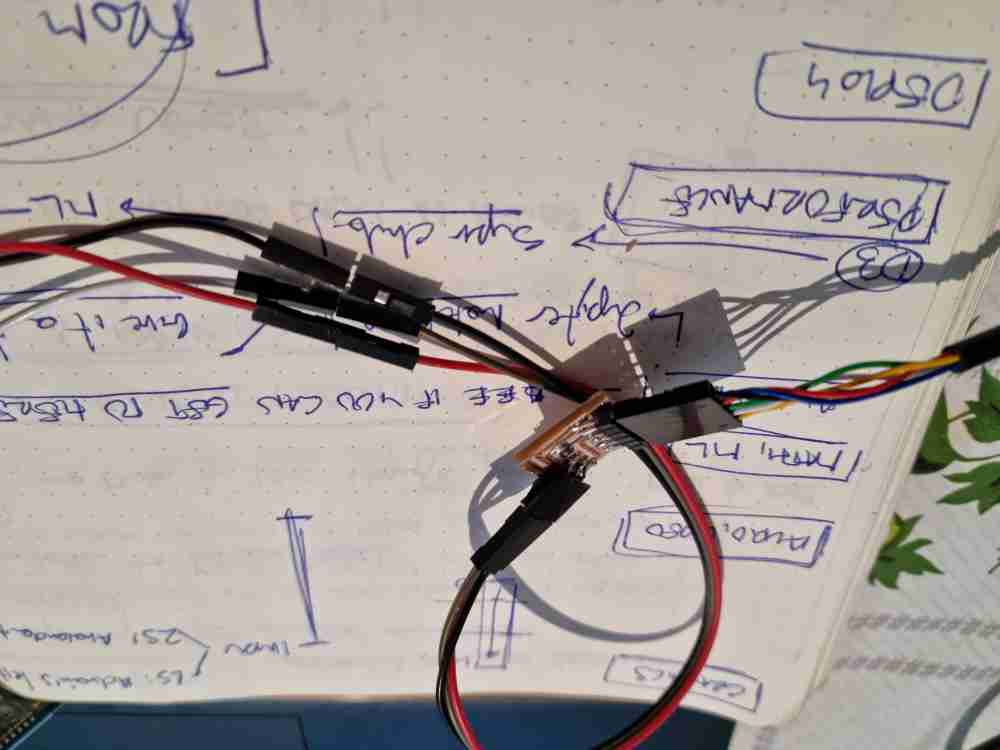
- For the INDIVIDUAL ASSIGNMENT , my planning will be:
- Understand and test the Processing language.
- Write an application with processing that interfaces an input device that i´ve made.
- For the GROUP ASSIGNMENT
- Compare as many tool options as possible.
INDIVIDUAL ASSIGNMENT
PROCESSING
For the individual assignment, i´ve decided to explore, learn and test the Processing language, as it´s got similarities with the arduino IDE coding. To start, as usual, I invested time in reviewing some past repositories such as Adrián´s and Lorena´s, and also checked a begginers tutorial to get started.
Quickly I understood that Processing is a software sketchbook and language for coding with the aim of visual arts, similar to Arduino IDE code due to the fact that it´s divided into three main blocks: First: a text editor (sketches), Second: the compiler, and Third: the window display. And it also runs on libraries.
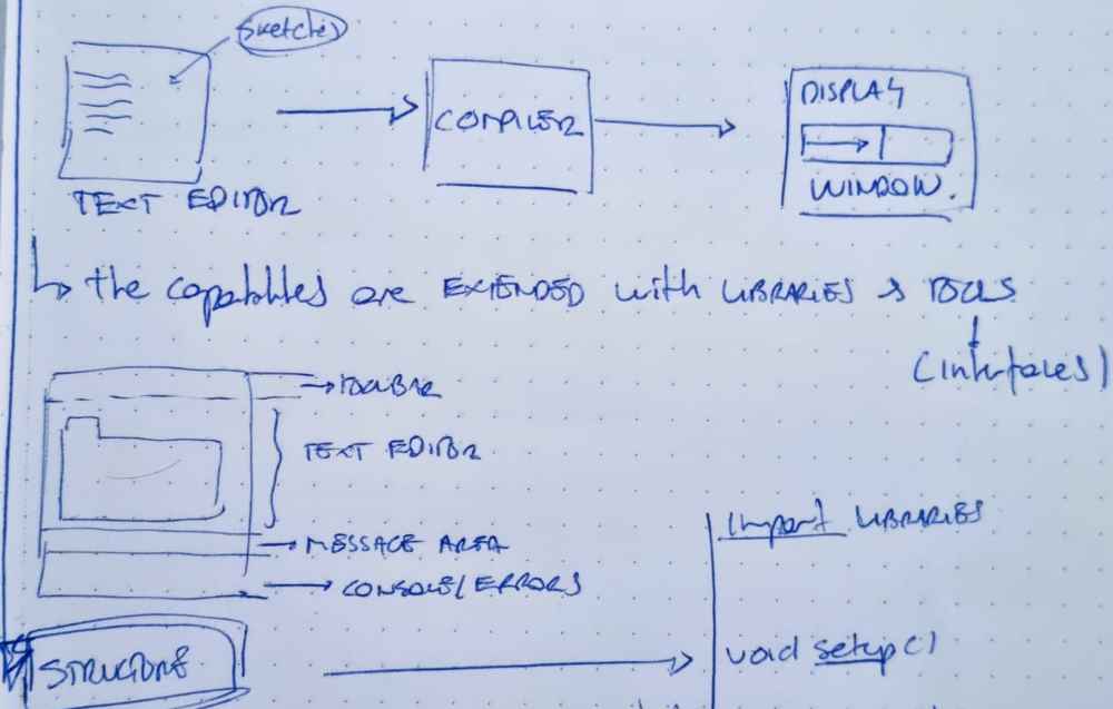
The coding structure of the text editor is similar to the arduino IDE, as it has the same "modules":
| Import libraries: You first need to "call" the libraries and variables to use. Being very important -> import processing.serial.*; |
| Void setup: Where you define from were you´re going to "read" the data, it could be a .csv from the computer or a String, Integer or Floats, etc.. from an input device (Wired or wireless. |
| Void draw: It´s were you define the size and characteristics of the display window, and it´s also were you declare the "void loop" if needed. |
Here you can check the Processing Structure cheatsheet with all it´s possibilities described.
Once ready, I started doing a couple of simple sketches examples:
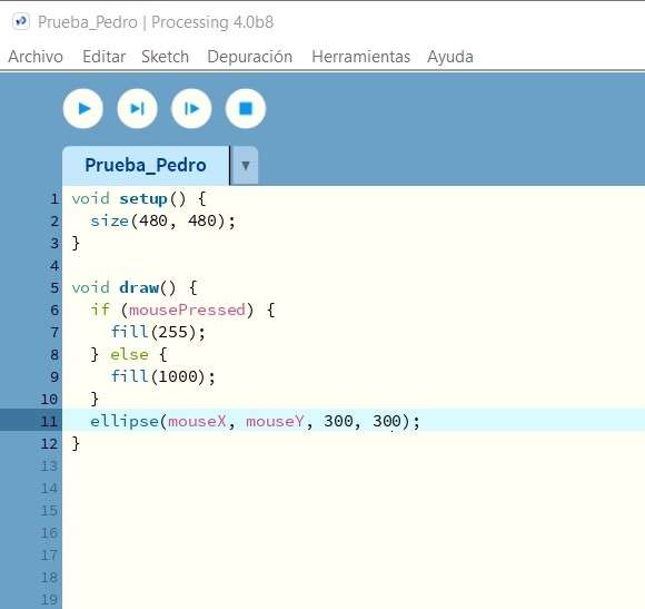
 Testing.
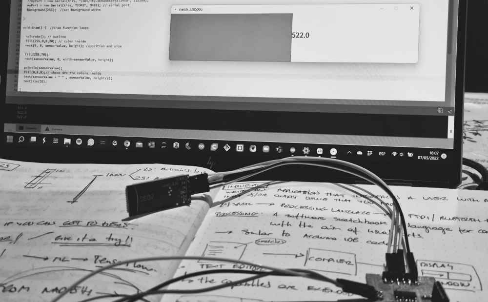
And once I understood how Processing worked, I started FIRST with a wired connection (FTDI) to my previously made, in input devices assignment, step response. To achieve it, I used Adrián´s Processing sketch for visualizing the step response data (Thank´s Adrián!), in his interface assignment. It really doesn´t need much modification due to the fact that in the Processing code you don´t declare the output variable, you just "call" the serial port from where you want to recieve the data, check the serial port number and the baudrate used.
 step response.
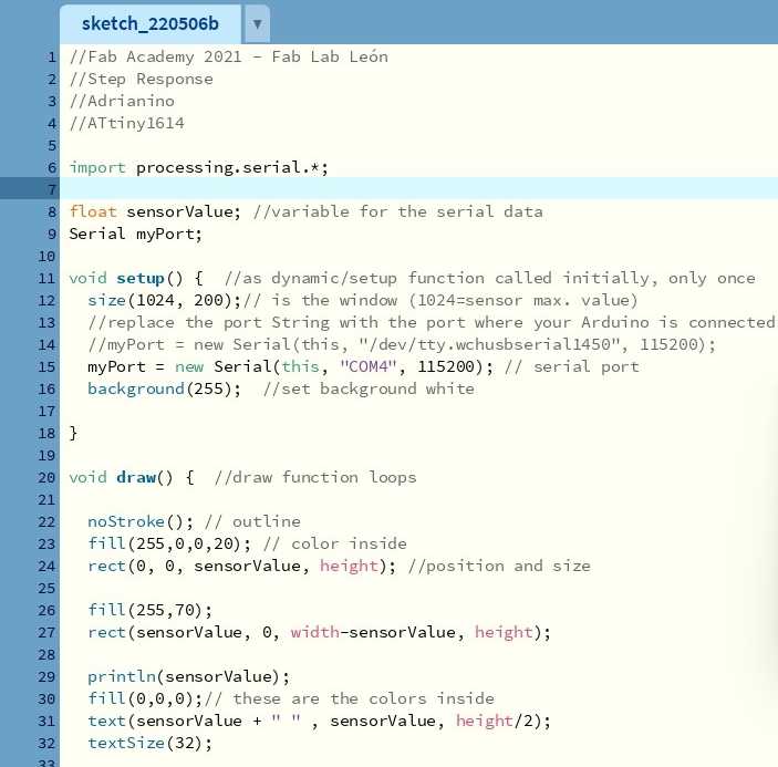 Adrián´s sketch.
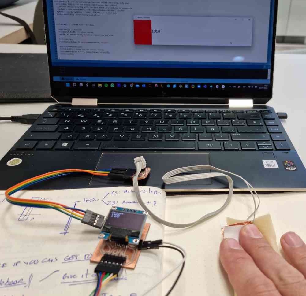 FTDI measuring.
Here you can check a video:
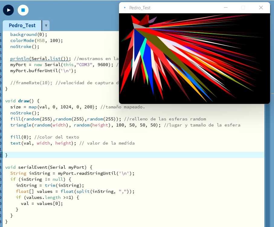
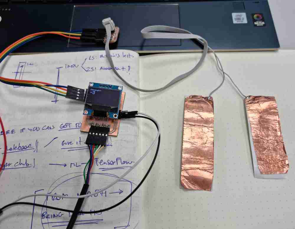
I got this first spiral working without issues, In my experience this usually happens when you invest time in exploring, understanding and learning before going hands on. Now, i´ll go for a second spiral with the aim of transfering data of my step response via bluetooth connection, using the HC-06 bluetooth module as in the last assignment.
 VCC via serial UPDI.
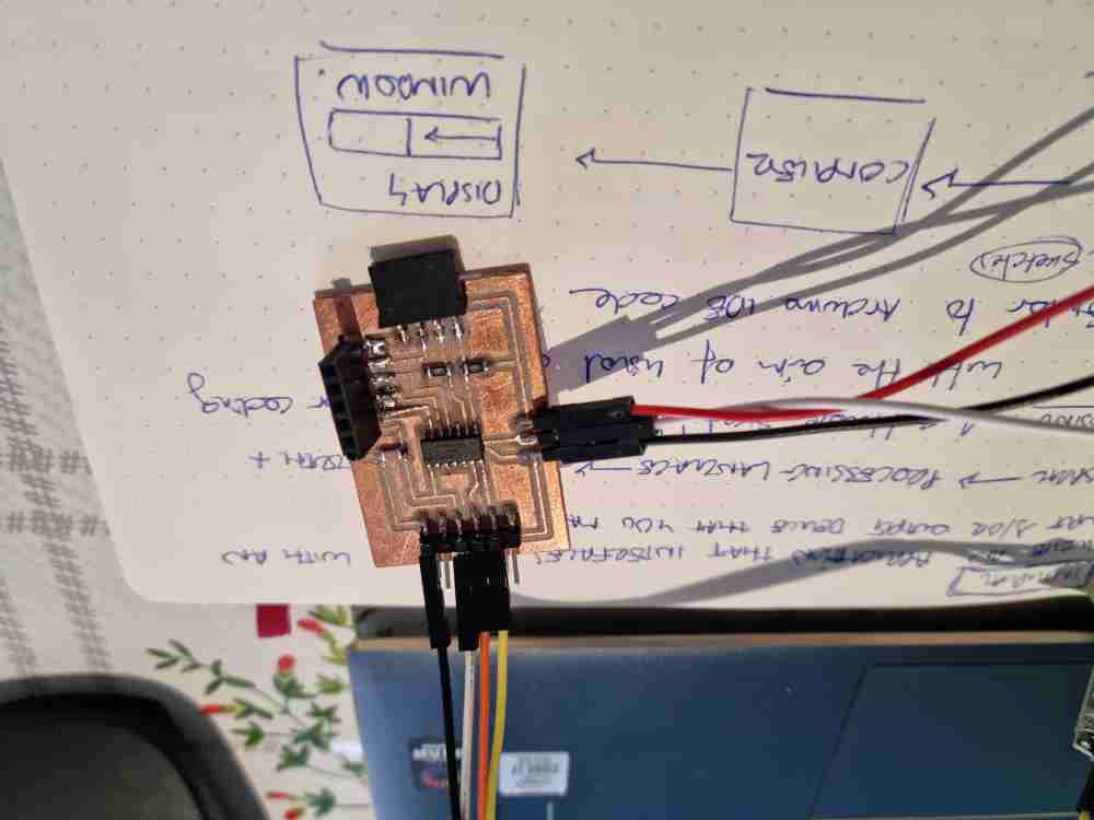 Connecting ATtiny1614 to HC-06.
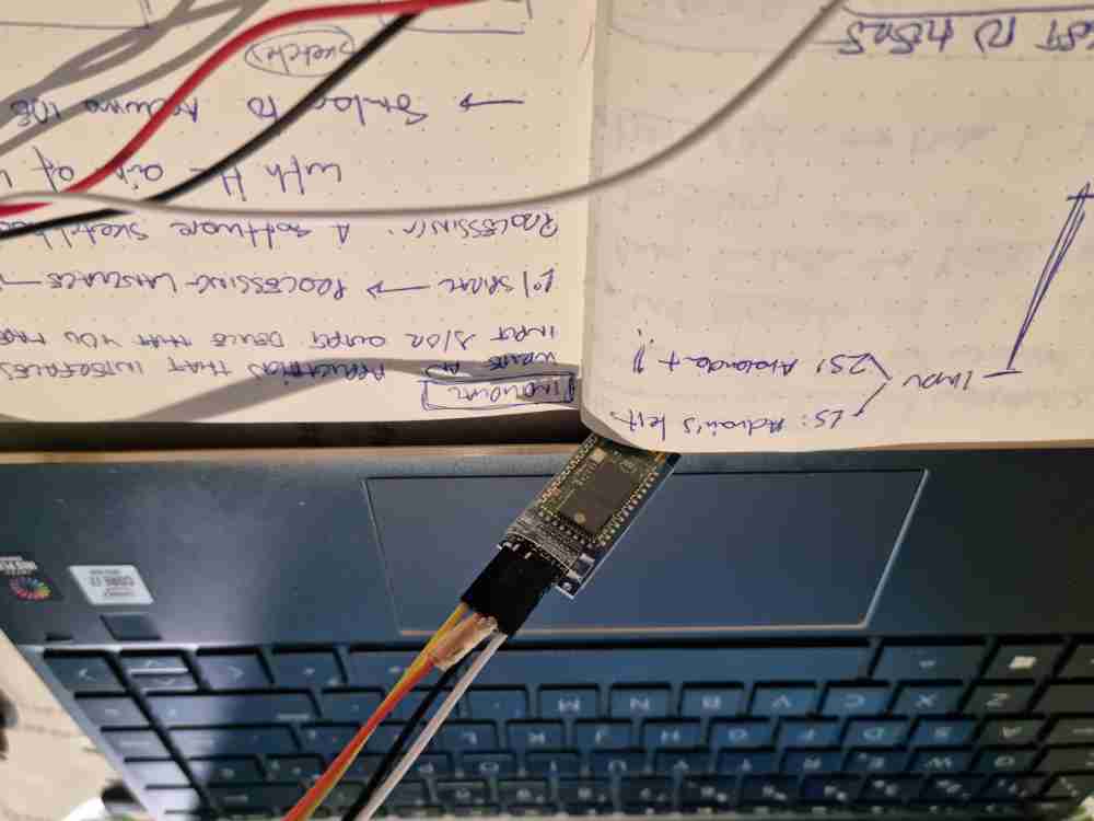 HC-06.
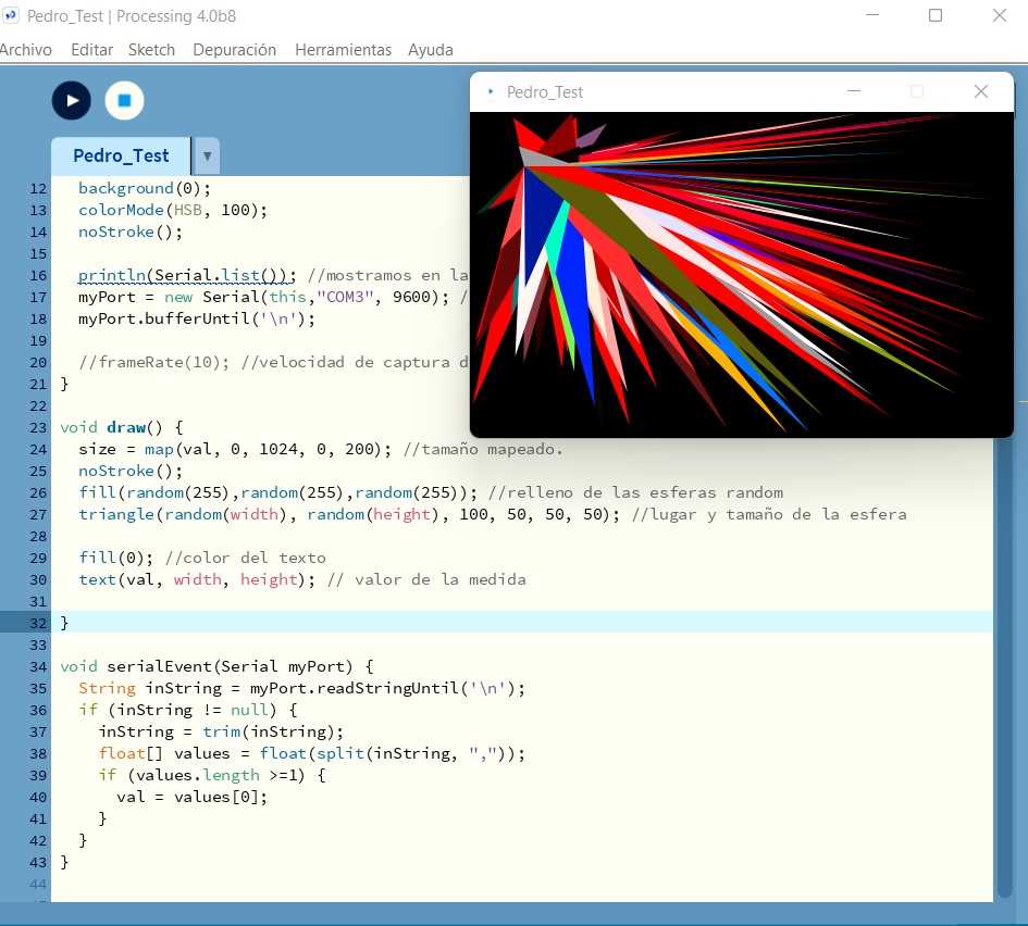
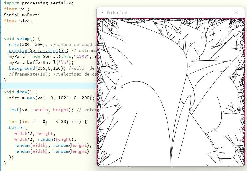
So, I tested two different Processing sketches, both similar regarding the input device (step response + bluetooth), but changed the visualization of the data. On the first, its random triangles which´s size and colour change depending on the value collected in the serial input, and the second one, those values are transformed into lines. I used one of Adrián´s Processing sketches to prepare the random viewing setup, and changed the visualization specifications as you can see below:
//Adapted from Adrián Torres
//Pedro Chana Fab Academy 2022.
import processing.serial.*;
float val;
Serial myPort;
float size;
void setup() {
  size(500, 500); //tamaño de cuadro
  println(Serial.list()); //mostramos en la pantalla los valores del serial
  myPort = new Serial(this,"COM3", 9600); //puerto serial
  myPort.bufferUntil('\n');
  background(255,0,120); //color de fondo
  //frameRate(10); //velocidad de captura de datos 10 frame por segundo}
void draw() {
  size = map(val, 0, 1024, 0, 200); //tamaño mapeado.
  noStroke();
  fill(random(255),random(255),random(255)); //relleno de los triangulos random
  triangle(random(width), random(height), 100, 50, 50, 50); //lugar y tamaño del triangulo
  fill(0); //color del texto
  text(val, width, height); // valor de la medida}
void serialEvent(Serial myPort) {
  String inString = myPort.readStringUntil('\n');
  if (inString != null) {
    inString = trim(inString);
    float[] values = float(split(inString, ","));
    if (values.length >=1) {
      val = values[0];
    }
  }
}
Here below you can see the videos of the data visualization of each sketch.
Download triangle test .pde: Random triangle example .pde
Download strenght visualization .pde:: Sensor value visualization .pde
GROUP ASSIGNMENT
As in the group assignment we have to test as many tools as possible, I started this part of the assignment testing out the MIT app inventor.
MIT APP INVENTOR:
MIT App Inventor is a cloud-based tool that lets you create app for mobile phones or tablets from a web browser. After reviewing the getting started documentation, you can see that it´s a very simple app with two major modules. A designer module and a blocks editor module that´s very similar to Arduinoblocks concept that we tested earlier in the embedded programming week.
To test it out, I wanted to create an app to read the strenght vales from my step response input module transmited via bluetooth, so I reviewed some easy video-tutorials: data recieve form HC-06, and recieving sensor data using bluetooth.. Regarding the bluetooth configuration, I followed the same process and the one used in the network and communications week.
Even do you can "communicate" in various ways to create your app regarding to the device were you´re going to visualize the data (mobile app, chromebook, emulator and USB cable), I opted to do it via Android phone, where you only need to connect you mobile phone and your computer to the same WIFI signal. To be able to do it, we need to download and install MIT App Invention companion app v2. So, here are the steps I made:
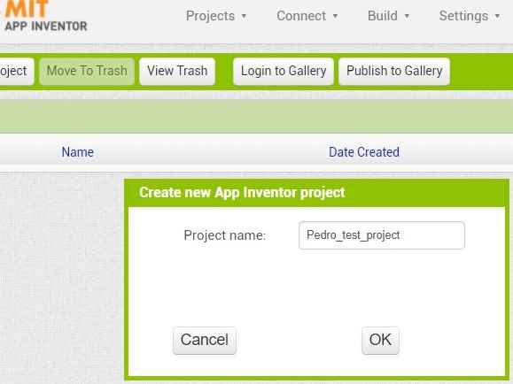
| Start a new project, and name it! |
| In the DESIGNER module: From the Palette, add as many components as needed. In my case, i´m going to keep it simple and will add a label for displaying the "strenght" values, and listpicker, from where we can display all the bluetooth modules availabe, and will select our HC-06 module. Finally, we will add the clock to set time intervals later, and the bluetooth server component. |
| Edit components properties: Once we´ve got all our components, we edit the text size of our label and listpicker by changing the font size and the text of each component. |
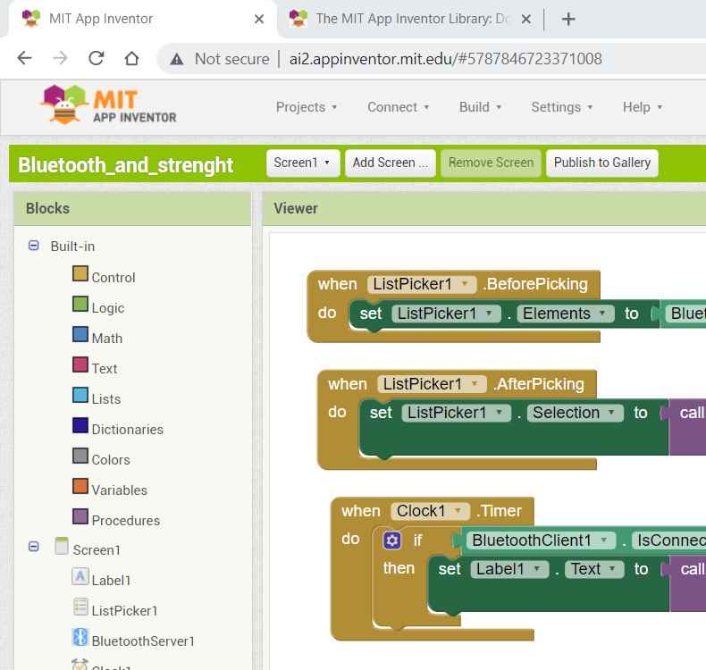
| once we check in the viewer that all the components are listed as wished, we switch to the BLOCKS module. |
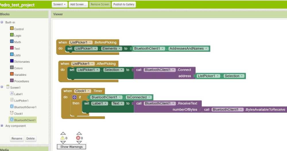
| In the BLOK module: We create three different CONTROl Blocks. The FIRST blocks "lists" all the bluetooth devices available, selecting later our HC-06. The SECOND module lets you connect to the desired bluetooth terminal, and the THIRD module recieves the data available. |
| Once the DESIGNER and the BLOCKS module are defined: we need to "connect" the program to our mobile phone. |
| Open Connect -> AI Companion: Open the app in your mobile phone and connect via QR or via code. Press BT module and select the HC-06 bluetooth device. If the device is reading data it will show it on the mobiles screen, if not, it will display "Waiting for values". |
Here you can check how it went with the DESIGNER module:
 creating a new project.
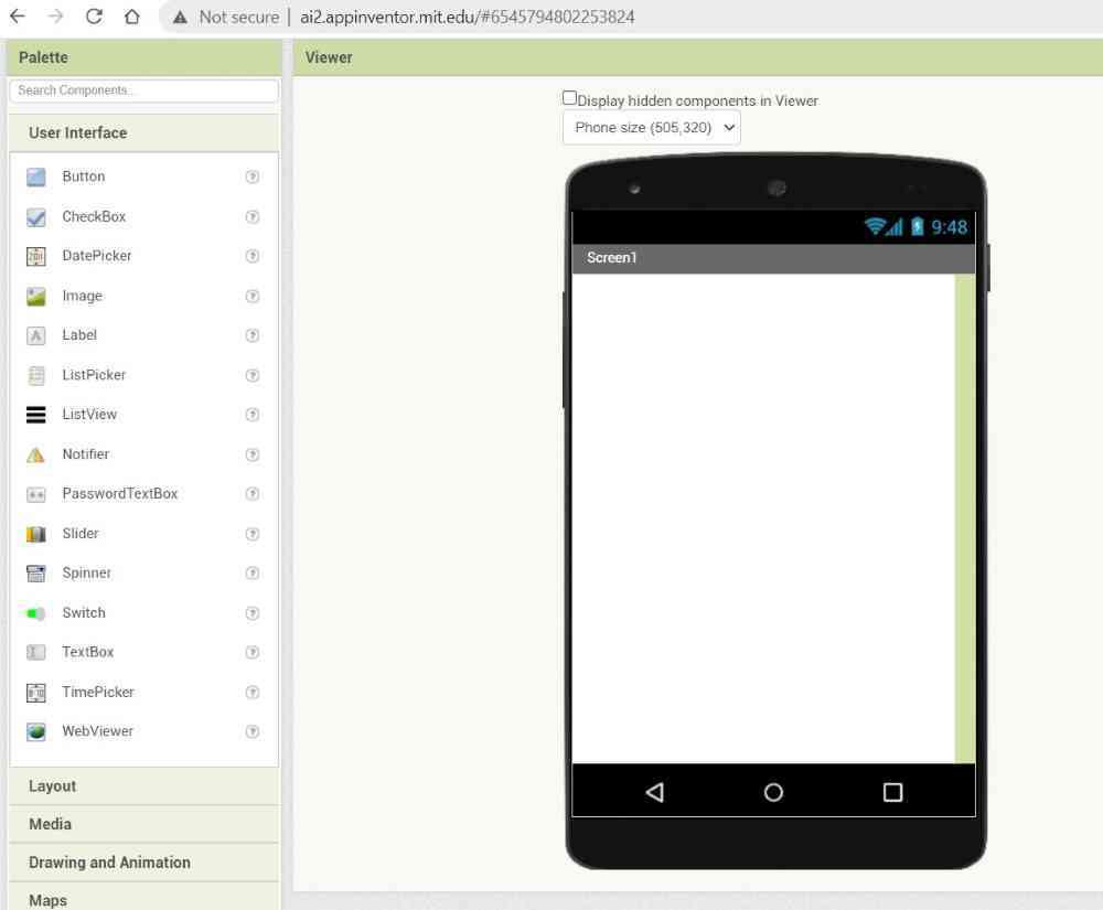 In design module.
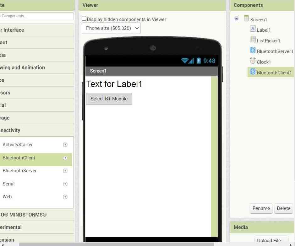 Adding components.
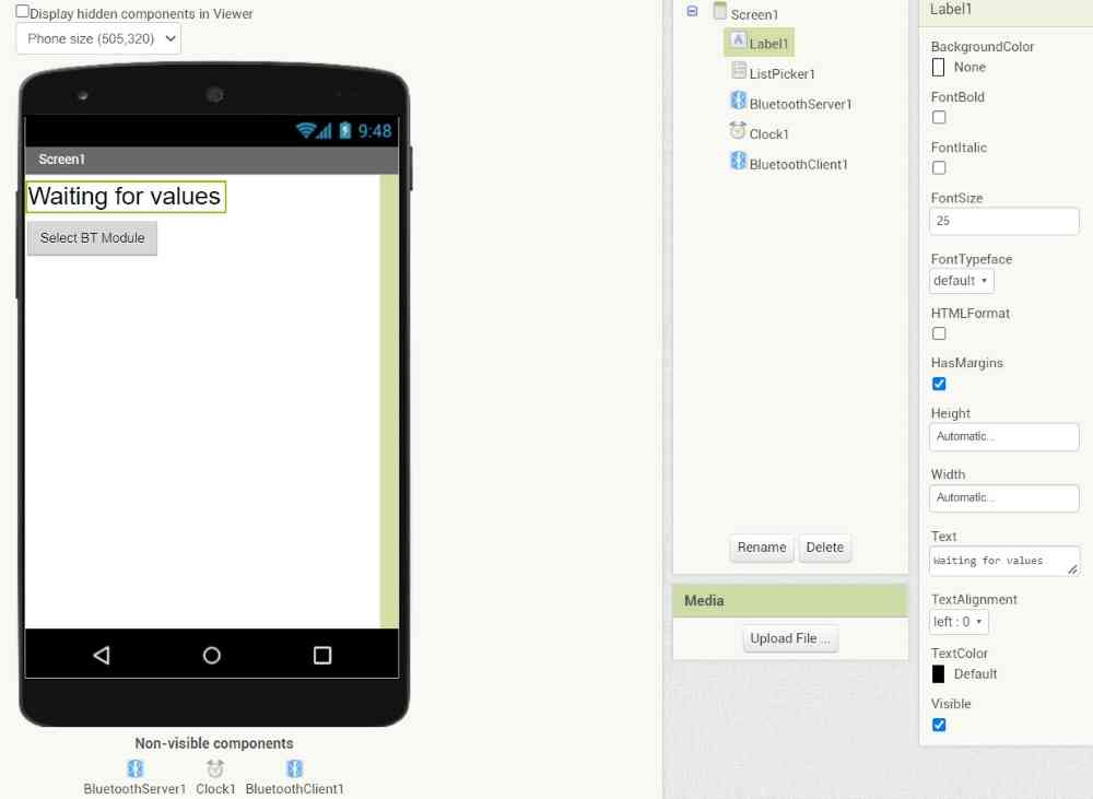 Editing components.
And here´s the BLOCK coding:
 Block code.
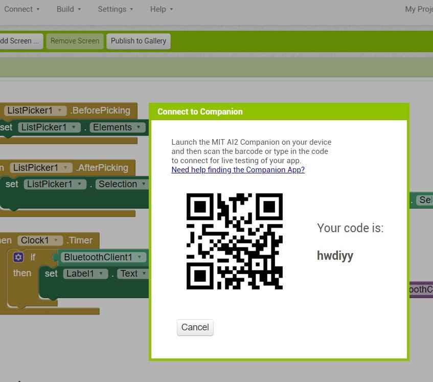 QR from computer.
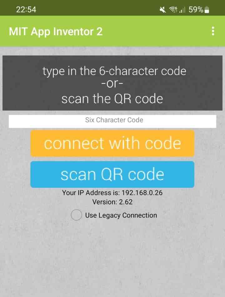 QR from mobile.
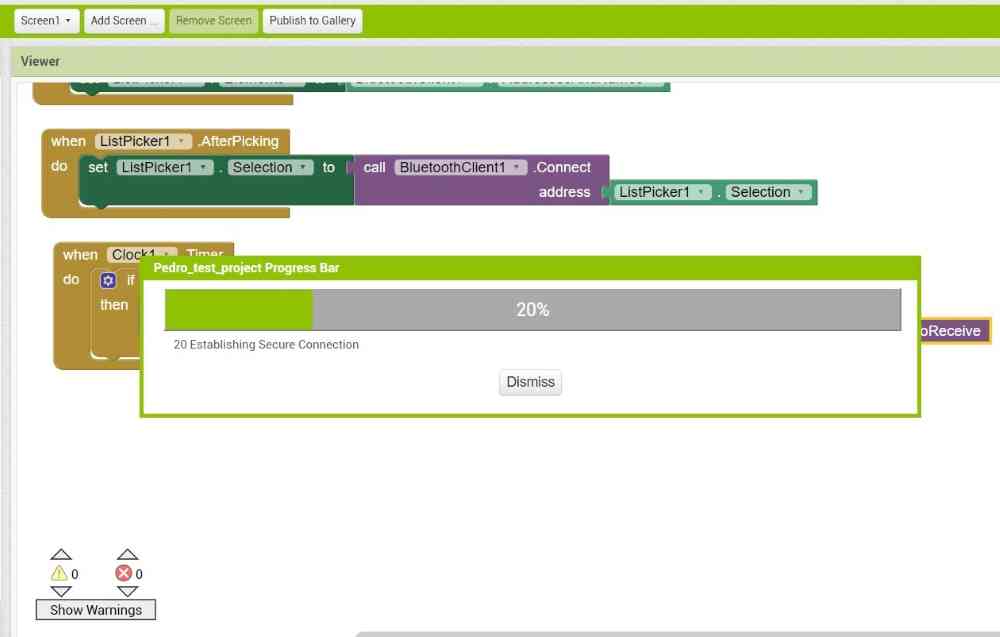 Uploading program to mobile device.
Here´s a video of how it looks when opening from the mobile phone:
For the first experience with MIT App Inventor, it looks like an easy tool to design custom made apps. I tested a very simple app, but with more time you can design more visual friendly and useful apps, and probably I will design a "better" app to read the strenght values of my hand grip strenght measure device.
MATH and MACHINE LEARNING with Phyton 3 (jupyter)
As my intention with the final project is to make an objetive measure of the grip force value in non-clinical environments, I´m interested in analyzing the collected data with maths functions and machine learning with the aim of identifying clusters of variables capables of predicting good, and bad functional prognosis.
A couple of years ago I did some practice with Phyton with anaconda and using jupyter´s notebook interface , so I´m really interested in trying to apply it!
The advantages, from my little experience, of using jupyter is that it´s very similar to html and it´s easy to use powerful data visualization libraries such as seaborn, and matplotlib for example, and scientific libraries such as NumPy. And the best part is that once you get the basics, it´s quite easy to make it work.
So, to get started, the first thing we need to do is to download and install the above mentioned software:
| Download and install anaconda and jupyter. |
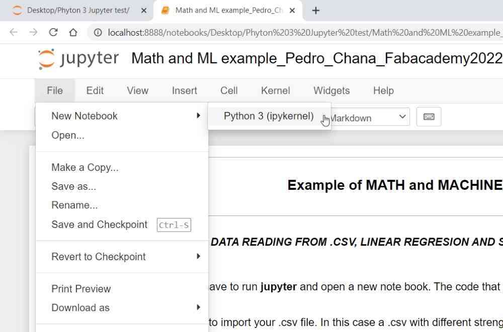
| Launch jupyter (anaconda3): And open a new Phyton 3 (ipykernel) file. |
| You´ll see a first cell, and you can edit it as Code, Markdown, and Heading depending on your needs. |
| As the first part of the code, you have to bring the pandas data analysis library into our environment. |
| Next, we have to open the desired .csv file. |
| And after, depending on what you want to calculate or visualize we´ll call different libraries and code. |
| You can check some examples below. |
Here you can see how I did:
 Block code.
 QR from computer.
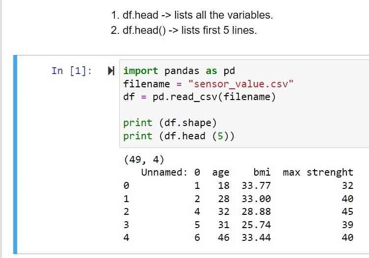 QR from mobile.
Now that we´ve got our Phyton environment prepared via Jupyter. It´s time to tests with different maths and libraries. So here below you can see a little test I made with an .csv file I created with age, BMI, and grip strenght values. The examples are dividied by:
- Data reading.
- Data visualization.
- Maths and machine learning.
DATA READING
For this first part, below you can see the code to obtain from the .csv a list of the variables, their correlation, a separation of the variables into train and test using the train_test_split method, and finally the train and test linear regresion results:
 variables listed.
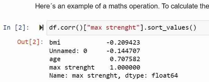 Correlations.
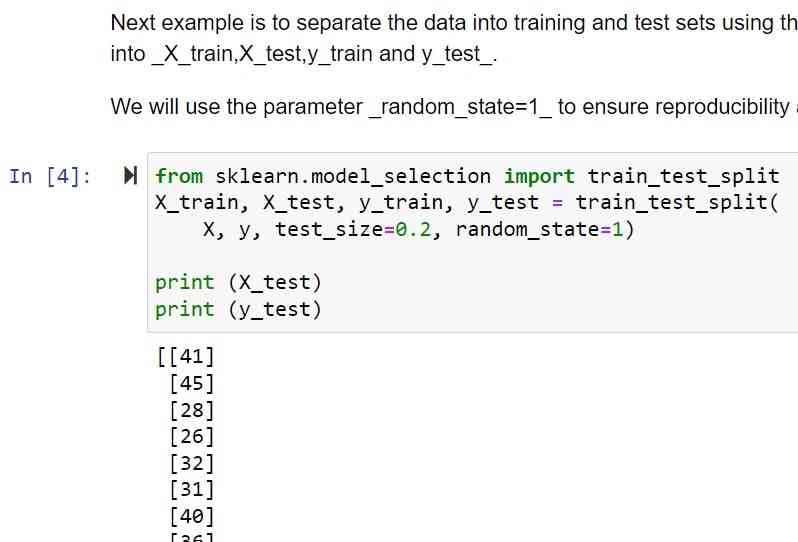 Train and test split.
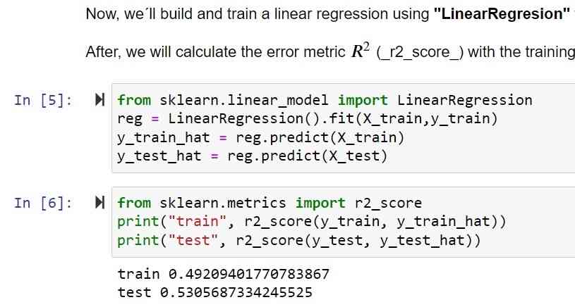 Linear regresion results.
DATA VISUALIZATION
Now, you can see some examples of the data visualization libraries, such as seaborn for the previous correlation value with heatmap, and plotting examples for the .csv variables. I also tested polynomial features but as it has active value displaying, you can´t see it in the images but you can try it yourselves!
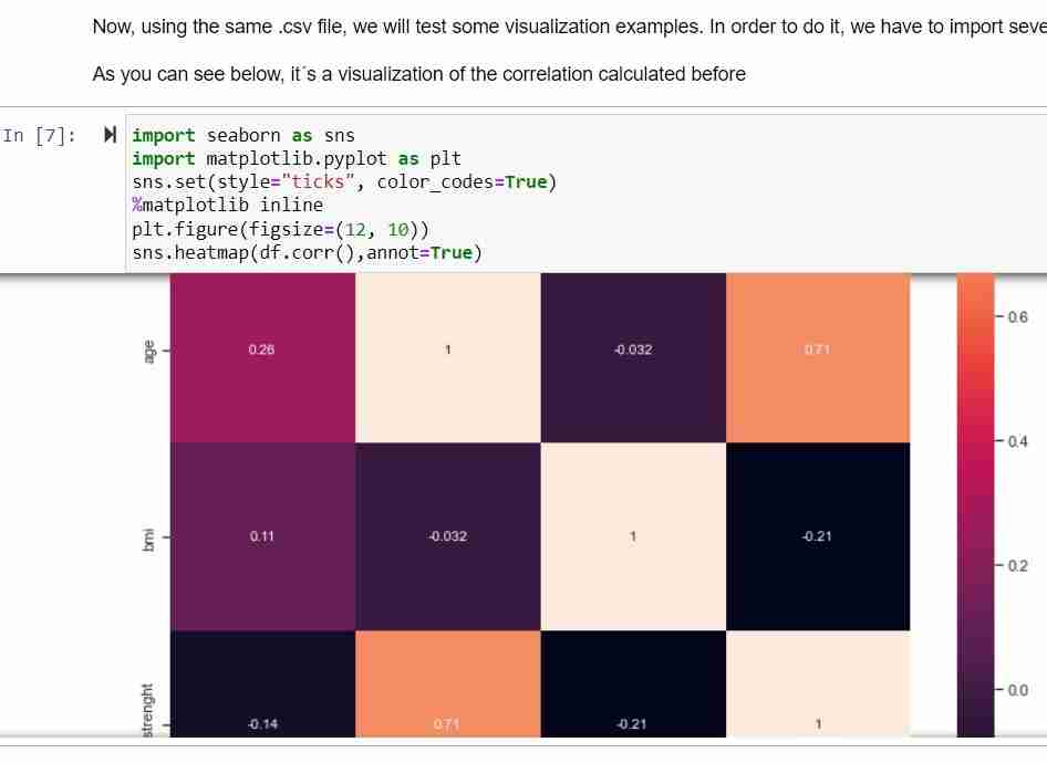 heatmap.
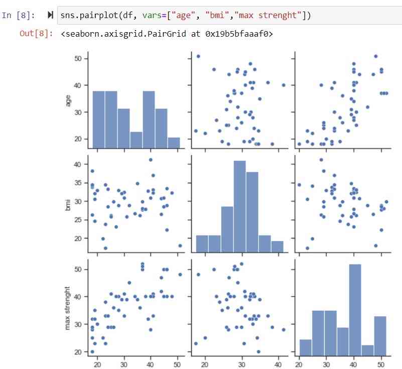 plotting examples.
MATHS AND MACHINE LEARNING
Finally, I tested out Machine learning using splits to test if the model can predict correctly the data. So. you can check the video below with the video of the previous polynomial features:
Download .py file: Maths and ML example .py
Download .csv file: Sensor value .csv example
Download jupyter notebook file .ipynb: Jupyter notebook file .ipynb
For final impressions, i´m very happy with the results. I´ve applied knowledge I learnt some time ago, but now í´ve given it a utility, so excited to join both "worlds", as scientific data analysis and obtaining objetive values through digital fabrication are the goals for my final project!
Back to top