## Instructors, Bootcamp and Expectations The first week emphasized how much FabAcademy can challenge your mental, physical, and social health. It surfaced important overlooked factors in our daily life. We explored the efforts put into the **open source** way of thinking—how literally you can build anything, given the right mentality, resilience, and budget.

## Project Management First eye opener: **Time Management**. The "hack" lies in the subcontext of **Supply Side Time Management** (Available Time determines Tasks). Neil shared insights on **Rapid Prototyping** best practices: 1. **Parallel Development:** Aligning tasks and time slots to work simultaneously. 2. **Spiral Development:** Each progress adds to a spiral, honing iteration capabilities while mitigating risk.
Supply Side Tip

Organizing my schedule on Google Calendar was the first step to allocate time for tasks practically.


## Building this Website Merging HTML and Markdown into a single site to keep it aesthetic yet practical. In my first trial I approached the website design differently which can be found here later in March I decided to do a full revamp , the old documentation for week one can be found here [Link](week01.html) I researched documentation websites and came to like [https://quickdir-nextjs.vercel.app/](https://quickdir-nextjs.vercel.app/). Following the same approach of code inspection and taking elements, also using this gemini to help my draw up the code [Chat link here](https://gemini.google.com/share/2f4f2c12bcf6) I came up with the following structure. # CSS Class Reference Summary A breakdown of the styling classes used in the project, categorized by their function. --- ## 1. Navigation & Headers | Class | Simple Description | | :--- | :--- | | `.navbar` | The main container for the top menu; keeps it fixed at the top. | | `.navbar-inner` | Centers the logo and links within the navbar with consistent spacing. | | `.nav-container` | A wrapper that keeps navigation links from shrinking in size. | | `.side-nav` | A vertical menu that stays in place on the side as you scroll. | | `.sidebar` | A side panel used for secondary links or documentation sub-menus. | | `.sidebar-block` | A container for grouping specific sets of links within the sidebar. | --- ## 2. Layout & Structure | Class | Simple Description | | :--- | :--- | | `.layout` | The master container that uses Flexbox to hold the sidebar and main content side-by-side. | | `.content` | The primary area for the page's main text and articles. | | `.container-wrap` | Limits the width of the content and centers it on the screen. | | `.container-wrap2` | A centered container that forces elements to stack vertically. | | `.main-content` | The main text area specifically paired with the `side-nav` layout. | | `.doc-header` | A styled header section specifically for documentation pages. | | `.row` | A horizontal container used to hold and align columns. | | `.col-md-4` | A column that occupies 1/3 of the row width on desktop screens. | --- ## 3. Hero & Sliders | Class | Simple Description | | :--- | :--- | | `.flexslider` | The base frame and container for a slideshow. | | `.hero-slider` | A high-profile, large slideshow found at the top of a page. | | `.slide` | An individual image or "page" within a slideshow. | | `.active` | A trigger class that makes a specific slide visible. | | `.slide-content` | The text and buttons that appear on top of a slide image. | --- ## 4. Work & Gallery | Class | Simple Description | | :--- | :--- | | `.work` | A project tile that displays a background image. | | `.desc` | The text overlay on a work tile that appears when hovered. | # JavaScript Logic Reference Summary A breakdown of the functions and interactive features used in the project. --- ## 1. Theme Toggle (Dark/Light Mode) | Logic | Simple Description | | :--- | :--- | | `updateThemeUI` | Changes the background colors and switches the icon between a Sun (Light) and Moon (Dark). | | `localStorage` | Remembers your chosen theme (Light or Dark) even after you refresh or close the browser. | | `toggleBtn.addEventListener` | Listens for a click on the theme button to flip-flop between modes instantly. | --- ## 2. Tab Navigation | Logic | Simple Description | | :--- | :--- | | `tabBtns / tabContents` | Finds all the buttons and the sections they belong to. | | `openTab(tabId)` | Hides all content sections and only shows the one that matches the clicked button. | | `window.scrollTo` | Smoothly scrolls the user back to the top of the page when they switch tabs. | --- ## 3. Search & Filtering | Logic | Simple Description | | :--- | :--- | | `searchInput` | Listens for every letter you type in the search bar. | | `assignmentCards` | Looks through all project tiles on the homepage. | | `query filtering` | Compares your search text to the card titles. If it matches, it stays; if not, it disappears. | --- ## 4. Lightbox (Image Zoom) | Logic | Simple Description | | :--- | :--- | | `initLightbox` | Scans the page for images and adds a "zoom-in" cursor to let users know they are clickable. | | `openLightbox` | Dims the background and pops the clicked image up in a large view. | | `Maps(dir)` | Allows the user to go to the next or previous image without closing the popup. | | `keydown` listener | Lets users use the Keyboard (Arrows to browse, Escape to close) for a better experience. | --- ## 5. Mobile Menu | Logic | Simple Description | | :--- | :--- | | `mobileMenuBtn` | The "hamburger" button that appears on small screens. | | `classList.toggle` | Slides the menu in or out and changes the menu icon to an "X" when open. | | `auto-close` | Automatically hides the menu once a link is clicked, ensuring it doesn't block the screen. | --- ## 6. Utilities & Effects | Logic | Simple Description | | :--- | :--- | | `IntersectionObserver` | Watches as you scroll and makes elements "fade in" (lazy load) as they enter the screen. | | `backToTop` | A button that only appears after you scroll down 500 pixels; clicks jump you back to the start. | | `copyCode` | A one-click feature that copies snippets to your clipboard and shows a "✓ Copied!" success message. |
My Documentation Workflow
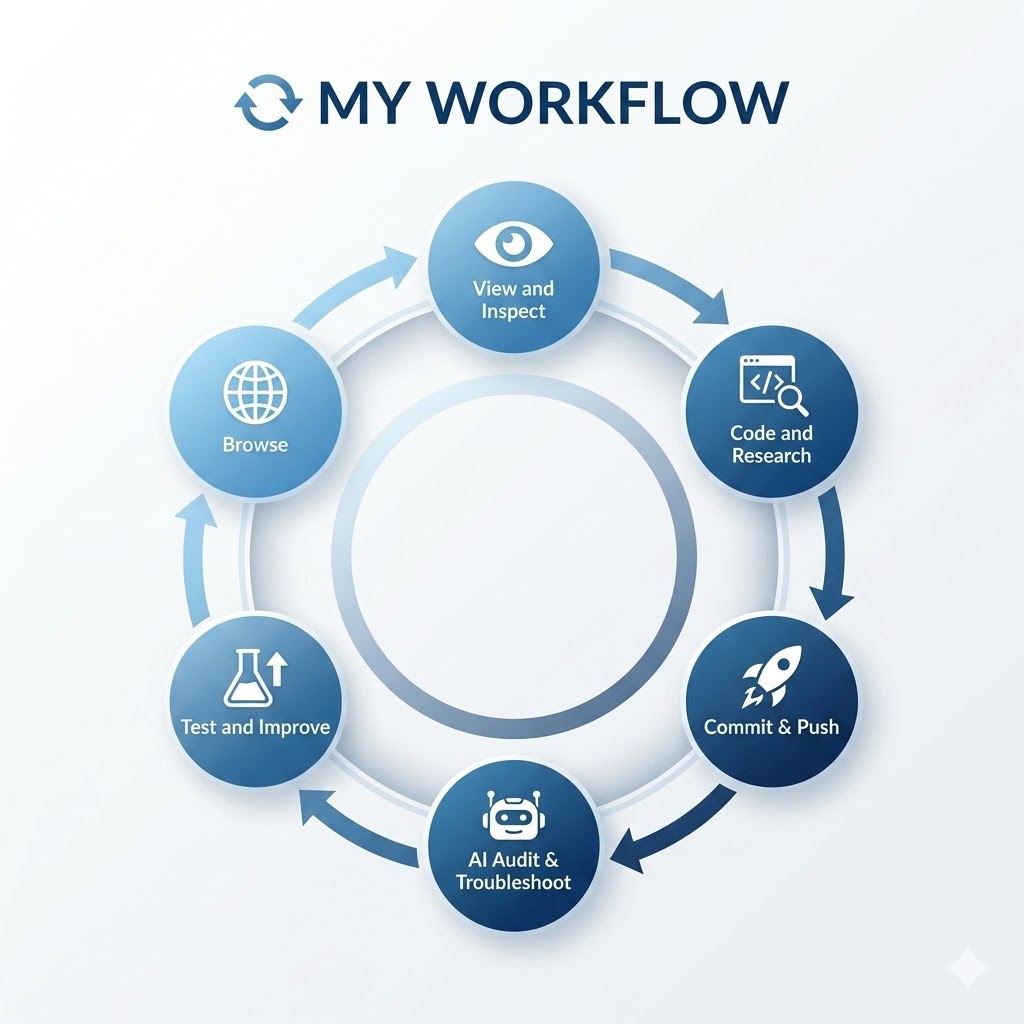
Workflow generated via Google Gemini.

## Tools and Resources - [x] **VS Code:** Personal favorite text editor. - [x] **md-block:** Essential for rendering Markdown in this template. - [x] **GitBash:** The terminal for GitLab communication. - [x] **Chrome Inspect:** Used to deconstruct CSS from inspiration sites.
MD-Blocks Script plugin

It is possible to merge HTML with MD code.

MD-Blocks Code Render

This script can be imported into the header section and it serves to render md-block sections defined in the code using md-block tags at the beginning and end of a section

Master Template Page

I created a master template file containing all the visual and style elements to keep it as a reference to extract from it any code in my future weekly assignments

Master Template


## Setting up the Repository 1. Generated SSH Key: `ssh-keygen -t rsa -C "email" -b 4096` 2. Added Public Key to GitLab Preferences. 3. Configured Global User: `git config --global user.name "name"` 4. Cloned Repository: `git clone [SSH URL]`
SSH Key Generation
GitLab SSH Interface
SSH Keygen git-clone commands in terminal,
Finding the SSH key
SSH public key confirmation
Local FabAcademy repostiry created on Desktop
Visual Studio Interface after successfull clone
First push using git-push command in terminal

## Git Workflow: Commit and Push Standard procedure for updating the documentation: 1. `git add .` (Stages changes) 2. `git commit -m "Description"` (Commits with message) 3. `git push` (Uploads to GitLab)

## Syntax Used ### HTML Components | Syntax | Use Case | |:---|:---| | `