Main Topics
Git, HTML, CSS and responsive web design.
Fab Academy 2026
Learning Git, building my first personal website and understanding the basics of HTML and CSS.
Git, HTML, CSS and responsive web design.
Git, GitLab, Visual Studio Code and web browsers.
Version control, website structure and CSS Grid layouts.
I didn’t know how to use Git before this course, thankfully our teacher here in the Fab Lab gave us a short tutorial to get started.
Copies a remote repository to your local machine.
Adds all modified files to the staging area.
Saves changes with a descriptive message.
Uploads local commits to the remote repository.
git clone <url>

git add .

git commit -m "message"

git push

git status

git pull

git reset --soft

git reset --hard
At the beginning, I didn’t know how to program in HTML or CSS, so I watched YouTube tutorials to learn the basics.
Special thanks to the YouTube channel "Hola Mundo". Throughout the Fab Academy, I will keep improving my page until it looks exactly the way I want.
My first version of the website was very simple, but it helped me understand the basics of HTML structure and CSS styling.
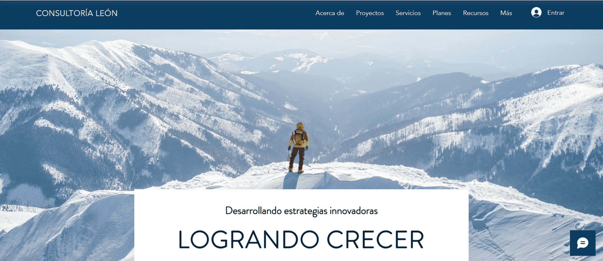
I started searching for inspiration for the design of my page, and on Wix.com I found a website with a large background image that I really liked.
Then I tried to recreate a similar design using one of my own photographs.
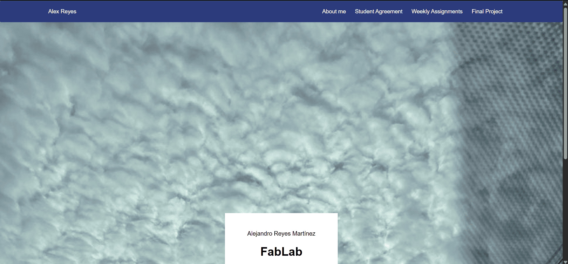
One of the first things I experimented with was creating a fullscreen background image with centered text.
.fondo{
  min-height: 100vh;
  background-image: url("images/nubes.jpeg");
  background-size: cover;
  background-position: center;
  background-repeat: no-repeat;
  background-attachment: fixed;

  display: flex;
  justify-content: center;
  align-items: flex-end;
  position: relative;
}

.texto_fondo{
  background: white;
  padding: 30px 60px;
  margin-bottom: 40px;
  text-align: center;
}
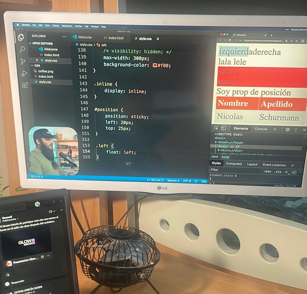
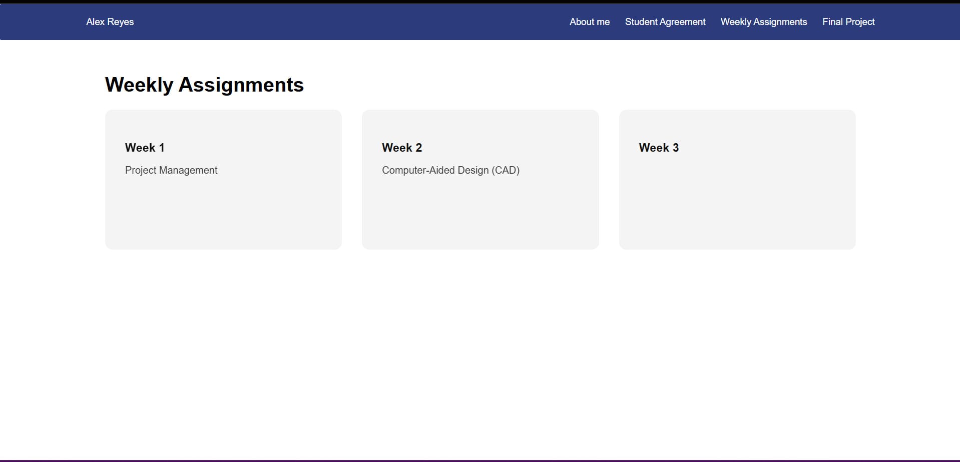
I wanted to create blocks that display the weekly assignments using a responsive grid layout.
CSS Grid helped me make the layout adapt automatically to different screen sizes.
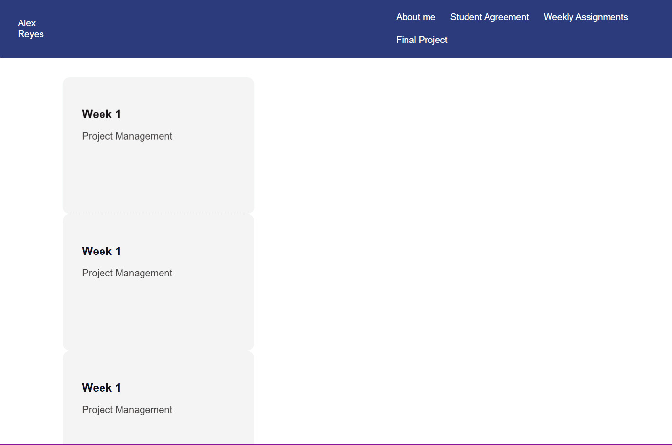
At first I had problems with the grid layout, but after researching and practicing, I was finally able to make it work.
.reja-semanas {
  display: grid;
  grid-template-columns: repeat(auto-fit, minmax(250px, 1fr));
  gap: 32px;
}

.bloque-semana {
  padding: 32px;
  background-color: #f4f4f4;
  border-radius: 12px;
  text-decoration: none;
  color: #111;
  min-height: 160px;

  transition:
    transform 0.3s ease,
    box-shadow 0.3s ease,
    background-color 0.3s ease;
}

.bloque-semana h3 {
  margin-bottom: 8px;
}

.bloque-semana p {
  opacity: 0.8;
}

.bloque-semana:hover {
  background-color: #ffffff;
  box-shadow: 0 12px 30px black;
  transform: translateY(-6px);
}
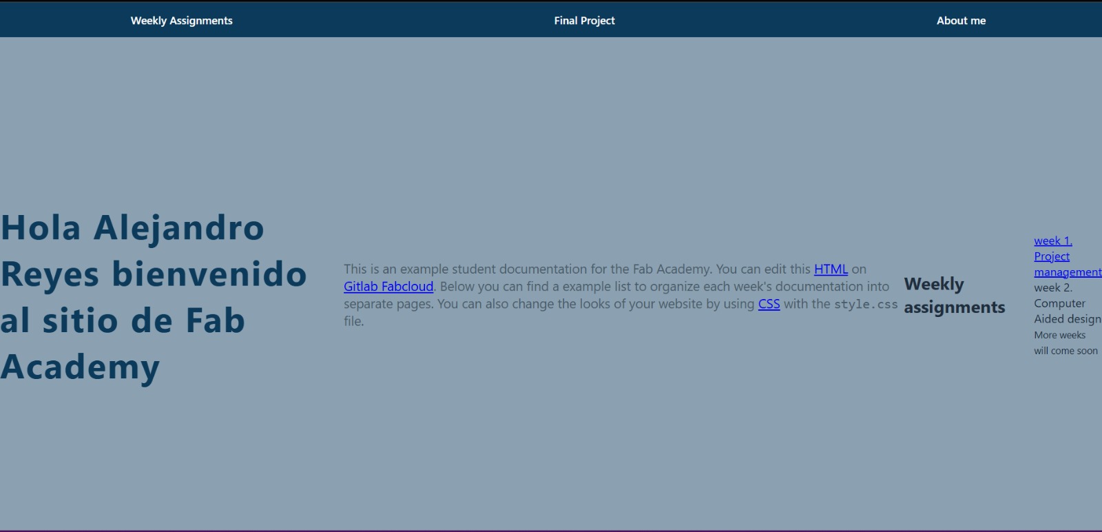
Here is the final result of my weekly assignments grid.
This week helped me understand the foundations of web development and responsive layouts.
I learned the basic Git commands needed to manage and upload my documentation.
I started experimenting with layouts, backgrounds and animations to improve my website design.