01 Project Management
This week's assignment includes working through a git tutorial, build a personal website describing me and my final project and upload both to the class archive.
My first steps with git on MAC
Through the Fabacademy every student received their own repository on Gitlab with an HTML template documentation website. Mine can be found here. Thus the first steps were to familiarize with the terminal, install git to my laptop and clone the repository to start editing.
I had used git and github before on Windows and quickly understood that MAC OS does things differently.
1. Get git running on MAC OS
My laptop, a MacBook Pro (2023) did not have git installed yet. I used --git version in the terminal resulting in an error git not found and
therefore started with the tutorial
of our local node.
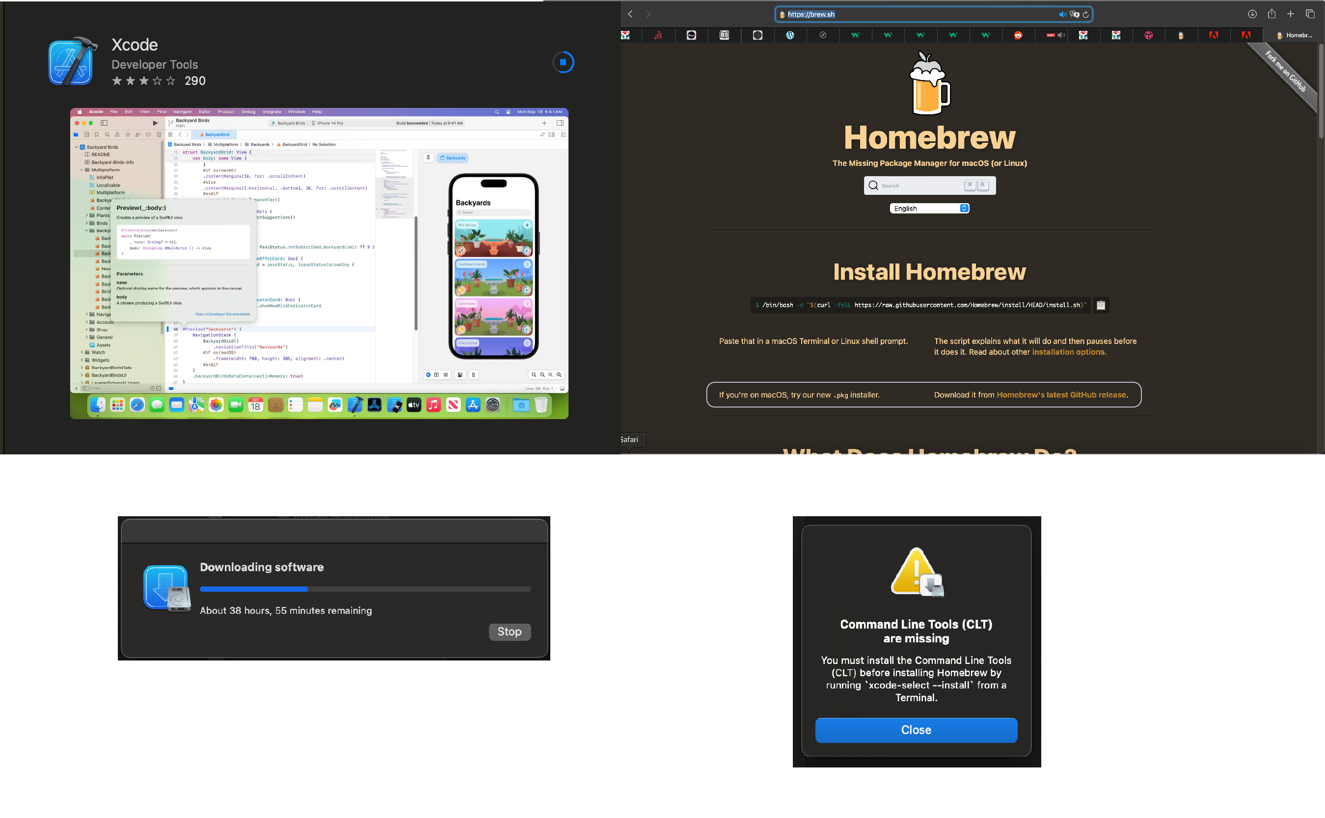
The first step was to download X-Code for developers from the App Store in order to replace it with Homebrew as a package manager to install git. Giving me an inital download time of 38 hours I was a little frustrated, but after two hours it was done. Secondly I downloaded the new .pkg installer of homebrew, not yet being very familiar with the terminal. In order to complete homebrew's installation I added the missing command line tools by running
xcode-select --install in the terminal.

$ brew install git stated by git's download guide had zero effect.
Next I googled "how to install homwbrew on MAC" and checked redswitches' guide.
Running brew doctor on terminal gave me the info "brew not found".
2. Get git running on MAC OS 2.0
That was the moment I needed actual human expertise: Thanks
Since homebrew was not yet running I installed it through terminal this time using /bin/bash -c "$(curl -fsSL https://raw.githubusercontent.com/Homebrew/install/HEAD/install.sh)".
Once this was successful, which I checked with the command brew doctor, which returned "Your system is ready to brew",
using $ brew install git actually installed git.
The step that asked for the password was especially confusing, since one just types it into the terminal without any success message.
The next step was to log in to the gitlab account the Fabacademy had already created for us.
Let's note at this point, that github and gitlab are products of the same company and the accounts can be linked,
but my initial github account login links to another account. To link my gitlab account locally I added my username git config --global user.name "your_username"
and email address git config --global user.email "your_email@mail.com".

In order to clone my repository and start editing I had to create an SSH key first using the following command ssh-keygen -t rsa -C "your_email@mail.com"
, check the SSH key cat ~/.ssh/id_rsa.pub and copy pbcopy ~/.ssh/id_rsa.pub the key in order to enter it in my repository online.
The final step was to clone my repository locally using the following command git clone + repository link,
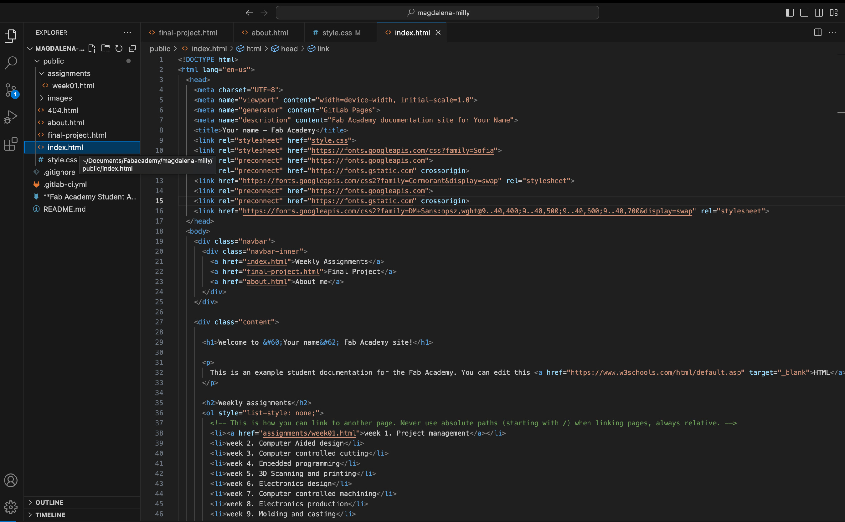
which created a folder on my laptop. Now I was ready to edit the code in Visual Studio Code.

3. Error ds.store in terminal
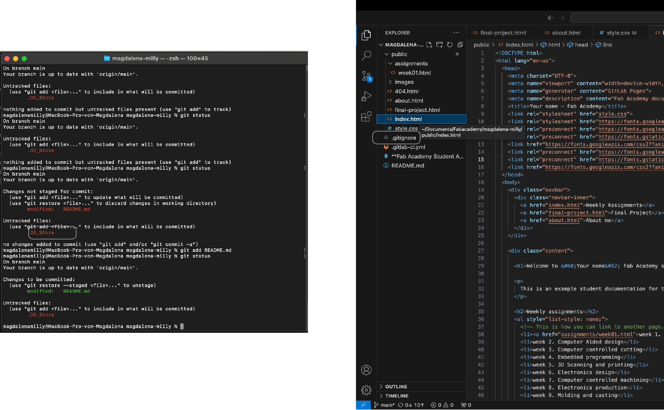
Once my repository was ready to be edited the terminal showed an error stating "ds.store". I followed stackoverflow's tutorial and created a .gitignore file in my repository to eliminate the error.

Lessons Learned
- terminal = code without interface, instead of interacting with the computer you tell it what to do
cd + directory path= opens your directory, in case the terminal has been closed- zhs = shell, in which your programmes operate and can be written
- human help is gold, when installing software
Building my personal website from scratch
The goal for this website was to create an easy tool to "document as you work" to keep track of my journey and make it easy for instructors to read. Being a UX designer by trade I knew I had to keep it very simple and not go crazy on my ideas, since this time I could not ship it to the development team.
1. Research

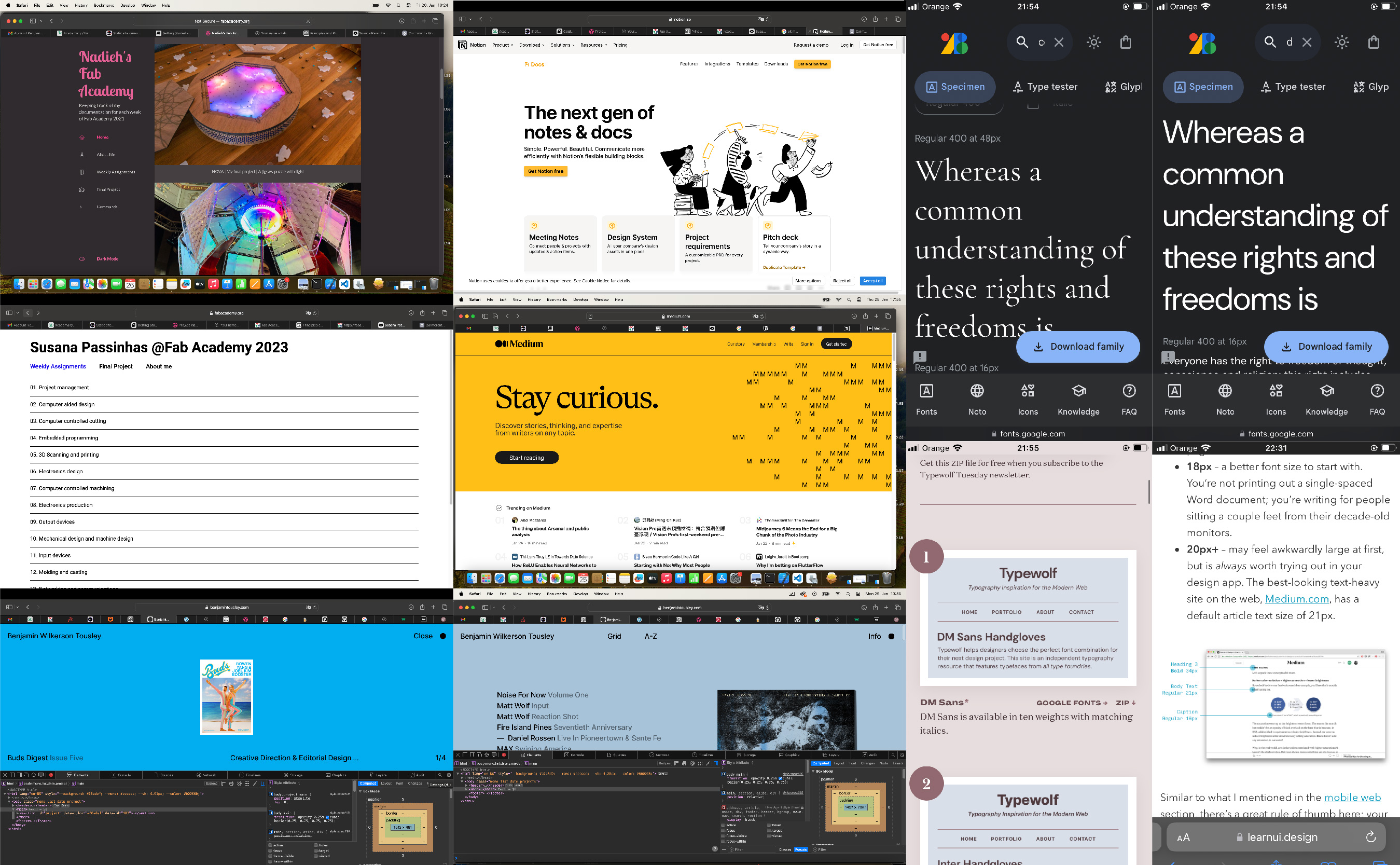
Initially I researched a bit on the Fabacademy page, how student's from the previous years had structured their website and which were the prerequisites of the assignment. Early on I was conviced to use a static site generator, because the commands seemed more natural to use, but eventually decided to work with HTML and practice it, since I knew it would benefit me in my job afterwards.
During research I prefer to understand which prerequisites I have: about page, final project, assignments, footer (navigation). Secondly i define what is the most important task for the users of the page: understand who's journey it is, as document and read the assignments (building blocks) and eventually the appearance of the page (look & feel).
Since the page was mostly about reading, I checked medium, an online magazine, that won tons of awards for usability and their page is very well structured. I analyzed their line height and font sizes using the inspect element and double-checked the recommended sizes for web on learn UI design.
For appearance I browsed typewolf for the best google fonts recommendations and visited a few websites that were given as an example there. Most of which had code way to complex for me to understand though. So eventually my goal was to modify the template and change very little of the structure to keep editing simple.
2. Workflow

In general I worked through the different sections by searching and reading about the topic "e.g. links in HTML" on w3schools copying the code to my repository or editing the existing template given to us by the Fabacademy.
3. Navigation

My basic navigation includes 3 main pages:
- Magdalena Milly, which gives a quick overview of who I am and why I am doing Fabacademy
- Assignments, which includes a list of the 20 assignments and links to the respective pages
- Final Project, which shows the development of my final project idea
4. Look & Feel

My first step was to integrate the two Google fonts I am using: Cormorant and DM Sans. Google actually provides the link to incorporate in the head of the HTML, just keep in mind to select all font weights, since they will be included in the link and copy the correct reference from Google for your CSS stylesheet.
The second step was to create or edit the CSS styles: body, H1-H4, code.
Especially important was to add a line height of 1.5 to the body text and to change the colors. To define the palette I used atmos.
But my only real pitfall was the link. Researching several sites I could not find out why the style did not trump the navigation class.
Eventually I ended up defining the link in both the .navbar class and the .content class as a workaround.
5. Building Blocks

I have tried to keep my content blocks as simple as possible, using very few elements:
- paragraphs: consisting of a headline and body text combination
- images: I created an Illustrator file from which I can easily arrange and export images
- indexlist: I created
.indexlistclass to specify the assignment list - list: I am just using the pre-defined unsorted list
ul - divider: again I am just using the pre-defined
hrcode - footer: adapting the template
footerstyle
Lessons Learned
My level of respect for my former colleagues rose a lot during this assignment. Some issues are still a mystery for me, but I ended up with a working tool, that I can easily document in. There are still a couple of open questions, which I want to explore in the future:
- Why didn't style trump class on the link?
- How can I adapt the margin properly for mobile devices?
- What is the best practice of font sizing: %, em, px?
Final Projekt sketch
Please find my final project ideas here.