Week 14: Interface and Application Programming
of graphical user interfaces and software applications for device and system interaction.
Before starting
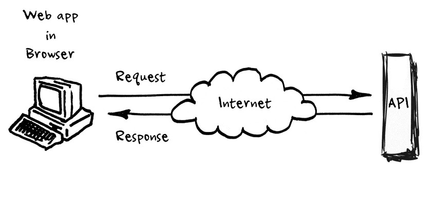
By providing intuitive interfaces and efficient communication mechanisms, it enables operators and engineers to interact with machines, sensors, and production processes in a reliable and user friendly manner, improving productivity, accuracy, and operational efficiency.
For further information about this topic, please consult this week’s group page.
Interface and Application Programming
UI
User Interfaces (UI) are the collection of visual and interactive elements that enable communication between a person and a computer system. Their main purpose is to allow users to interact with an application in an intuitive, efficient, and user-friendly manner. A user interface may include buttons, text boxes, menus, scroll bars, images, windows, icons, sliders, and other graphical components that allow users to enter information, display data, or perform actions within a software application.
Qt Designer
In this case, the Qt Designer application was used. Qt Designer is a visual development tool that is part of the Qt framework and allows users to create graphical user interfaces (GUIs) through a drag and drop environment without the need to manually write the interface code. It provides a wide variety of widgets, layouts, containers, and design tools that simplify the creation of professional desktop applications.
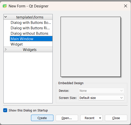
Creating a New Interface
When the application is opened, a start screen appears that allows the user to create a new interface file. Different templates are available, such as Main Window, Widget, Dialog without Buttons, Dialog with Buttons Bottom, and other predefined interface types. Each template is designed for a specific purpose and provides a suitable base structure depending on the application's requirements.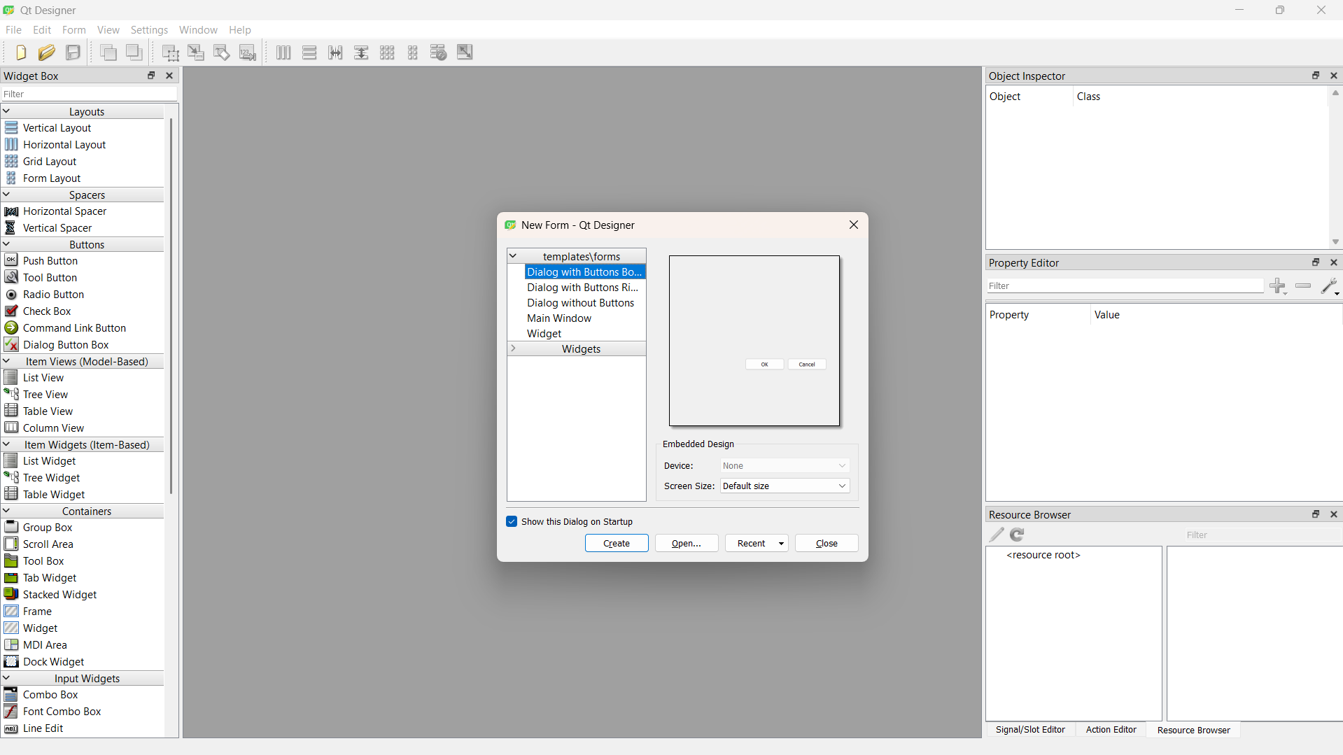
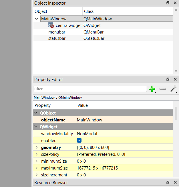
Qt Designer Workspace
After selecting the desired file type, the main design workspace is displayed. On the left side, there is a panel containing all the tools and components that can be added to the interface. These include layouts, containers, buttons, input widgets, display widgets, item widgets, spacers, and many other graphical elements.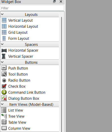
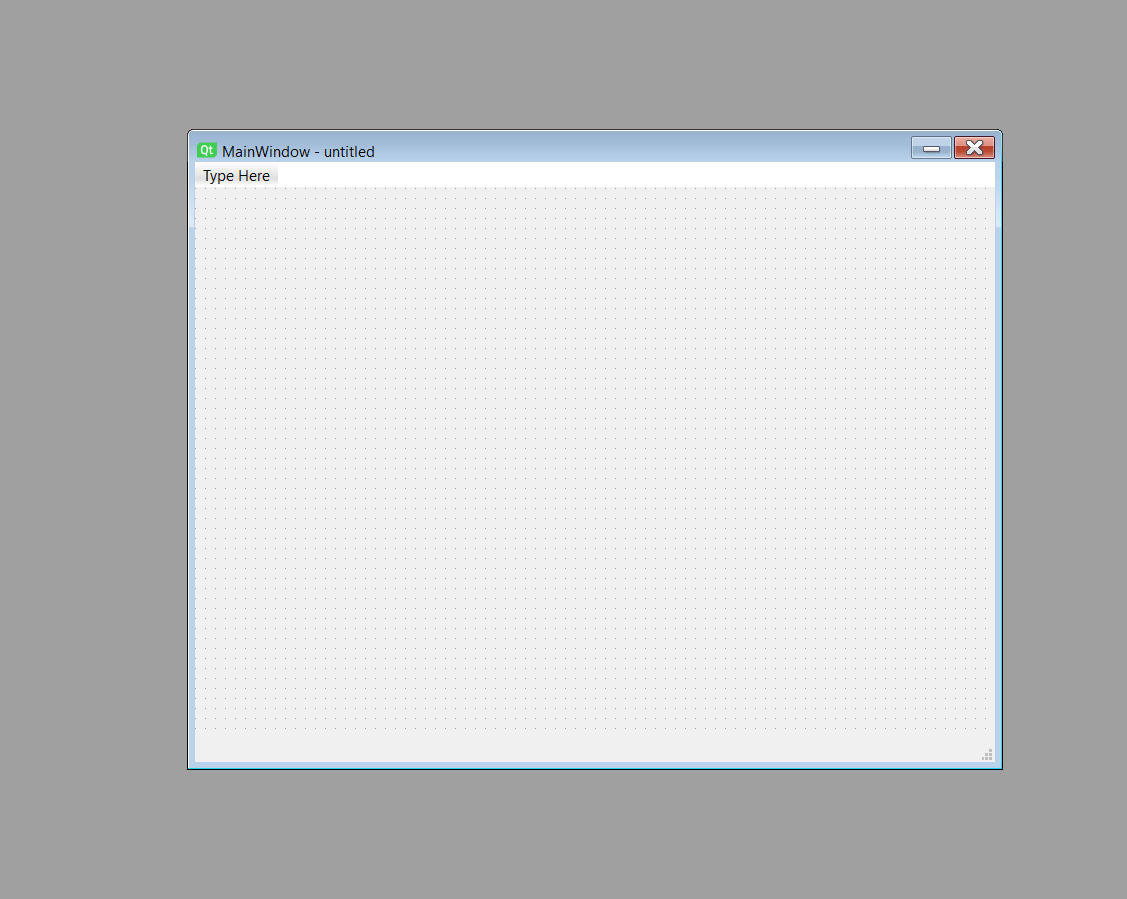
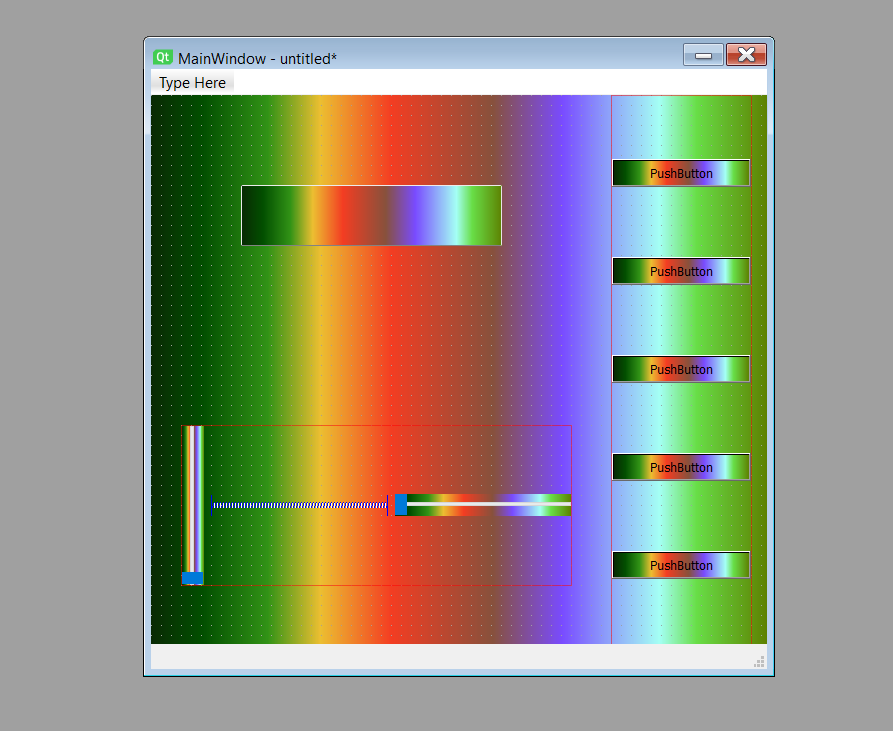
Interface Design
Using the widgets, layouts, and containers available in the left-side toolbox, the following interface was created as the basis for the project. These elements were arranged according to the application's requirements to provide an organized and user-friendly graphical environment.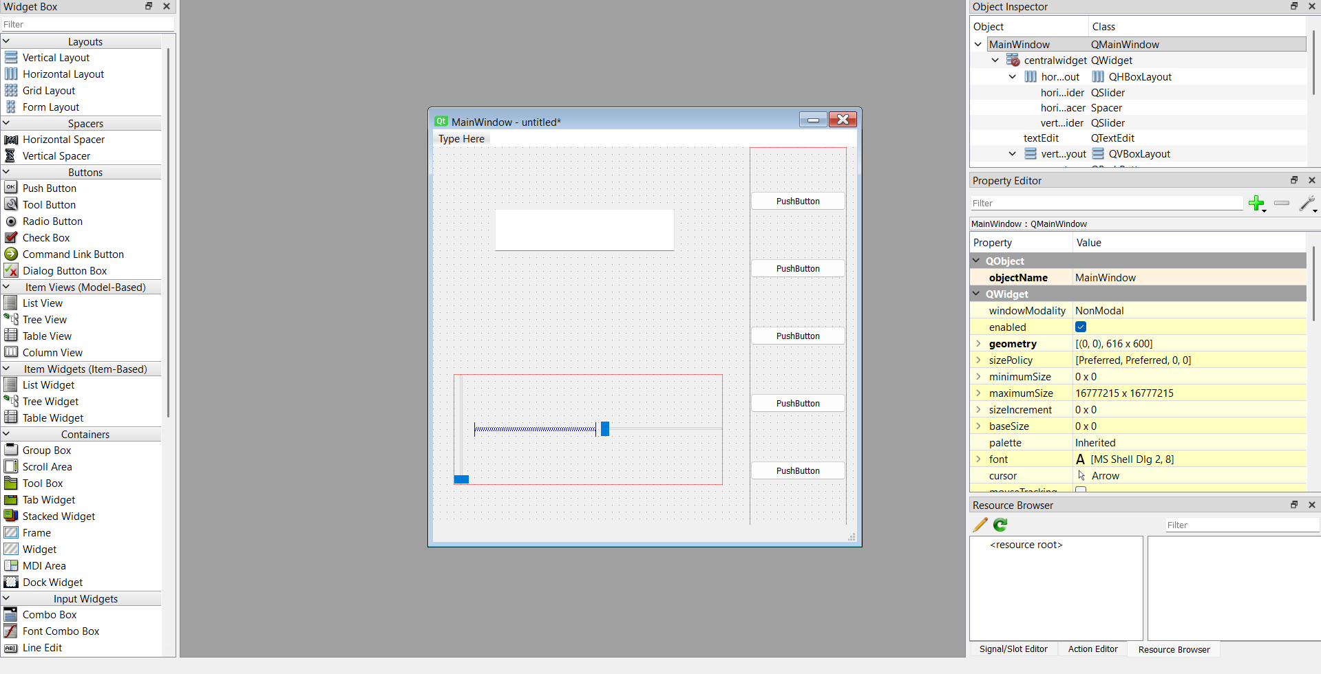
Stylesheets and Custom Appearance
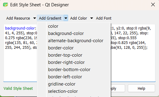
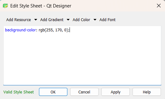
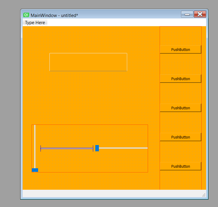
Focusing on the Object Inspector located on the right side of the workspace, if the user right clicks on MainWindow (the main container) and selects Change StyleSheet... , it is possible to access the Qt stylesheet editor. Qt stylesheets are based on CSS syntax and allow developers to customize the appearance of interface elements such as buttons, labels, text boxes, sliders, and windows.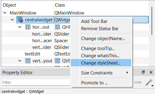
Example 1:
Saving and Editing the UI File
Once the UI has been created in Qt Designer, it can be saved as a .ui file, preferably inside a dedicated project folder to keep all related files organized. Since a .ui file is actually an XML document, it can be opened and edited using any source code editor, such as Visual Studio Code, Qt Creator, Notepad++, or similar development tools.Advantages of Editing the UI File Manually
Opening the .ui file in a code editor provides additional flexibility that may not always be available through the graphical interface of Qt Designer.For example, developers can directly modify the stylesheet, adjust widget parameters, rename objects more efficiently, or insert advanced configurations that would be difficult or time consuming to create through the drag and drop environment.
<widget class="QMainWindow"
        name="MainWindow">
Main Window
This element defines the main application window. All widgets, layouts, menus and graphical controls are placed inside this container. The QMainWindow class provides the standard structure for desktop applications developed with Qt.
<property name="geometry">
 <rect>
  <x>0</x>
  <y>0</y>
  <width>616</width>
  <height>600</height>
 </rect>
</property>
Window Geometry
Defines the initial position and dimensions of the application window. The interface starts with a width of 616 pixels and a height of 600 pixels.
<property name="windowTitle">
 <string>MainWindow</string>
</property>
Window Title
Specifies the text displayed in the title bar of the application. This title helps users identify the purpose of the software.
QMainWindow{
    background-color:#232544;
}

QPushButton{
    background-color:#2f3155;
    color:white;
    border:none;
    border-radius:12px;
    padding:8px;
}

QPushButton:hover{
    background-color:#3a3d6b;
}
Global Style Sheet
The style sheet customizes the visual appearance of the interface. The main window uses a dark blue background, while buttons are displayed with rounded corners and a modern color scheme. The hover effect changes the button color when the mouse pointer moves over it, providing visual feedback to the user.
QTextEdit{
    background-color:#2d3052;
    border:2px solid #3e4166;
    border-radius:25px;
    padding:15px;
    color:white;
    font-size:20px;
}
Text Display Style
This style defines the appearance of the text area used to display information such as RGB values. Rounded corners, internal padding, and high-contrast colors improve readability and create a modern user interface.
QSlider::groove:vertical {
    background: #45476a;
    width: 10px;
    border-radius: 5px;
}

QSlider::handle:vertical {
    background: white;
    border: 2px solid #f5b642;
    height: 20px;
    margin: -2px;
    border-radius: 10px;
}

QSlider::sub-page:vertical {
    background: #f5b642;
    border-radius: 5px;
}
Vertical Slider Style
These rules customize the appearance of the brightness slider. The groove defines the track, the handle represents the movable control used by the user, and the sub-page highlights the active portion of the slider according to the selected brightness level.
<widget class="QWidget"
        name="centralwidget">
Central Widget
The central widget acts as the main workspace of the application. All interactive controls such as text boxes, sliders and buttons are placed inside this container.
<widget class="QTextEdit"
        name="textEdit">

 <property name="geometry">
  <rect>
   <x>90</x>
   <y>90</y>
   <width>261</width>
   <height>171</height>
  </rect>
 </property>

</widget>
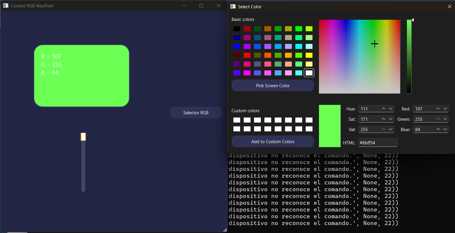
RGB Information Display
Creates a text editing area used to display color information. The geometry property determines the position and size of the widget inside the main window.
<widget class="QWidget"
        name="horizontalLayoutWidget">

<layout class="QHBoxLayout"
        name="horizontalLayout">
Horizontal Layout Container
This container organizes its child elements horizontally. Layouts automatically manage widget positioning and resizing, making the interface more adaptable to different window sizes.
<widget class="QSlider"
        name="verticalSlider">

<property name="minimum">
 <number>0</number>
</property>

<property name="maximum">
 <number>100</number>
</property>

<property name="value">
 <number>100</number>
</property>

<property name="orientation">
 <enum>Qt::Vertical</enum>
</property>
Brightness Control Slider
Creates a vertical slider used to control brightness. The minimum value is set to 0, the maximum value to 100, and the initial value to 100, meaning the LEDs start at full brightness.
<widget class="QPushButton"
        name="pushButton">

 <property name="text">
  <string>PushButton</string>
 </property>

</widget>
Control Button
Defines a push button that can later be connected to application logic. In this project it is used to open the RGB color selector and send the selected color values to the ESP32 through the serial connection.
<widget class="QMenuBar"
        name="menubar">
Menu Bar
Provides a standard location for application menus. Although it is not currently used, it can be expanded in future versions to include settings, tools or configuration options.
<widget class="QStatusBar"
        name="statusbar"/>
Status Bar
The status bar is located at the bottom of the window and can be used to display messages, notifications or connection status information while the application is running.
Additional, a .ui file can be converted into a Python source file using the pyuic6 utility included with PyQt6:
pyuic6 -x week14.ui -o frontend.py
Converting the UI into a .py file offers several advantages:
- The interface can be executed directly as part of a Python application.
- Additional functionality and logic can be attached to buttons, sliders, menus, and other widgets.
- Hardware devices such as sensors, microcontrollers, serial ports, and IoT systems can be controlled through the interface.
- Dynamic behavior can be implemented, allowing widgets to update in real time according to user interaction or external events.
- The UI becomes easier to integrate into larger software projects.
    # Form implementation generated
    # from reading ui file 'week14.ui'

    # Created by:
    # PyQt6 UI code generator 6.11.0

    # WARNING:
    # Any manual changes made to this
    # file will be lost when pyuic6
    # is run again.
Generated File Information
This header is automatically inserted by the PyQt6 user interface compiler. It identifies the original UI file used during the conversion process and provides information about the generator version. The warning is particularly important because any manual modifications made inside this file will be overwritten the next time the UI is recompiled using the pyuic6 command.
from PyQt6 import
QtCore,
QtGui,
QtWidgets
PyQt6 Modules
These modules provide access to the Qt framework. QtCore contains fundamental classes such as timers, signals, events and object management. QtGui includes graphical resources such as colors, fonts, images and painting tools. QtWidgets provides all visual components used in the interface including buttons, text boxes, sliders and layouts.
class Ui_MainWindow(object):

    def setupUi(
        self,
        MainWindow
    ):
Main Interface Class
The Ui_MainWindow class contains every instruction required to recreate the graphical interface designed in Qt Designer. The setupUi() method is responsible for constructing the complete user interface, creating widgets, assigning styles, configuring layouts and positioning components.
MainWindow.setObjectName(
    "MainWindow"
)

MainWindow.resize(
    616,
    600
)
Main Window Setup
The object name is used internally by Qt to identify the widget. The resize() function establishes the initial dimensions of the application window. These values determine the default size displayed when the program starts.
MainWindow.setStyleSheet(
    "QMainWindow{...}"
)
Global Styling
The stylesheet created inside Qt Designer is converted into a Python string and assigned to the main window. This stylesheet controls colors, borders, typography, hover effects and the overall appearance of the graphical interface.
self.centralwidget =
QtWidgets.QWidget(
    parent=MainWindow
)

self.centralwidget
.setObjectName(
    "centralwidget"
)
Central Widget
The central widget acts as the main workspace of the application. Every interactive control such as text boxes, sliders and buttons will be placed inside this container.
self.textEdit =
QtWidgets.QTextEdit(
    parent=self.centralwidget
)

self.textEdit.setGeometry(
    QtCore.QRect(
        90,
        90,
        261,
        171
    )
)
RGB Information Display
Creates a QTextEdit component used to display RGB values or status information. The geometry property defines the position and size of the widget inside the main interface.
self.horizontalLayoutWidget =
QtWidgets.QWidget(
    parent=self.centralwidget
)

self.horizontalLayout =
QtWidgets.QHBoxLayout(
    self.horizontalLayoutWidget
)
Horizontal Layout
This layout automatically arranges widgets horizontally. Layouts simplify interface design because Qt handles positioning and resizing automatically.
self.verticalSlider
.setMinimum(0)

self.verticalSlider
.setMaximum(100)

self.verticalSlider
.setProperty(
    "value",
    100
)

self.verticalSlider
.setOrientation(
    QtCore.Qt.
    Orientation.Vertical
)
Brightness Controller
This slider controls brightness levels from 0% to 100%. The default value is initialized at 100, meaning the LEDs start at full brightness. The vertical orientation provides a user experience similar to brightness controls commonly found in mobile applications.
self.pushButton =
QtWidgets.QPushButton(
    parent=
    self.verticalLayoutWidget
)

self.verticalLayout
.addWidget(
    self.pushButton
)
RGB Selector Button
Creates the push button that will later be connected to the RGB color selection system. The widget is inserted into a vertical layout, allowing Qt to manage positioning automatically.
def retranslateUi(
    self,
    MainWindow
):

    _translate =
    QtCore.
    QCoreApplication.
    translate
Translation Support
Qt separates visible text from interface creation. This function allows labels, titles and button captions to be translated into different languages without modifying the interface structure.
if __name__ == "__main__":

    app =
    QtWidgets.QApplication(
        sys.argv
    )

    MainWindow =
    QtWidgets.QMainWindow()

    ui =
    Ui_MainWindow()

    ui.setupUi(
        MainWindow
    )

    MainWindow.show()

    sys.exit(
        app.exec()
    )
Application Execution
This block executes when the file is launched directly. It creates the QApplication object, instantiates the main window, builds the graphical interface, displays it on screen and starts Qt's event loop. Once the event loop is running, the application can respond to user interaction.
Terminal
With the .ui file completed, the next step is to configure the development environment and begin programming the application logic through the terminal.mkdir project_namedirpython -m venv venvvenv\Scripts\activatepip install PyQt6pip freezepip freeze > requirements.txtpyuic6 -x input.ui -o output.pypip install pyserialcopy con main.py
This command creates a new directory where the entire project will be stored. Keeping all project files inside a dedicated folder helps maintain organization and simplifies dependency management, version control, and file distribution.
Displays the contents of the current directory. It allows developers to verify existing files and folders, confirm their current location within the file system, and ensure that project files have been created correctly.
Creates a Python virtual environment named venv. A virtual environment provides an isolated workspace containing its own Python interpreter and installed packages, preventing conflicts with other projects or system-wide installations.
Activates the virtual environment. Once activated, all Python packages installed through pip will be stored inside the project environment rather than affecting the global Python installation. This ensures portability and reproducibility of the project.
Installs the PyQt6 framework, which provides Python bindings for the Qt graphical user interface library. It is important to activate the virtual environment before executing this command, as pip installs packages into the currently active environment. This guarantees that all required dependencies remain associated with the project.
Lists all Python packages currently installed in the active virtual environment, including their exact version numbers. This is useful for verifying dependencies and documenting the software environment used by the project.
Creates a text file named requirements.txt containing every installed package and its version number. This file allows other developers to recreate the exact same environment by installing all listed dependencies with a single command.
Converts a Qt Designer .ui file into an equivalent Python source file. The generated file contains all instructions required to recreate the graphical interface programmatically. This command must be executed each time the .ui file is modified so that the Python representation remains synchronized with the graphical design.
Installs the PySerial library, which provides serial communication capabilities in Python. This package is essential for exchanging data between the graphical application and external hardware devices such as microcontrollers, development boards, sensors, and embedded systems through COM ports.
Creates a new Python source file named main.py, which is typically used to implement the application's functionality and business logic. Keeping custom code inside main.py is recommended because the generated output.py file may be overwritten every time the .ui file is converted again using pyuic6. Separating interface generation from application logic improves maintainability and prevents accidental loss of code.
Main.py:
import sys
import serial

from PyQt6.QtWidgets import (
    QApplication,
    QMainWindow,
    QColorDialog
)

from PyQt6.QtGui import QColor

from fronted import Ui_MainWindow
Imports and Dependencies
This section imports all libraries required by the application. The sys module provides access to command-line arguments and allows the application to close correctly. The serial module (PySerial) enables communication with the ESP32 through a serial COM port. PyQt6 modules provide the graphical user interface, including windows, dialogs, buttons and color management tools. Finally, Ui_MainWindow imports the interface generated from the Qt Designer .ui file.
class MainWindow(QMainWindow):
Main Application Class
This class inherits from QMainWindow and represents the entire RGB controller application. All visual components, communication functions and user interactions are managed inside this class.
def __init__(self):
    super().__init__()

    self.ui = Ui_MainWindow()
    self.ui.setupUi(self)

    self.setWindowTitle(
        "Control RGB NeoPixel"
    )
Window Initialization
The constructor executes when the application starts. It initializes the parent QMainWindow, creates an instance of the generated interface and loads all widgets into the current window. The window title shown by the operating system is also configured here.
self.serial_port = None

try:

    self.serial_port =
    serial.Serial(
        port="COM9",
        baudrate=115200,
        timeout=1
    )

except Exception as e:

    print(
        "No se pudo abrir COM9:",
        e
    )
Serial Communication
This block establishes communication with the ESP32 connected through COM9. The baud rate must match the value configured in the microcontroller firmware. If the port cannot be opened, the application continues running and reports the error in the terminal.
self.current_color =
QColor(
    255,
    0,
    0
)
Default RGB Color
Creates a QColor object initialized with pure red. The selected color becomes the default NeoPixel color when the application starts.
self.brightness = 100

self.ui.verticalSlider
.setMinimum(0)

self.ui.verticalSlider
.setMaximum(100)

self.ui.verticalSlider
.setValue(100)
Brightness Configuration
The brightness slider operates between 0 and 100 percent. A value of 100 corresponds to maximum LED brightness while 0 turns the LEDs off. The current brightness value is stored and used during RGB calculations.
self.ui.verticalSlider
.valueChanged.connect(
    self.brightness_changed
)

self.ui.pushButton
.clicked.connect(
    self.open_color_picker
)
Signal and Slot Connections
Qt uses a signal-slot architecture. When the brightness slider moves, brightness_changed() is executed. When the RGB button is pressed, the color picker dialog opens.
def open_color_picker(self):

    dialog =
    QColorDialog(self)

    dialog.setCurrentColor(
        self.current_color
    )

    dialog.currentColorChanged
    .connect(
        self.color_changed
    )

    dialog.exec()
Color Selection Dialog
Opens the Qt color picker window. The currently selected color is loaded into the dialog and every modification made by the user generates an immediate update. This allows real-time NeoPixel color control.
def color_changed(
    self,
    color
):

    self.current_color =
    color

    self.send_current_color()
Color Change Event
This function executes whenever the user selects a new color. The selected QColor object is updated and immediately processed before being transmitted to the ESP32.
def brightness_changed(
    self,
    value
):

    self.brightness =
    value

    self.send_current_color()
Brightness Change Event
Executes every time the brightness slider changes position. The stored brightness percentage is updated and applied to the current RGB color before transmission.
r = int(
    self.current_color.red()
    * self.brightness / 100
)

g = int(
    self.current_color.green()
    * self.brightness / 100
)

b = int(
    self.current_color.blue()
    * self.brightness / 100
)
Brightness Scaling
RGB values are multiplied by the brightness percentage. This preserves the selected hue while adjusting the intensity perceived by the LEDs. For example, a red value of 255 at 50% brightness becomes approximately 127.
self.ui.textEdit
.setPlainText(

    f"R = {r}\n"
    f"G = {g}\n"
    f"B = {b}"

)
RGB Information Display
Updates the text box showing the current red, green and blue values. This provides direct visual feedback regarding the exact color being sent to the ESP32.
self.ui.textEdit
.setStyleSheet(

f"""
background-color:
rgb({r},{g},{b});

color:white;

font-size:16px;
"""

)
Dynamic Color Preview
The QTextEdit background changes according to the selected RGB values. This provides an instant visual preview of the color currently transmitted to the NeoPixels.
message =
f"{r},{g},{b}\n"

self.serial_port.write(
    message.encode()
)
Serial Data Transmission
RGB values are converted into a comma-separated string and sent through the serial connection. Example: 255,0,0 The ESP32 receives this information, extracts the RGB values and updates the NeoPixel LEDs accordingly.
app =
QApplication(
    sys.argv
)

window =
MainWindow()

window.show()

sys.exit(
    app.exec()
)
Application Startup
This block represents the entry point of the program. A QApplication object is created, the main window is instantiated, displayed on screen and Qt's event loop begins execution. From this point the graphical interface remains active and reacts to user interactions.
Arduino
The development board from Week 11 was reused for this project. This board controls a set of NeoPixel LEDs, which communicate with the microcontroller through the D5 pin of the Seeed Studio XIAO ESP32-C6.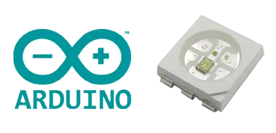
Code:
#include <Adafruit_NeoPixel.h>

#define LED_PIN D5
#define NUMPIXELS 2

Adafruit_NeoPixel pixels(
    NUMPIXELS,
    LED_PIN,
    NEO_GRB + NEO_KHZ800
);

void setup()
{
    Serial.begin(115200);

    pixels.begin();
    pixels.clear();
    pixels.show();
}

void loop()
{
    if (Serial.available())
    {
        String line = Serial.readStringUntil('\n');

        int r, g, b;

        if (
            sscanf(
                line.c_str(),
                "%d,%d,%d",
                &r,
                &g,
                &b
            ) == 3
        )
        {
            for (int i = 0; i < NUMPIXELS; i++)
            {
                pixels.setPixelColor(
                    i,
                    pixels.Color(r, g, b)
                );
            }

            pixels.show();
        }
    }
}
NeoPixel Library Initialization
The first line imports the Adafruit NeoPixel library. This library provides all the functions required to initialize, control, and update addressable RGB LEDs from the microcontroller.
#include <Adafruit_NeoPixel.h>
Pin and LED Configuration
Two constants are defined to simplify hardware configuration. The first specifies that the NeoPixel data signal is connected to pin D5 of the XIAO ESP32-C6. The second indicates that the LED strip contains a total of two addressable LEDs.
#define LED_PIN D5
#define NUMPIXELS 2
NeoPixel Object Creation
An instance of the NeoPixel class is created. This object stores all information required to communicate with the LEDs, including the number of pixels, the communication pin, and the protocol used by the LEDs.
Adafruit_NeoPixel pixels(
    NUMPIXELS,
    LED_PIN,
    NEO_GRB + NEO_KHZ800
);
Setup Function
The setup function executes once when the microcontroller starts. The serial port is initialized at 115200 baud to receive RGB commands from the desktop application. The NeoPixel strip is also initialized, cleared, and updated to guarantee that all LEDs start turned off.
void setup()
{
    Serial.begin(115200);

    pixels.begin();
    pixels.clear();
    pixels.show();
}
Serial Data Reception
Inside the main loop, the program continuously checks whether data has arrived through the serial port. When a complete line ending with a line break is received, it is stored as a string for processing.
if (Serial.available())
{
    String line =
        Serial.readStringUntil('\n');
}
RGB Value Extraction
The received text follows the format:
255,0,0
The sscanf() function extracts the three integer values and stores them in the variables r, g, and b.
int r, g, b;

sscanf(
    line.c_str(),
    "%d,%d,%d",
    &r,
    &g,
    &b
);
Updating All LEDs
Once valid RGB values are received, a loop iterates through every NeoPixel and assigns the same color to each LED. This ensures both LEDs display identical colors simultaneously.
for (int i = 0; i < NUMPIXELS; i++)
{
    pixels.setPixelColor(
        i,
        pixels.Color(r, g, b)
    );
}
Applying the New Color
The color data is stored in memory until the show() function is called. This command sends the updated information to the LEDs, causing the color change to become visible immediately.
pixels.show();
System Overview
The desktop application allows the user to select any RGB color using a graphical color picker. The selected RGB values are transmitted through the serial port in text format. The XIAO ESP32-C6 receives the data, extracts the three color channels, and updates both NeoPixels in real time. This creates a direct visual representation of the selected color on the LEDs.
Results