01 - Project Management
Documenting, Version Control and Planning
The first week of FabAcademy is all about project management. This does not only include the planning of tasks but also the documentation and version control. Ideally, all tasks should be fully reproducible due to detailed descriptions of all processes, some images or videos for easier visualization and files for downloading. To get familiar with the principles and practices for project management, we had several task to accomplish:
- Work through a git tutorial
- Build a personal website in the class achieve describing you and your final project
- Plan and sketch a potential final project
- Read and sign the student agreements and commit to your repos
Documenting and Version Control
For documenting the weekly progress, each student of FabAcademy gets their own Git repository on GitLab hosted by Fabcloud. It contained a basic .html template for my own website and a .yml file for publishing the website. However, when making changes to a file and uploading it to the repository, the file is usually replaced or overwritten. And here is what is so powerful about Git: It does not only save the current version of the file but also previous ones. Hence it is a very powerful software infrastructure for a distributed version control.
Version Control with Git: Commands for Setting up and Using Git
I have worked with Git for previous projects, but that was already some time ago. Luckily, my instructor walked me and my fellow students slowly through the process of installing and using it. In addition, I worked through the tutorial on the website of Git. To create a local working copy of my Git repository, I started with downloading Git. Then, I opened a Git Bash terminal and, I started specifying the configuration Git to setup my username with the command
git config --global user.name "my username"and my email address with
git config --global user.email "my.email@address.com"After that, I generated an ssh key with
ssh-keygen -t rsa -C "my.emal@address.com"which was saved to the ~/.ssh directory. It can be viewed with
cat ~/.ssh/id_rsa.pubCopying and adding the key to my Git profile for authentication allowed me to access the repository. Next, I had to clone my repository to a desired folder on my local computer. For this, I firstly went to the desired folder with
cd path/to/desired/folderand then cloned the git repository with the command
git clone https://gitlab.fabcloud.org/academany/fabacademy/2024/labs/kamplintfort/students/frauke-wassmuth.gitinto the local folder. The URL in this command can be copied from the Git repository on GitLab under "Code > Clone with HTTPs". In order to use git with the local repository, I furthermore had to go into the created git folder, in my case called "frauke-wassmuth" with the "cd"-command. Now, I am able to edit the files and upload the changes to the repository, which is done by creating a commit. For this, the changes I made to a file first have to be saved and can then be added to the index to stage the content and prepare it for the commit. This can be done with
git add *Then, a commit can be created with
git commit -m "commit message"which can subsequently pushed to the remote repository with
git pushThe last aspect of using Git was integrating it with Microsoft's Visual Studio Code that I use very frequently for programming. This step was really easy. After opening the folder of the cloned Git repository, I could open a Git Bash terminal via VS Code and just type in the commands, e.g. for making a commit. I expected it to be a lot more difficult but I don't want to complain here!
Documenting: Programming My Own Website
Now, that I know how to use Git on my own computer, I was able to start customizing my website.
There are many options of how to create a website. However, as I have good programming experiences,
but have never learned HTML, I wanted to use customize the website in HTML instead of using a higher
level software like Markdown. Therefore, I started with a small
HTML tutorial and decided to go with a pre-made
design template called "Dopetrope". In addition, I
investigated how things are done one other websites with Ctrl+U, especially on the website of my friends who
did FabAcademy in 2022, namely
Aaron Hinkle,
Leen Nijim and
Roland Grichnik.
For every change I made, I checked its functionality with the
Live Server
extension for VS Code.
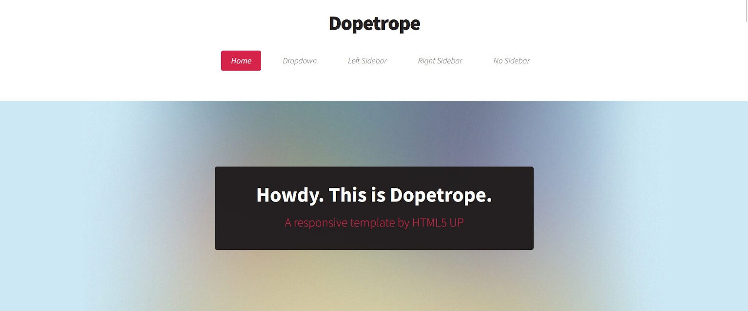
After downloading the design template and adding it locally to my repository, I started by changing the landing page, i.e. the index.html file. Initially it looked like this:
The first step of customizing it, was changing the text of the so-called banner, the header became "FabAcademy 2024" and the subtitle "Documentation by Frauke Waßmuth". Additionally, I titled the window "Frauke Waßmuth FabAcademy 2024" and the page "Welcome!" to welcome all visitors to my side. So hello to you!
Next, I customized the structure of the navigation bar to show "Home", "Assignments", "Final Project" and "About Me" with a dummy dropdown on the "Assignments" button and linked the buttons to (not yet) existing .html files. The code for this is:
<!-- Nav -->;
	<nav id="nav">;
		<ul>;
			<li class="current">;<a href="index.html">;Home</a>;</li>;
			<li>;
				<a href="assignments.html">;Assignments</a>;
				<ul>;
					<li><a href="#">Lorem ipsum dolor</a></li>
					<li><a href="#">Magna phasellus</a></li>
					<li><a href="#">Etiam dolore nisl</a></li>
					<li><a href="#">Phasellus consequat</a></li>
					<li><a href="#">Veroeros feugiat</a></li>
				</ul>
			</li>
			<li><a href="final-project.html">Final Project</a></li>
			<li><a href="about-me.html">About Me</a></li>
		</ul>
</nav>;
After correcting the dropdown to show a list of the individual assignments
and linking it to non-existing .html files,
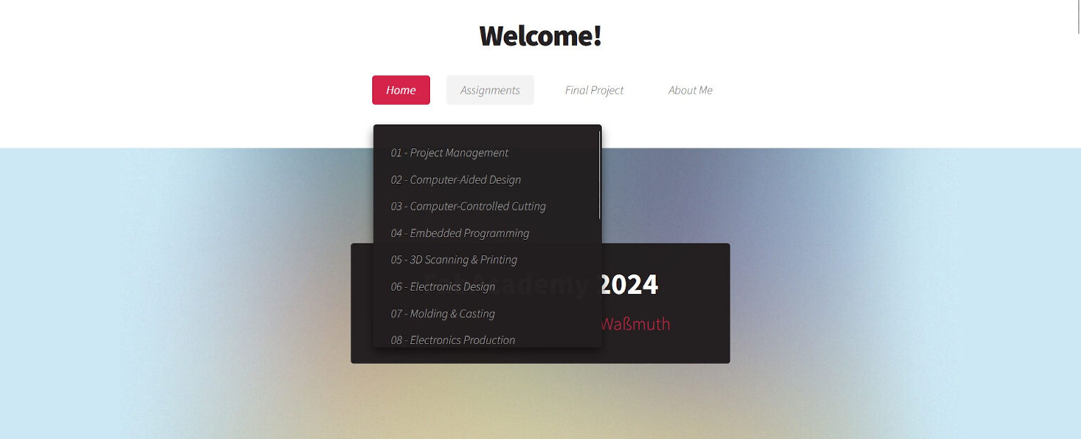
I noticed, that the dropdown menu was too long for my screen.
Therefore, I had the idea of making it scrollable.
As this addresses the style of the website, this had to be adjusted in the
style file "main.css", which is located in the folder "assets > css". To find the place
where I have to adjust something, I searching for "nav" which I hoped would lead me to
the design for the navigation bar. Here, I found the .dropotron entry which I figured
might be the right place to insert the following two lines of code.
height: 350px;
overflow: scroll;
After saving the changes, I checked the appearance of the navigation bar with the live server extension. And it really did, what I actually wanted:
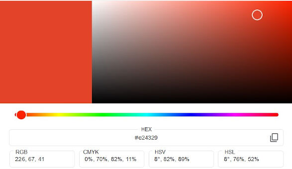
With the structure of the navigation bar being done, I did some changes on the general appearance. I firstly changed the colors. So instead of the pink color, I wanted to go for a red-orange color. For this, I replaced all occurrences of the pink color (#d52349) in the style file with the hex value (#E24329) of a color I picked on the Google Color Picker.
Furthermore, I did not like the italic font style of the navigation bar. In order to make it normal, I simply deleted the line
font-style: italic;in the #nav entry of the style file.
The last and potentially biggest change to the navigation
bar was probably concerning the position. In case a user scrolls down a page on their computer,
the navigation bar used to disappear at the top of the page. So, in case the user wants to access
a different page (via the navigation bar), the user had to scroll all the way up. This, however,
was very annoying for me so I searched for a solution online. On one
website,
the navigation bar was fixed at the top end of the page by setting the position of the navigation
bar to sticky. Therefore, I added the following lines to the #nav entry of the style file
position: -webkit-sticky;
position: sticky;
top: 0;
padding: 1em 0 1em 0;
background: #ffffff;
z-index: 9999;
border-bottom: solid 1px #ccc;
text-align: center;
However, it did not exactly work as I intended. As you can see in the video, the navigation bar sticks to the top of the page when the user scrolls down. But as soon as the user reaches the the end of the header, where the content begins, the navigation bar disappears behind a container.
I googled the cause for this and finally found a solution for it on
this
forum. Apparently, the sticky position is only valid within the parent container, i.e. the header.
Hence, I overcame the problem by dragging the code for the navigation outside of the header. And
viola, it works! You should be able to see the navigation bar on the top in case you are using a
relatively big screen.
"Sticky" Navigation Bar Does Not Work Outside Parent Container
The last aspect was creating other .html pages so that I finally was able to click on the buttons in the
navigation bar. For this, I duplicated the index.html file and renamed it as shown in the code above.
In each file, I dragged the attribute class="current" to the according button to show on which
page the user currently is.
Lastly, only the pages for the individual weekly assignments in the dropdown menu were left. Here, I wanted
to create a folder structure in the git repository according to the navigation bar. Hence, I made
a new folder and called it "assignments". I then duplicated an .html file and moved it into this folder.
However, as this file is now in a subfolder of the "public" folder, I now had to add ../ to all
relative path in order to correctly point to the location of the files via the parent directory.
Otherwise, the website was not completely functioning, i.e. it was plain without any style. I then duplicated
and renamed that file to create one file for each weekly assignment.
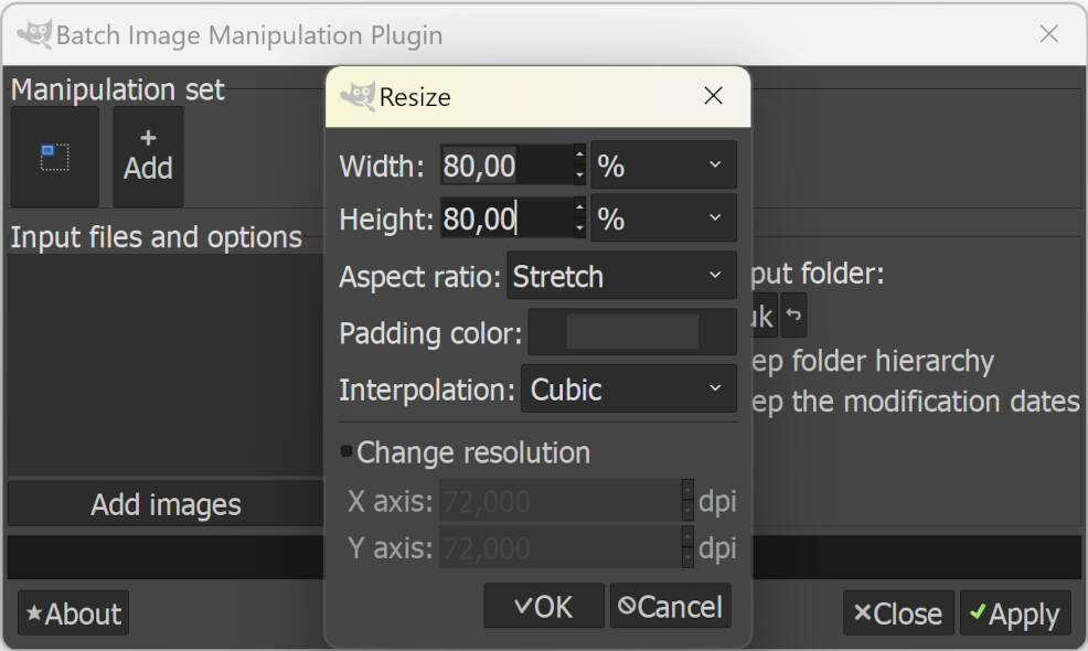
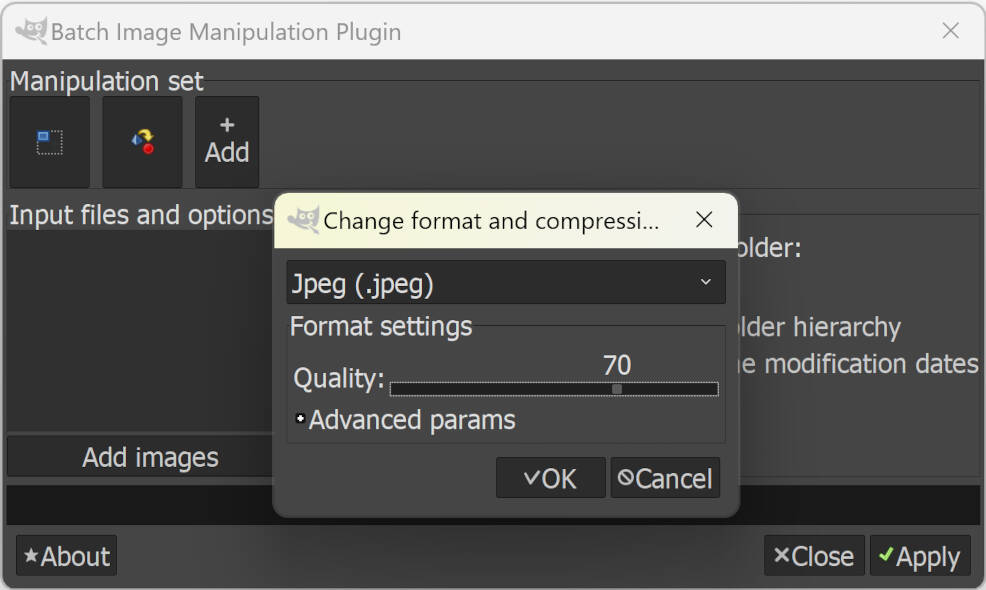
Now, that I had all .html files created and structured, I started with filling the pages with some content. I wrote something about myself in the About Me section as well as started some documentation for this week. However, nobody likes plain text, which is why I wanted to add some images as well but I figured they were relatively big with about a size of one megabyte. Therefore, I needed to compress the images. For this I used the GNU Image Manipulation Program, called GIMP, which I have used several times already. However, my instructor also recommended BIMP, a plugin for GIMP that allows batch-wise image processing and it really came in handy! So after downloading and installing it, I opened the plugin via "File > Batch Image Manipulation...". Then, I added two manipulation sets. Firstly, the images are resized to a width and height off 80 % and secondly, the format is changed to a .jpeg file with a compression quality of 70. After defining the input and output folder, the user simply presses "Apply" and these manipulations are applied to all images in the input folder and saved to the output folder. Easy!
After I compressed the images, I put them into the repository and added their paths to the .html files, e.g. to the About Me section. However, I had to fix some image paths as they pictures were not displayed. I firstly assumed the same cause for all pictures but in the end, I found three different mistakes. One path had a wrong file ending, another had a typo and lastly the folder path for the images on the Final Project section was simply not correct. Here, I accidentally typed the path of the image folder to be in same parent folder ("../images/") but instead this folder was in the very same folder ("images/"). After fixing all of it, I was happy with how the website turned out and I started documenting all steps that brought me to this very sentence!
Planning My Final Project
The second part of this week's assignment was the planning and sketching my final project. This step is really important because the final project must be composed of multiple fabrication techniques. And if you plan it properly in the beginning, a lot of headache and stress can be avoided! The planning does not only include a description of the idea with requirements and demands supported by a rough sketch but also time management.
Sketching The Idea
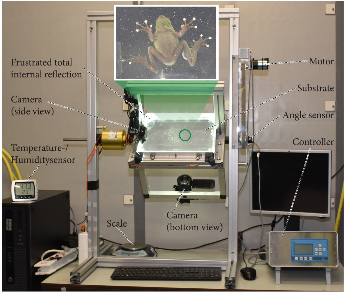
I am a researcher currently starting my PhD about soft robotics bio-inspired by soft-bodied animals. To make the most of my limited time, I want to use my final project for my PhD, i.e. to produce an experimental setup that allows me to visualize the contact of a small animal with its surroundings. More specifically, I want to make the contact area between the animal and a glass plate visible by "frustrated total internal reflection" (FTIR) under different environmental conditions, such as a normal horizontal plate, a wall or even an overhang environment to also assess its attachment performance.
This experimental setup already exists, made by a research group at the University Wageningen in the Netherlands. However, setups like these are self-made and cannot be bought off-the-shelf. Therefore, I have to build one myself during FabAcademy 2024.
From: Langowski, J. K. A., Rummenie, A., Pieters, R. P. M., Kovalev, A., Gorb, S. N., & van Leeuwen, J. L. (2019). Estimating the maximum attachment performance of tree frogs on rough substrates. Bioinspiration & Biomimetics, 14(2), 025001. https://doi.org/10.1088/1748-3190/aafc37
Furthermore, I formulated some demands and wishes about what the final project should implement.
Demands
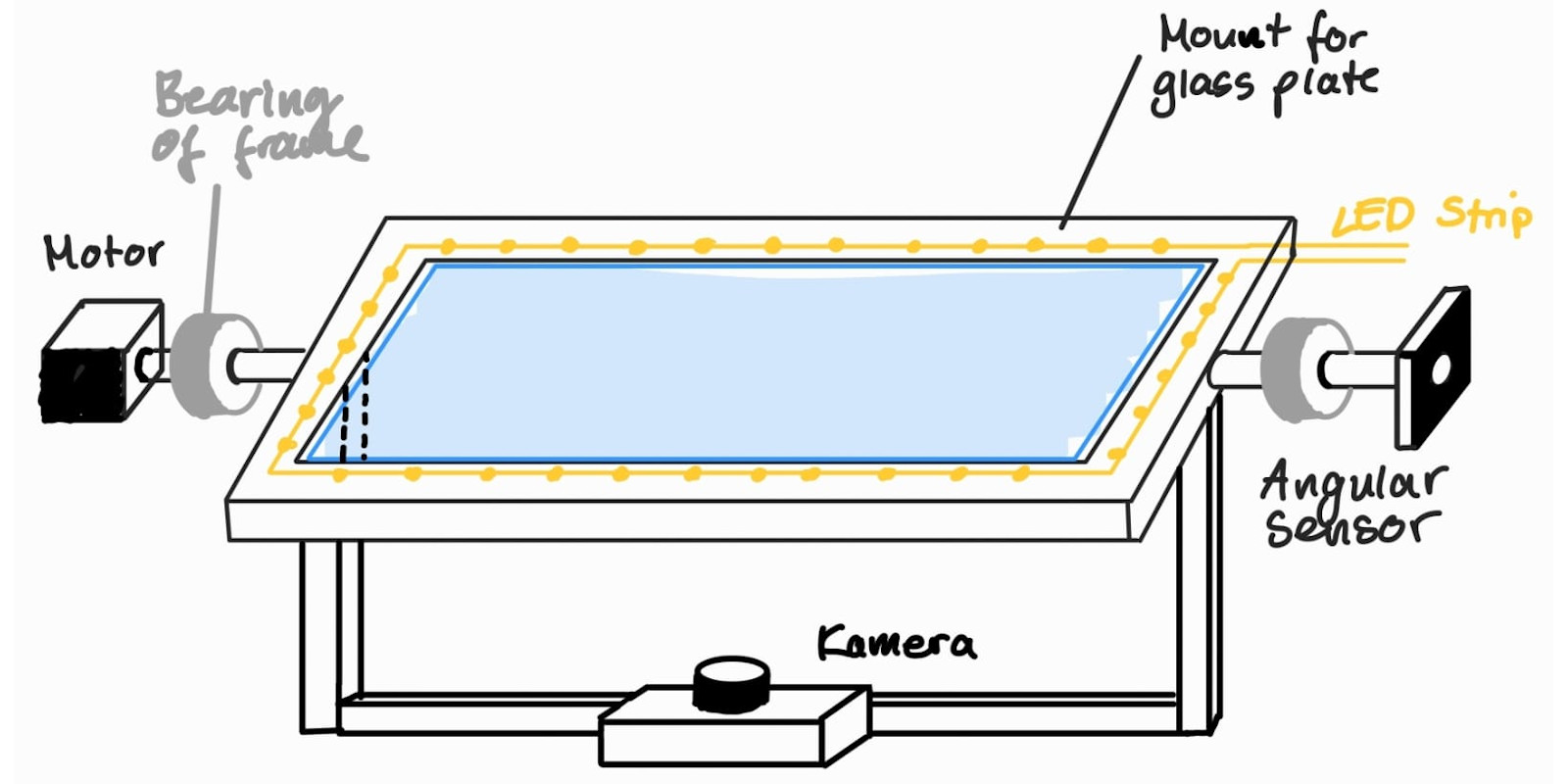
- An LED strip must be placed around the glass plate.
- The glass plate must be connected to a rotating shaft able of rotating 90°.
- A camera must be able to record the surface of the glass plate from below.
- The camera must be able to follow the rotations of the shaft.
- The shaft must be suspended by a frame.
- The rotation is controlled by a motor.
- An angle sensor is used to measure the angle
- A GUI is used as an interface via USB to the microcontroller.
- The microcontroller has a housing.
Wishes (optional)
- The camera is connected and controlled via a microcontroller.
- The rotation is controlled by the angle measurements.
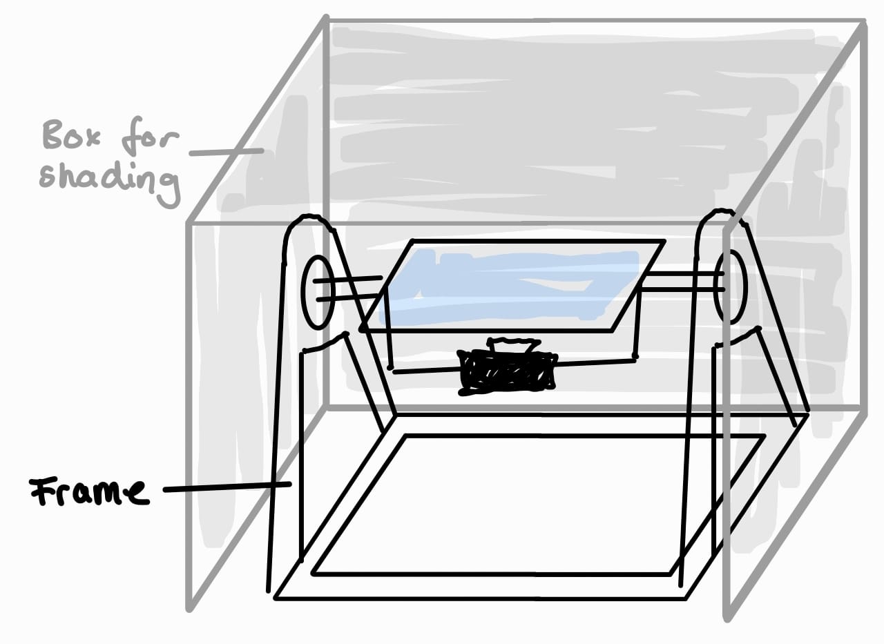
- For a high contrast, the setup should be partially enclosed by a shading box.
- The rotation is extended to 180°.
- All wires and other electrical components are integrated and not visible.
- It can be placed on a table, i.e. the dimensions are less than 120cm x 60cm x 60cm (h x w x d).
With these demands and wishes, I tried to sketch a concept of the setup how I imagine it to look.
Time Management
Time-wise planning of my final was slightly more complicated as I did not yet know what tasks I will need to accomplish for it. However, I tried to identify all necessary tasks and also their subtasks. Then, I started mapping the tasks onto the time I had available for the project, namely all 20 weeks of FabAcademy. Ideally, all parts that need a certain fabrication process are finished in the week that we learn about the fabrication process. Hence, I tried to match the steps to the modules of FabAcademy as shown in the following (initial) Gantt Chart.
