② Computer-Aided Design
This week I worked with a variety of CAD software to develop components of my project.
| Design File Links |
|
|---|---|
| - Button Base |

|
| - Back Button |

|
| - Settings Button |

|
| - Blue Background |
|
| - Red Background |

|
| - Potentiometer Knob |
|
| - Song Sonic Enclosure |
|
|
-
ALD (My Signature) JPG
- ALD (My Signature) Adobe Illustrator |

|
Raster Drawings |
|
Adobe Photoshop - GUI Buttons |
|
|
Since the Song Sonic has a GUI on its screen, I have the need for user interface elements.
One of the most commonly used is the button, and I decided to start with that as its design should be pretty straight forward to get started with.
I started by first creating a base button template that could be used to make other buttons:
|
|
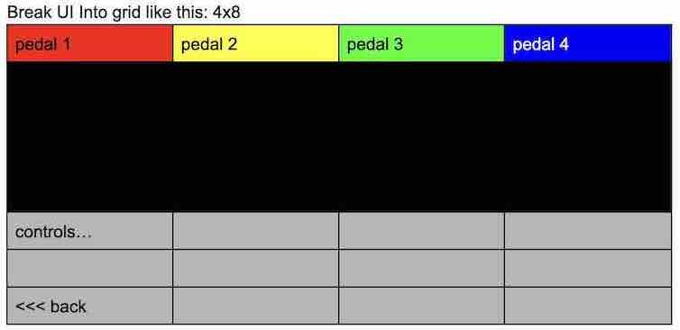
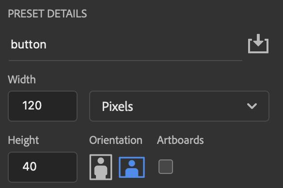
| Before starting the design process, I needed to know what pixel dimensions I am working with. I have decided to go with my Pyportal Titano to act as the user interface since it can be easily programmed and integrated to the circuit. I also already own 2, so I might as well put it to good use. This will also open up the option for the interface to be touch screen based as well. The Pyportal Titano comes in with a fairly decent screen resolution of 480x320 pixels considering it's a 3.5" screen. It will be important to create the GUI elements with the pixel size in consideration to simplify the coding and compatibility part later on. | |
|
I had this initial design layout in mind for the GUI: |
|
|
|
|
While this template is not set in stone, it will be a good guide for keeping consistent sizes throughout the GUI. The elements created will be based around this 4x8 grid system to make sure they stay proportional. I wanted my button template to take up one cell, and to get the measurements of each cell, I divided the width by 4, and the height by 8. |
|
|
Cell Width = total_width / num_cols = 480/4 = 120 pixels
Using these measurements, I created a blank canvas in Photoshop with a size of 120x40 pixels. |
 |
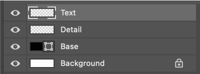
| For my image I made 3 layers, a base layer, one for shading and one for the text or image on the button. By using layers, I can easily make changes to different components of the raster, without having to worry about impacting the others. So for example, I can change my text from black to blue on a whim, without changing the red color of the button. |
|
|
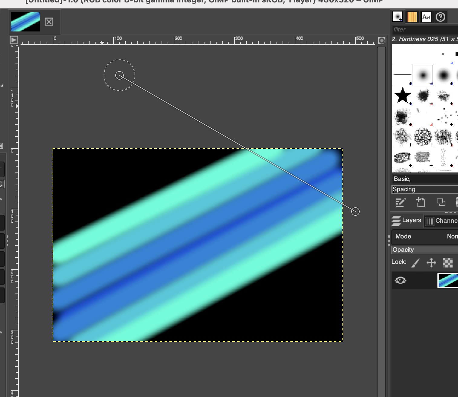
For the base layer, I filled it in with a dark gray, with a black border.
Note that the grid is on so I can see individual pixels, this will not appear on the final product.
I then used the circle brush tool to align circles on each corner. These are then connected to create the rounded shape which I filled in with a lighter gray. 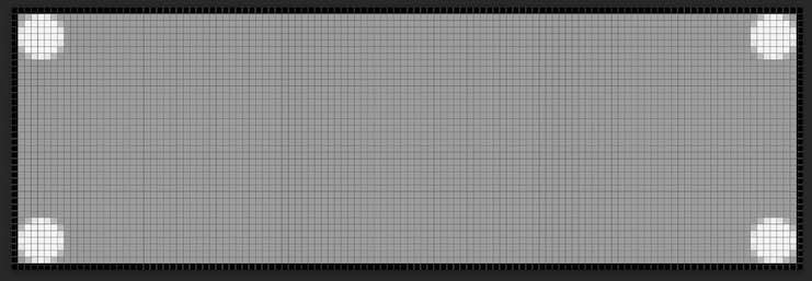 << Was turned into >> << Was turned into >> 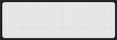
|
|
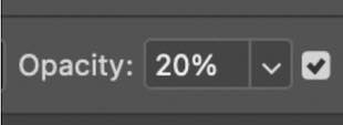
| Then, using the opacity setting on my brush tool, I set it to be see through to add shading on the details layer. 20% was a good level that was dark enough but not too opaque. I drew the shadows around the edge of the button using the straight line tool (by holding shift when drawing with the pen). |
|
| This left me with a finished base for a button, which can then be edited and recolored to be used as different inputs: | |

|
|
| I created the following two buttons, to navigate backward or change settings. This was done by recoloring the button template, then adding a graphic such as text or an image on top. Simple as that! | |


|
|
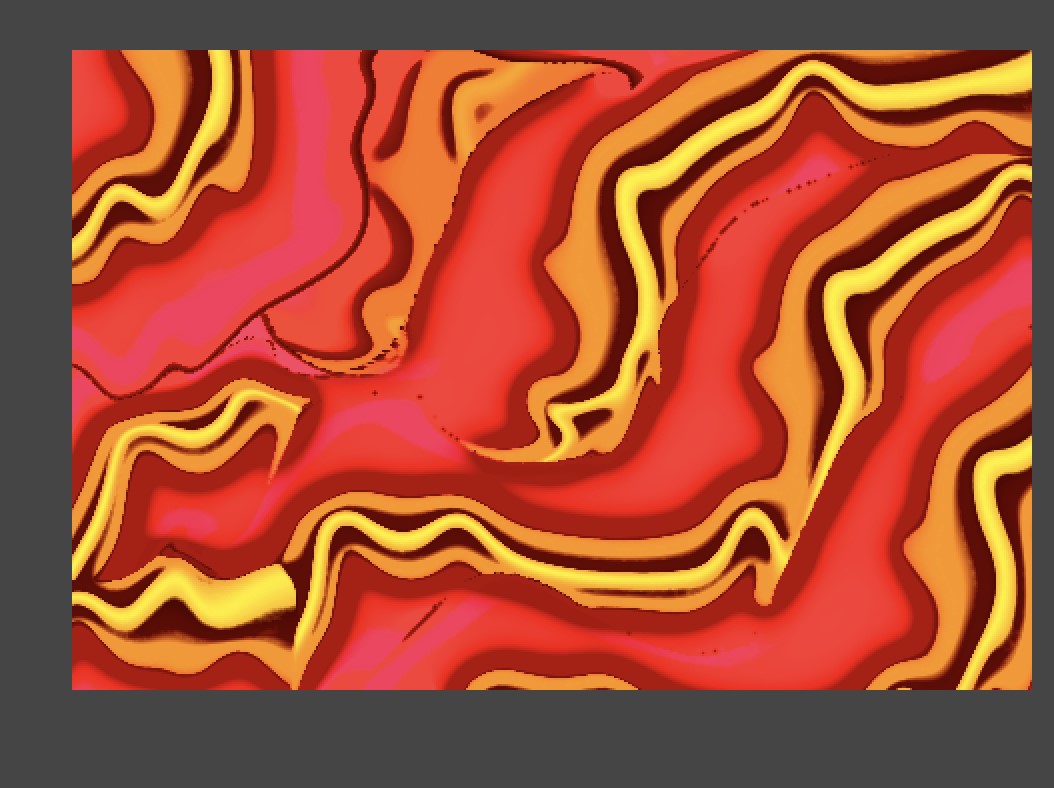
GIMP - GUI Background |
|
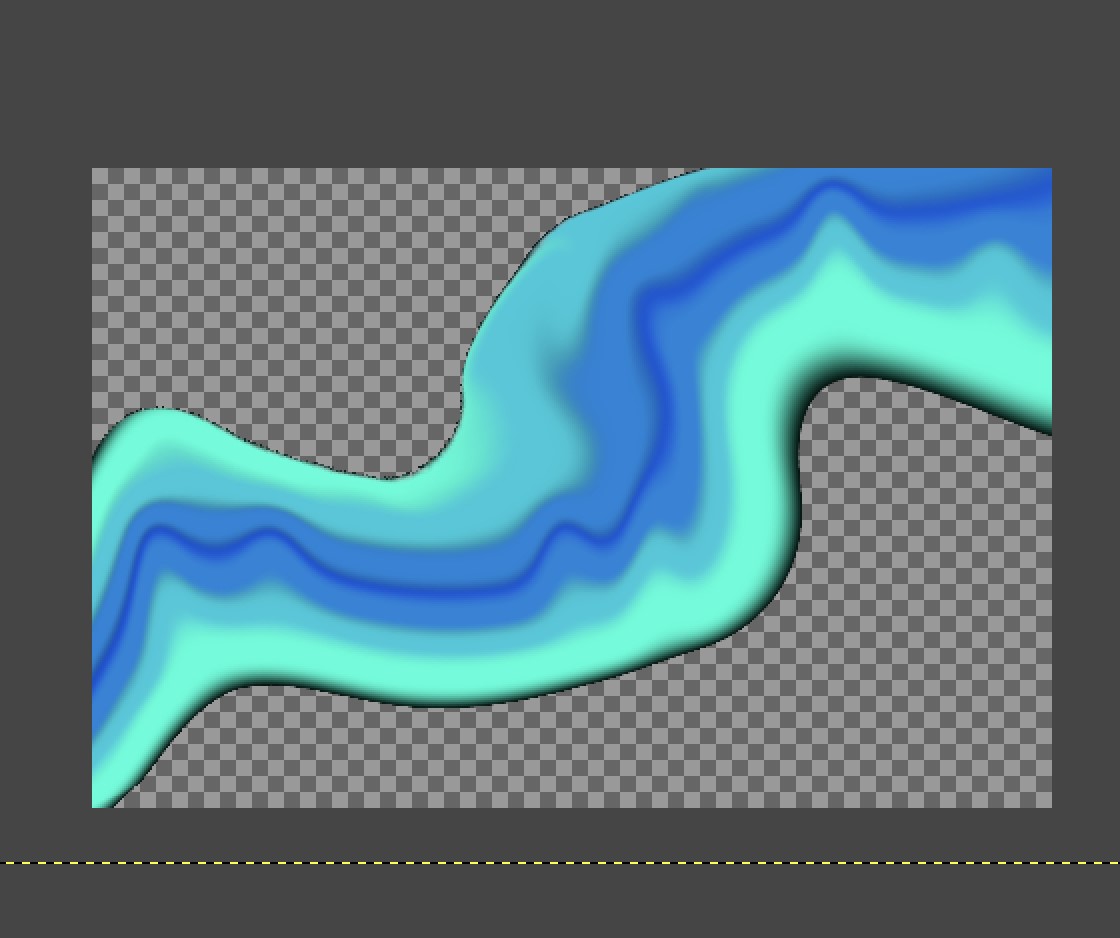
| For the GUI on the Song Sonic, I feel like having a normal black or white background would be pretty lame! So, I decided to try making my own background using GIMP. I started by making diagonal lines using the brush tool and a few different colors on a black background. |
|
| I then used the warp tool and smudge tool to smooth the colors together, and to give it a funky and organic wavy shape. I then copy and pasted this shape multiple times to create an interesting pattern. |
|
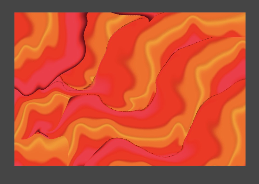
| I wasn't too sure I liked the color scheme, so using the colorizing adjustment tool I made it look sort of like magma. Especially, when mixed with the organic pattern. |
|
| I wanted to try out some of the filters that GIMP provides. Which there are many of. I ended up going with this filter called "cubism" under the artistic filter section. It ended up looking really cool, while still preserving the organic color pattern. |
|
After looking at it, I decided that the background was probably too bright, and I want the Song Sonic to not be too overbearing in that department.
I increased the saturation, decreased the brightness and changed it back to a blue color.
I ended with this final result:
|
3D Modeling |
|
Fusion360 - Outer Shell |
|
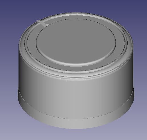
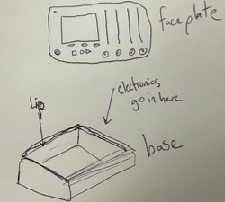
| Using Fusion360, I modeled the enclosure for my project. This consists of the base and sides, but not the top as the faceplate will be laser cut and then attached to the base. I started with this rough idea sketch: |
|
|
The base consists of a tapered and rounded design, an empty shell for the electronics to go into, and a lip for the faceplate to rest on and attach to with screws.
Instead of constructing it with a base then adding the sides and the lip, I figured it would be best to just sketch the side of it, extrude it, then cut into it to make the enclosure.
|
|
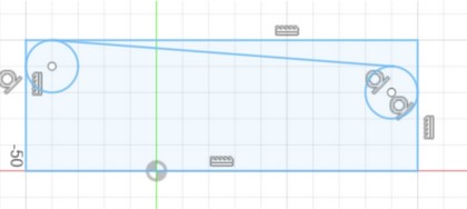
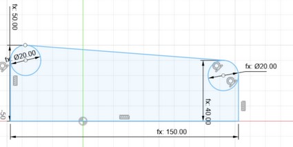
| Using a ruler, I decided to approximate the dimensions to 50mmx150mmx250mm to ensure enough space for all the components and a little wiggle room for wiring. |
|
| Here I added the dimensions of the side (50x150) and a couple circles to round the edges. I connected the top mid point of the circles, which will create the tapering of the enclosure. |
|
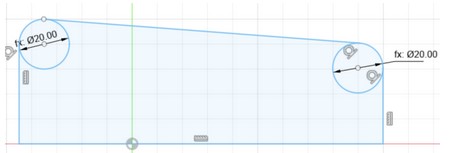
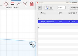
| I decided to make the circles parameterized so I can optionally change the curvature later. Here you can observe that changing the parameters changes the model. Thanks to Mikolas Zuza for this quick Fusion360 tutorial. |
|
| I finished up by adding parameters for the heights and width of the side. This way I can easily resize in the future. |
|
| I then created a parameter for the width set to 250mm, and pulled the sketch to that width to create the basic shape for the enclosure: |
|
| Using the filet tool, I added a 3mm filet on the outside edges to round off the harsh corners. |
|
| To make the hole for the faceplate, I started by making an outside perimeter of 10mm using 10mm squares in the corners and then connecting them. I also added parametrized circles for the faceplate inset curvature. |
|
| Then, I realized that I can just use parametrized measurements to ensure a spacing of 10mm, instead of using squares to line things up. I also added the edge of the inset that the faceplate would rest on at a distance of 5mm. These will be then inset at different distances. |
|
|
The lip is inset at ⅛” since that is a common width of material we use on the laser cutter here in the lab. Also, it is not too thin or flimsy as a person will need to step on this.The bottom of the base is set to 2.5mm so it can be easy to machine.
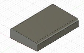
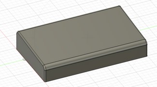
Here is the final result: |
|
|
|
|
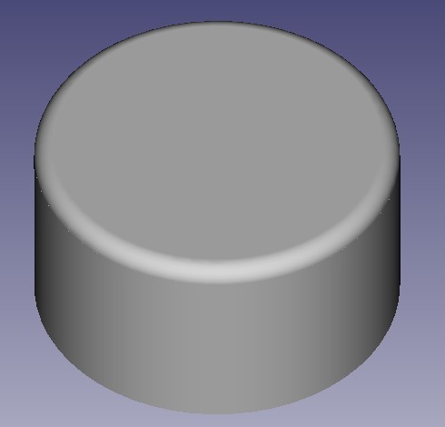
FreeCAD - Control Knob |
|
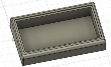
| The Song Sonic will consist of many buttons and knobs, so I need to design a knob that I can 3D print on the SLA printer, which can then be used to make a mold. This way I can cast many knobs, and only use the more expensive resin for one. I also wanted to take this opportunity to customize my own style of knob to add a personal touch to my project. Using tutorial by Jayanam, I started my endeavor of designing my own knob. |
Inspiration: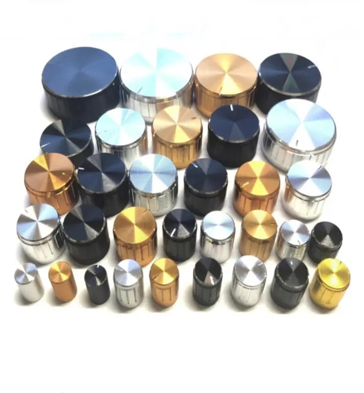
|
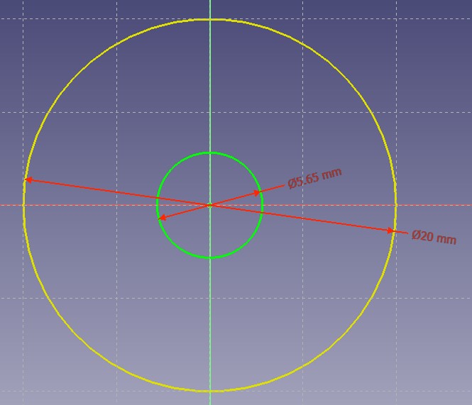
| Using calipers, I measured the size of the knob mount (5.6mm) on standard potentiometer, since these are what I will likely be using on my project. I created the circle that measured slightly above that(5.65mm), and created an outer circle (20mm) for the knob perimeter. This may need to be changed in the future depending on how "snug" the fit is on the potentiometer. |
|
| Through experimenting, I learned how to set the parameters of drawings in FreeCAD by going to the elements panel, right clicking the object I want to parametrize, and then selecting the appropriate constraint. |
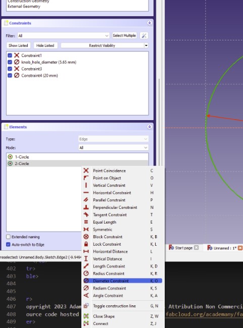
|
| To save on material, I wanted to make the inside hollow. To do this, I added too more circles as inner and outer diameters for the infilled sections. |
|
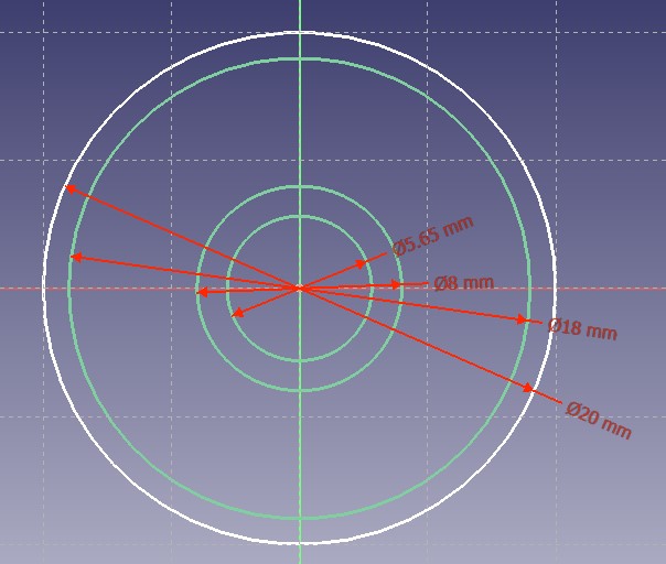
| What I didn't realize is that you have to make each shape separate before you can pad it, unlike Fusion360. So, I started with the outside ring and made it 10mm high. Followed by the inner ring with the same height. |
|
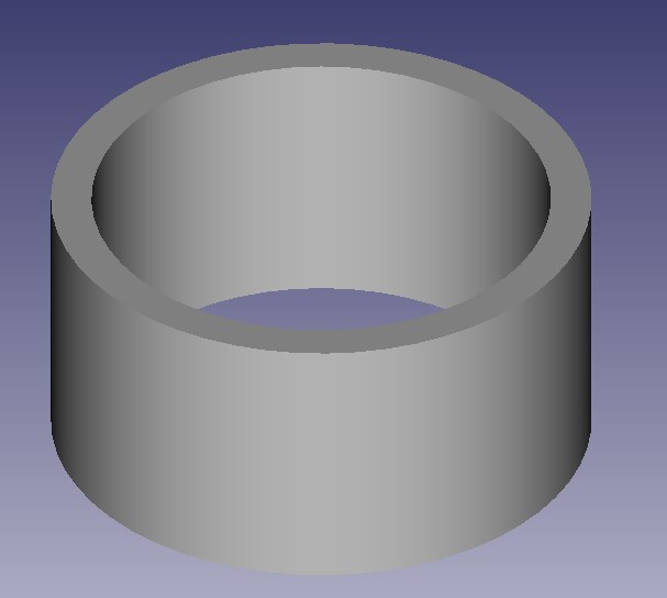
| I then added a 2mm thick circle 9mm up and filleted the edge by 1mm. This gives it a total height of 11mm. |
|
| I finished up by adding details here or there for my final design: | |
|
|
Vector Drawings |
|
Adobe Illustrator - Faceplate |
|
|
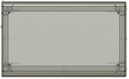
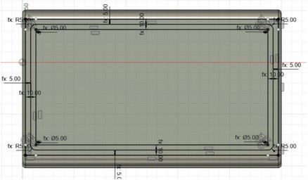
I designed the potential faceplate of my guitar interface using Adobe Illustrator - a vector based drawing software. The intention is to use this file to laser cut the faceplate of the Song Sonic. By using a laser cut faceplate I can make quick changes and cut out a new one quickly, without having to worry about manufacturing times. Since the laser can cut plywood or acrylic in a matter of minutes, any future changes to the layout of the faceplate will be a cinch. Since the faceplate will "house" the screen, buttons and switches to control the GUI, I had to make sure that I included all the requirements from my project specification, that specifically pertain to the number of "pedals" and GUI controls. |
|
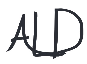
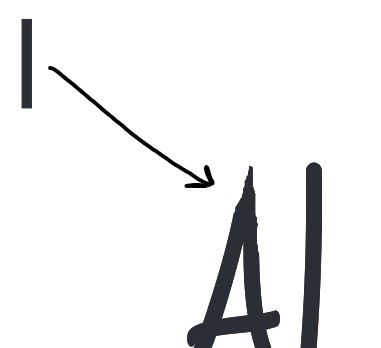
CorelDraw - My Signature |
|
|
Of course, branding is important when designing a new product, and in this case the "branding" is more of a calling card. It was my intent to recreate my signature in a vector based program to make sure it looks perfect, and can be easily used on the laser cutter for engraving, or the vinyl cutter to make a sticker. This will allow me to incorporate my signature as part of the design for the Song Sonic. |
|
| I wanted my signature to look like it was written by hand, so I tried (many times) to write my signature using the brush tool on CorelDraw. Using a brush width of 5, I signed my initials using my mouse. If I were to do this in the future, I would probably use an ipad to write it, or use a photocopier. I used the eraser tool to clean up the edges a bit, to make them somewhat close to the caligraphic style I am looking for. |
|
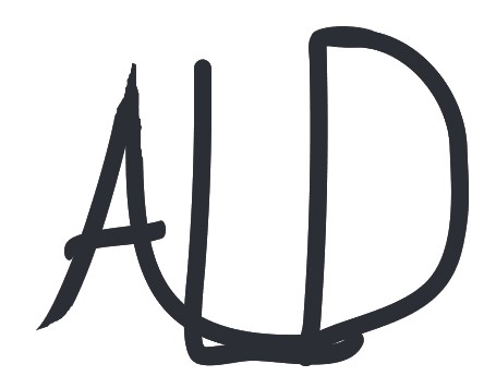
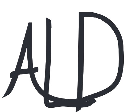
| With the rough copy started, I utilized rectangles and circles to smooth out the rough edges. |
 |
|
I carefully resized and rearranged the letters to be more "proportional" but this part was definitely more along the lines of what I think looks good.
This is the result I was left with: |
|
| I continued messing around with the width of the border, combining the letters into one shape, and adjusting different vertices to create a more sharp look. Here is the final result, ready to be laser cut, engraved and made into stickers! |
*Notice the change in spacing of the letters, a more rounded "D", elongated "L" and the "A" is a bit more bold and "swooping" to make it pop.
|