Weekly practices 2D raster / vector applications
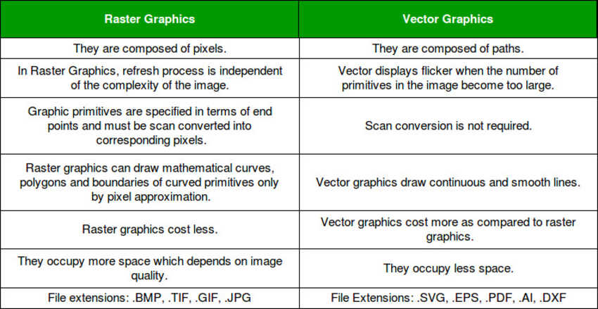
I have gone through this useful link for deep understanding about 2D raster and vectors.
Model (raster, vector, 2D, 3D, render, animate, simulate, ...) a possible final project, compress your images and videos, and post a description with your design files on your class page.
I have gone through this useful link for deep understanding about 2D raster and vectors.

Raster applications: I have been familiar with photoshop and normal windows paint applications, that’s why I decided to explore a new application which is GIMP
Gimp
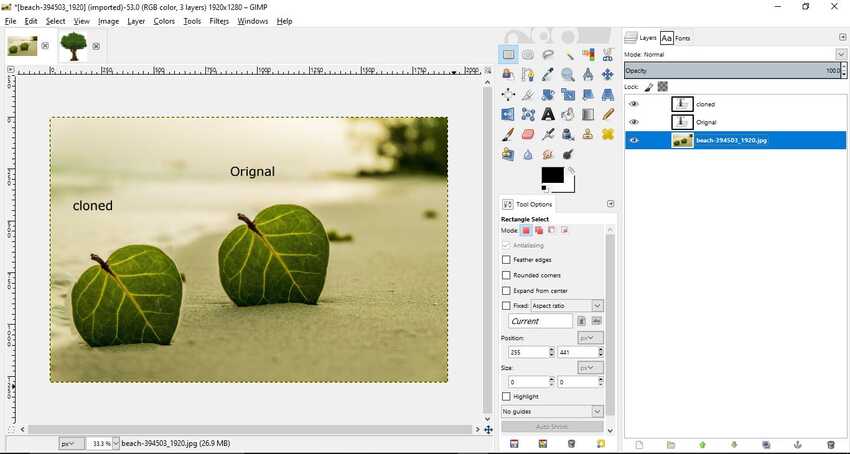
I went through some tutorials online like these. As I was exploring this new application I got impressed by this clone and heal tool, it was something new for me.
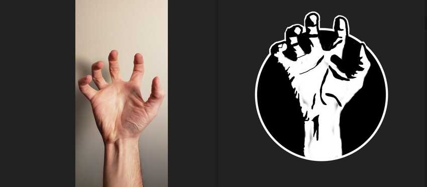
Here is an example of using gimp and converting a photo to pixel art ( I explored photos from pixabay )
I practiced also to make a logo by folowing these videos. It was very interesting and a new thing which I accomplished in my life :)
Vector applications such as illustrator and Coreldraw were commonly used in my surroundings so I decided to explore a new application INKSCAPE.
Inkscape
I downloaded inkscape on my desktop as my laptop already has large and heavy files so I didn't want to make it slow like a tortoise:)
While exploring inkscape I found a new amazing feature, which is shape tool. Inkscape has four versatile shape tools, each tool capable of creating and editing its own type of shapes. A shape is an object which you can modify in ways unique to this shape type, using draggable handles and numeric parameters that determine the shape's appearance.
For example, with a star you can alter the number of tips, their length, angle, rounding, etc. — but a star remains a star. A shape is “less free” than a simple path, but it's often more interesting and useful. You can always convert a shape to a path (shift+ctrl+c), but the reverse conversion is not possible.
Also I found exciting new text tool that can manipulate alignment of any letters within a word by alt+up and down keys.
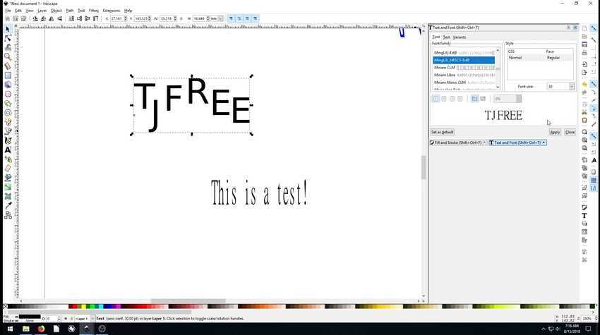
I practiced and explored through many tutorials / videos like this doughnut here.

xDesign
I am looking forward to try this new tool as soon as I recieve its license key.
Fusion360
I started by going through some practice tutorials like this because I became eager to design a lego man by myself. To my surprise I found out that designing 3D with these tutorials was taking so long as they were without dimension sheets. It made me realize the importance of dimension sheets. When I discussed this issue with my friends / colleagues of fab academy they also had the same problem and then someone had it so it was shared a bit late, that’s why I could not finish these tutorials and moved to the assignment right away.
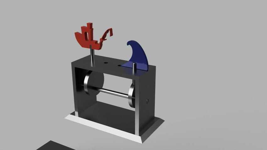
As remembrance, my first ever group assignment work was also designed on fusion 360. I had designed the rectangular structure of the model shown in the picture with the base using extrude join and then chamfer , holes were done by extrude cut and other parts were designed by other friends/colleagues of fab academy. It was a very nice experience to work in a team, especially when you feel part of the family around them.
Blender
I used this program for rendering a simulation.
I was so happy to explore this application as I had already heard about it alot in the 3D printing community for its sculpting features. It gave me inspiration to take this chance and explore it more in depth.
I followed the blender guru tutorials.
Which helped me alot but due to time constraints I couldn’t see them all but this was the outcome from that practice
And here is a list of keyboard shortcuts pdf.
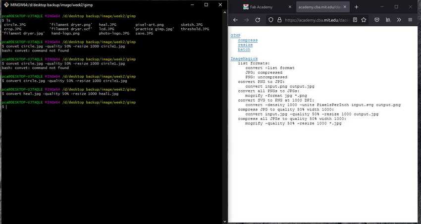
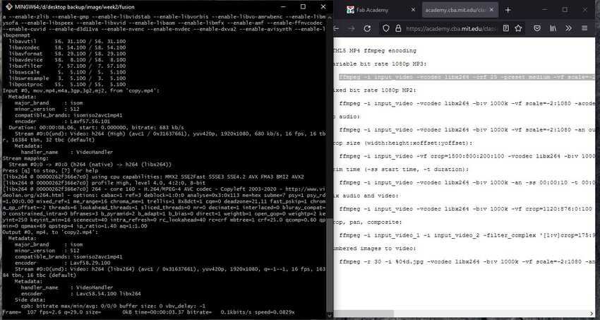
For compressing and resizing images and videos, I used comaand line provided in the lecture on gitbash. My experciance with photos and images were great as completed all commands without any problems. As for videos still need confidence.
Gimp
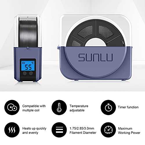
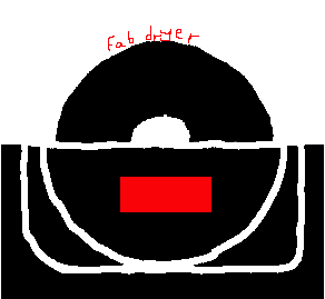
I decided to make a logo of my final project, but due to lack of time I tried only to draw an existing filament dryer as practice for the final logo.
I started by opening the application and inserting this photo into a blank file by using the open command tools from the file menu.
Since the photo was very big and I needed only a small part from it so I used the rectangle tool to select the part needed only, then from the image menu top bar I chose crop to selection and cropped it. Here is the preview of it
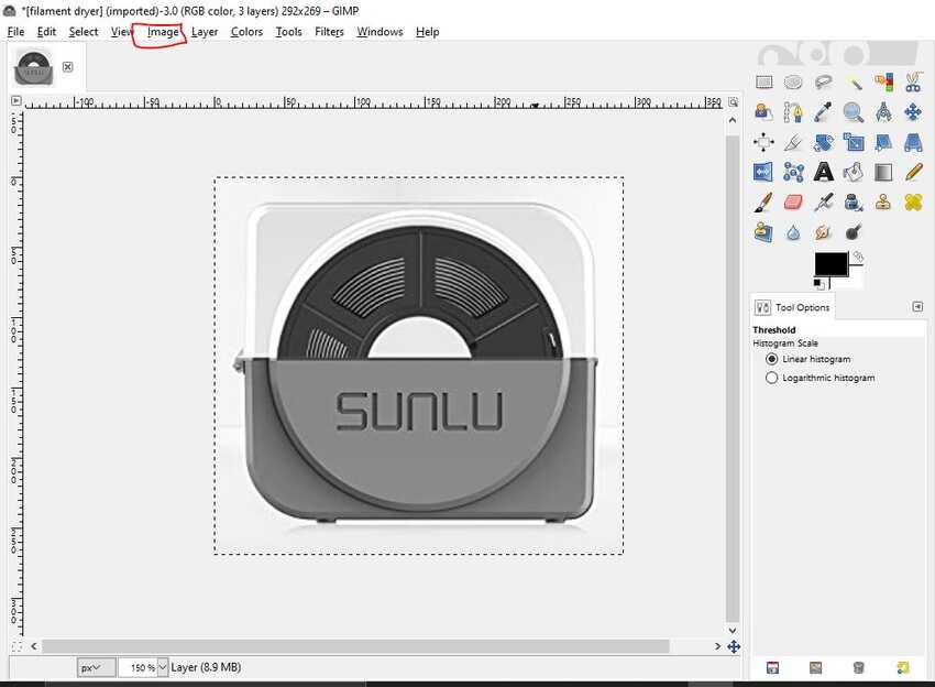
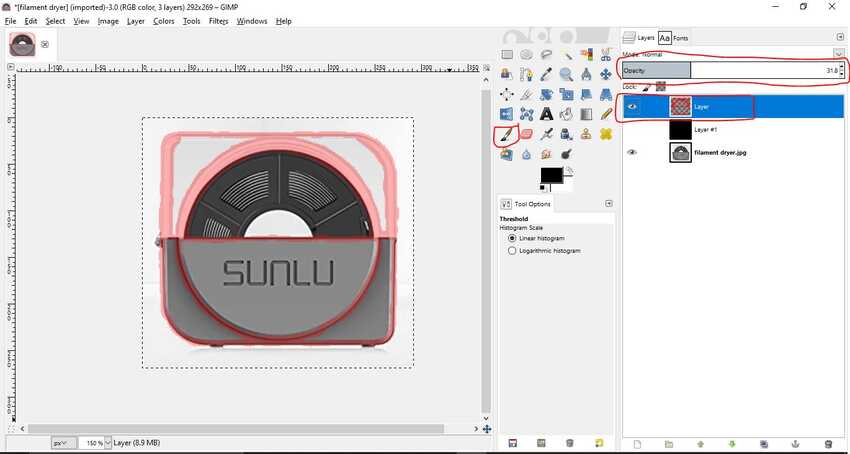
Next step was to sketch by using any freehand tool, so first I added a new layer so that the present picture doesn't get visible in the final result file. Then by using the brush tool I started to trace the outline of the filament dryer and other details that I thought were important to get a nice effect. I used the red color so that when tracing it's clearly visible and does not merge with the photo.
Tip: I changed the opacity to 50% of the new layer so that the photo layer is viewed clearly. As shown in the picture.
Once the sketch was over I wanted to change the color from red to white so I used the threshold tool from the image menu and dragged the arrow towards white color which made the red color change into white.
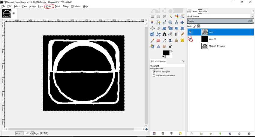
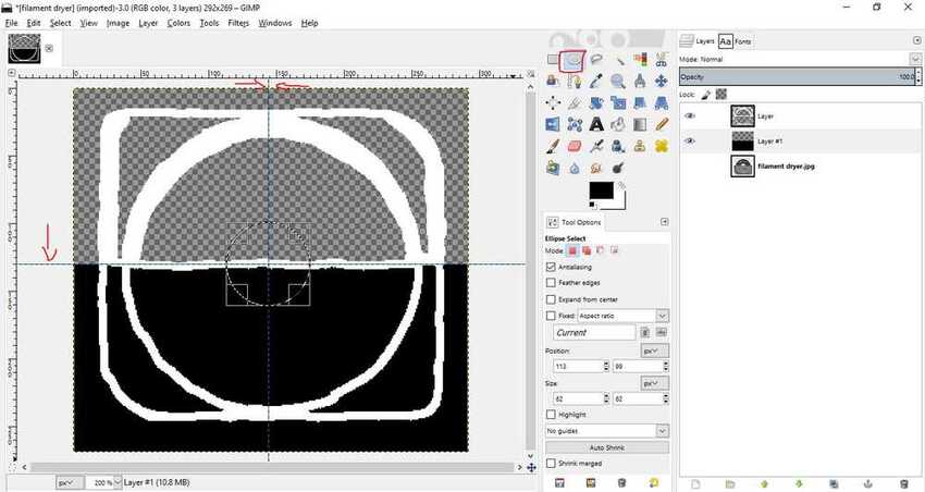
I wanted to add black background so it looked nice so I added a new layer and changed its properties from transparent to black background color.
But found that it was not looking good so I changed back to add a new transparent background layer and added only the bottom half a solid black fill by using a rectangle tool to select the area and the fill tool to fill the color.
For the rounded part in the center I used the circle tool and drew a circle which allowed me to ease the process of tracing a perfect round shape and filling the color.
Tip: I used the grid lines to know the center point for the circle.
I added a small rectangle by using the rectangle tool and filled it with the red color, it resembles the place of the lcd screen in the dryer box.
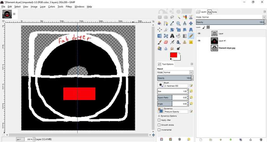
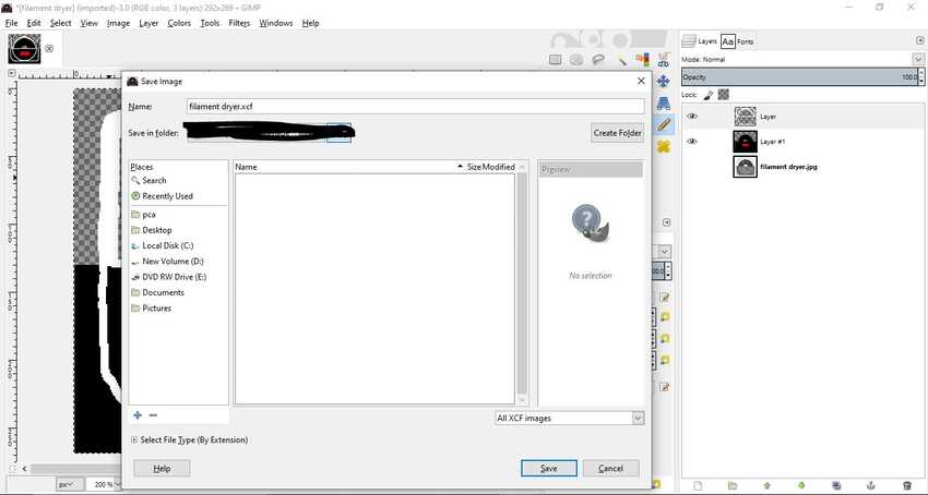
Hooray I completed my design. I exported the result by using the export command from the toolbar and modified the path, name and checked the format and clicked export.
Inkscape
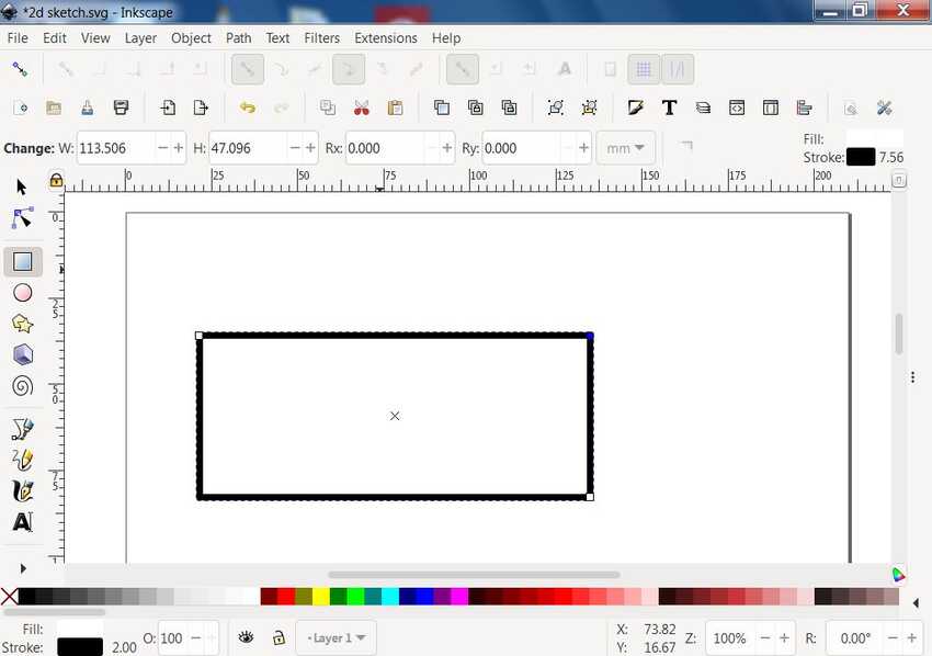
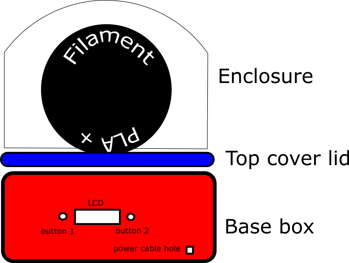
I decided to sketch my final project fab dryer on inkscape as my normal sketch on paper is not proper. To start with, I opened the application into a new file. I drew a rectangle and kept its stroke width 5mm and infill white. All these settings can be set from the toolbar or keyboard command shift + white color from the colors on the bottom. For reference we can name this rectangle base box as it will be the base of my project.
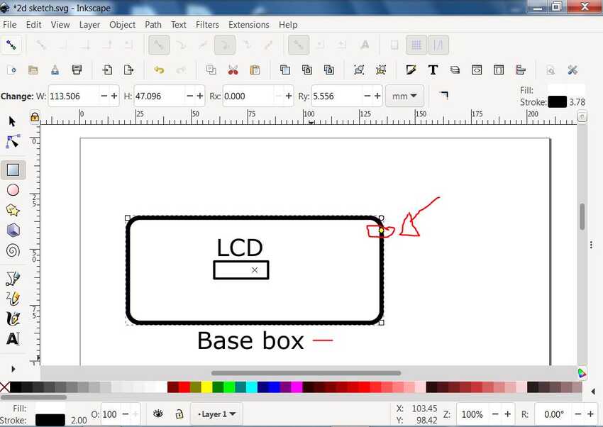
I made a round effect on the end of the box kind of fillet by clicking and dragging the right top point downward.
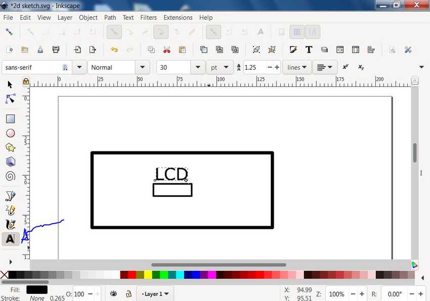
Then another rectangle for LCD on the front of the box and from text tool I wrote LCD so everyone can understand the meaning of the other rectangle.
And added 2 button holes on side of the lcd and a small power cable hole on the bottom right and added text for each of them.
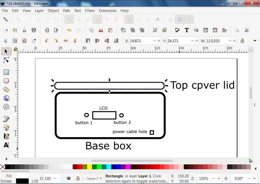
Added another rectangle for the top cover lid of the box and changed stroke width to 1mm and kept the shape feature rounded. And added its name beside it by using the text tool.
I realized that I was on the top of the page and the space was not enough for the enclosure, so I selected all (both rectangles) , grouped it by using the group feature from the top bar and moved it in the middle of the page.
Then by using the
bezier tool
I drew the enclosure freehand. I used the regular path in the bezier tool to draw the right, bottom and left border of the enclosure. Then without exiting the tool I changed from regular path to SP path for making an arc dom type semi circle on the top to complete my enclosure drawing.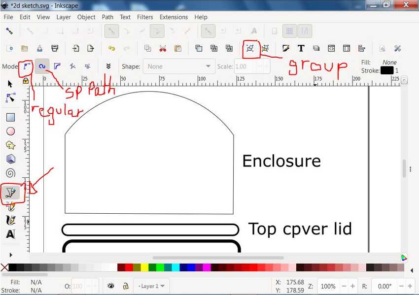
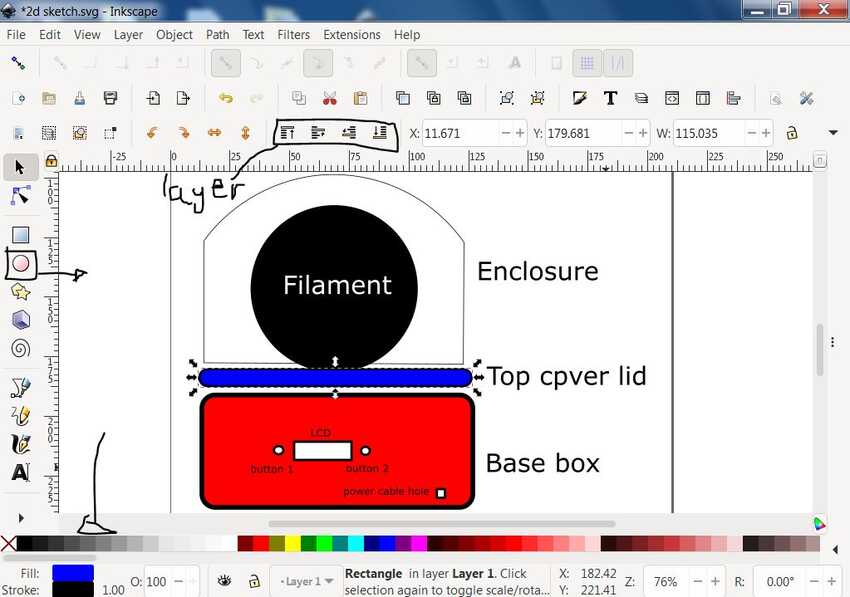
Next I drew a filament spool with the circle tool and for uniform scaling I kept pressing on cntrl + shift with the right mouse button as I dragged to draw the circle. By using the selection tool I moved the circle to position it in the bottom center of the enclosure so that its rest on the top cover lid rectangle.
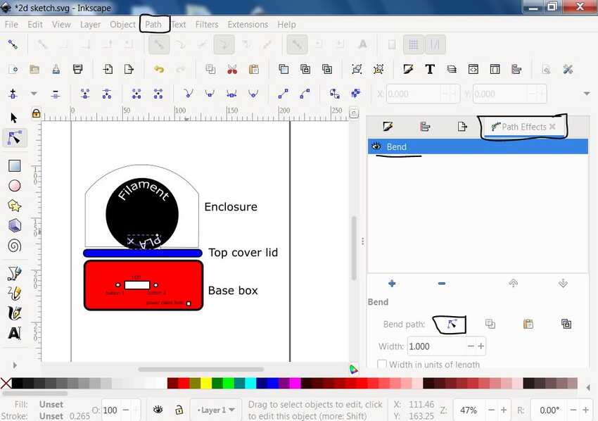
I decided to change the alignment of the text on the spool to be rounded (follow a circle path), so to do that I first converted the text “filament” & “PLA +” into path by selecting them and then going to path dropdown menu from the top, then selecting object to path. While I kept it selected I went again to the path dropdown menu and selected path effects, in which I added the bending effect and selected the on canvas tool to bend the both text freely around the circle.
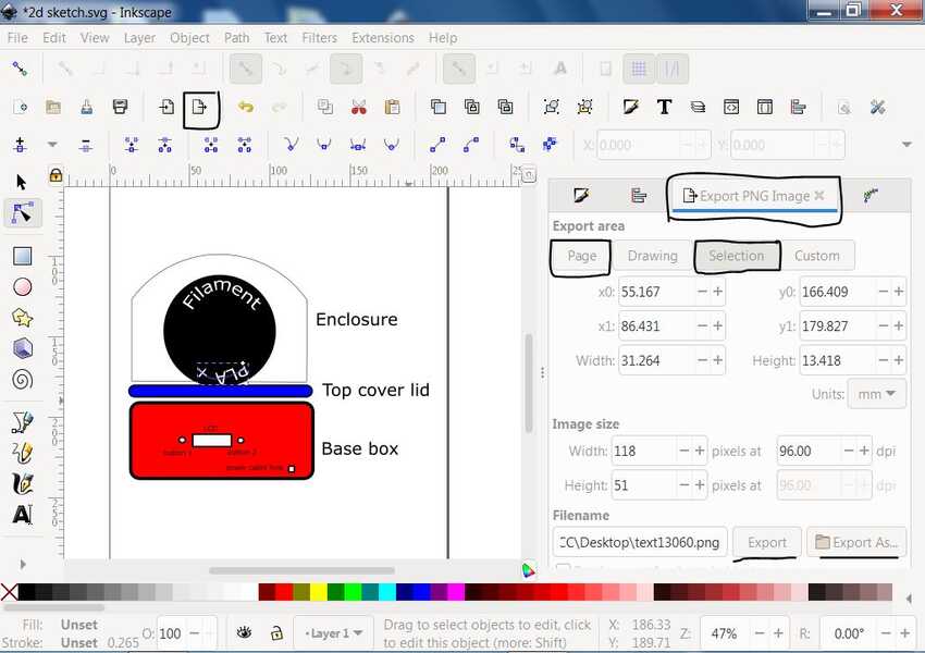
Then I exported the final image in jpeg so I selected all and then clicked on the export button (located on the top toolbar). In the export options I made sure it's on the selection tab not on the full page then I clicked export as to change the location, name (if desired) and the format from png to jpg.
Voila its done
Fusion360
First I saved a new file with the name project-base as I was thinking of designing each part in separate files.
At this stage, I still didn’t have enough knowledge to get exact measurements of my final project. So I used a parameter tool which can create equations and relationships to control the size of objects. For more information see here.
And I started with a small model in my mind with simple measurements which I knew that in the further process I would change according to the proportionate.
Note: Throughout the process of designing my full final project I returned to this tool and kept adding parameters with specific names so that in the future it can be changed easily.
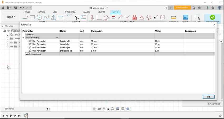
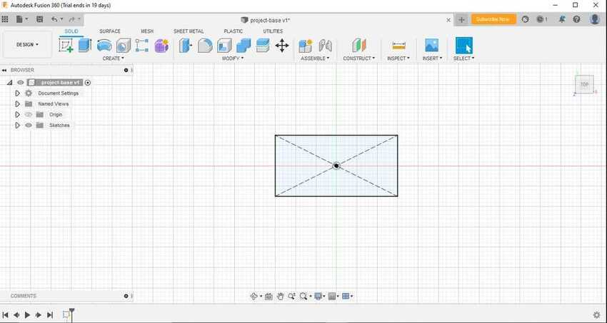
Then I started a new sketch and drew a centered-rectangle (to keep the origin point in the middle so that my full sketch can be fully defined and makes it easy to mirror anything in the future processes). I added dimensions which i had saved in the parameter tool. i.e. baseLenght - baseWidth.
Then I clicked on the finished sketch and clicked on the extrude tool (dimensions baseHeight).
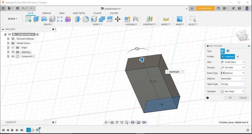
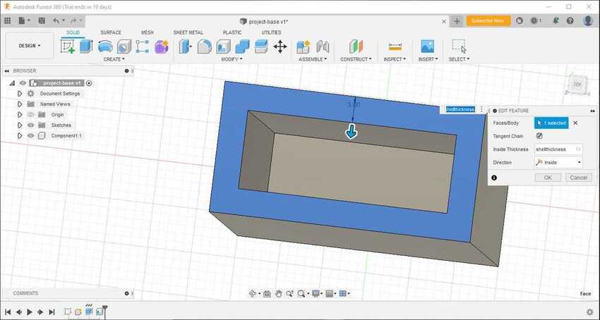
I used the shell tool (dimensions shellthickness) to give the container / hollow in center effect.
For some aesthetic view I used a fillet tool inside and outside the rectangular container structure which gave it a very smooth and nice looking round box base.
Then I started to draw a 2d sketch where the lcd might be and 2 buttons beside it. By clicking on a new sketch and clicking on the front side of the base box. Then I used the extrude cut command to make hole in that box.
In the 2d sketch process I had used the mirror tool to mirror the second button hole for exact location and dimensions.
The base of my fab dryer was completed.
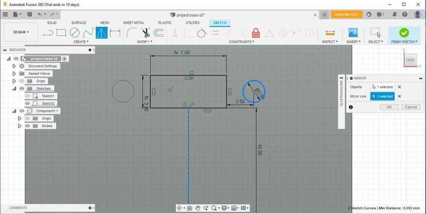
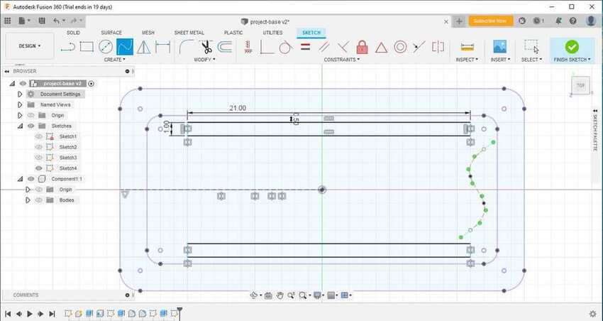
I started designing the top cover lid of the box which I had thought to design some holes on it to ease the convection process (allowing the hot air around the heater to rise up). So to start with, I used the project tool to project the top of the base box on a new sketch. This tool helped to save time as I didn’t have to draw the same sketch all over again.
Then I drew 2 long rectangles beside the top and the bottom border as shown in the picture with the dimensions of 1 x 21 mm. These 2 rectangles will be used as a single filament holder / more surface area for the convection process if used as a portable device.
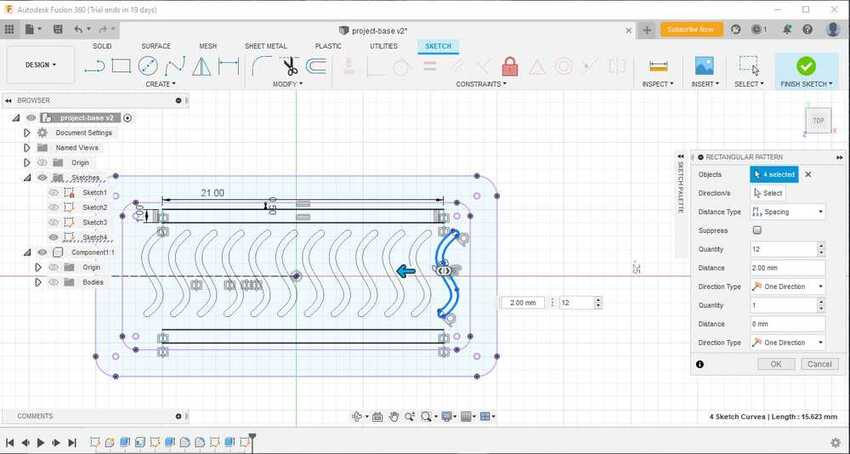
As for the holes in the middle of the top cover lid, instead of holes I thought to design something new. So I used the SPLine tool, which gave me freedom to design what I wanted without constraints. I couldn’t choose from many great designs from my head, so I decided to keep it simple and designed an S shape by SPLine and then using an offset tool to make another same shaped line in 1 mm offset. I connected both SPLine by arc tool to give a nice and smooth round effect on both sides.
Then I used rectangular pattern tool to duplicate it in certain amount and between specific spacing (2mm spacing and count 12).
In the end, I used the extrude tool to give the top cover lid 5mm thickness. It extruded all without the 2 rectangles and the S shape pattern parts to give a kind of nice ventilation holes look.
To use my fab dryer (final project) for a single filament use, it will need an enclosure. So I thought of a transparent acrylic semi circle enclosure. I started designing it by first disabling the view of the remaining 2 components, the lid and the box, then going back to the previous top cover lid sketch and extruding the whole projection into 20mm height.
Tip: In this process remember not to choose join extrude but a new component to make it separate from the other components.
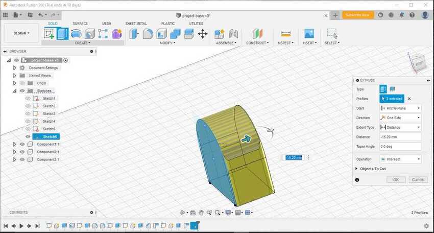
I sketched on the front side dom type semi circle on the front plane of that extruded part and selected extrude- intersect, which kept the intersecting parts between the sketch and the previous extruded part as shown in the picture. Lastly, I used the shell tool again to give it a hollow container shape (2mm shell thickness) to fit on the lid perfectly.
Modeling is done :)
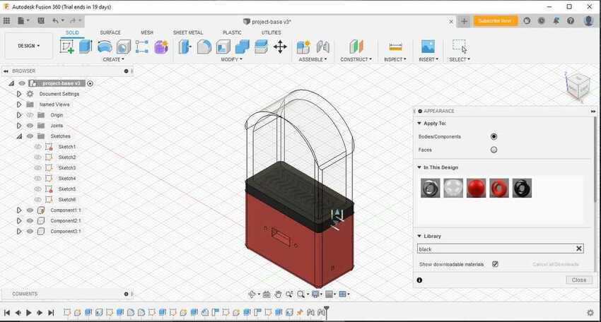
I added colors from the appearance tool:
Then I rendered it by going to the render workspace on the top left corner.
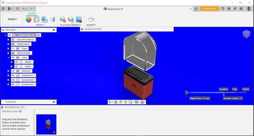
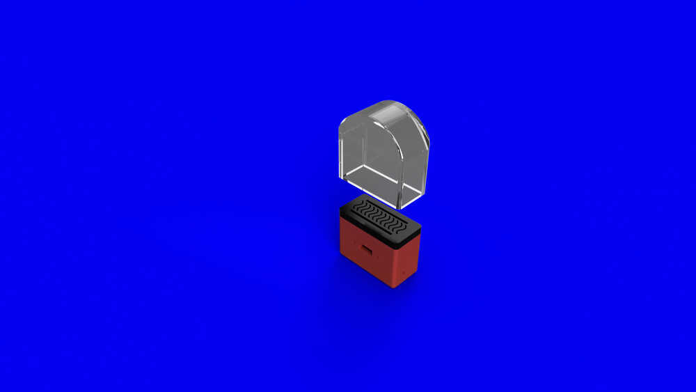
After rendering I exported the image.
For some visual effects I used the join assembly tool to give animation for the enclosure, slider movement on y axis. Also I have set limitations to move up direction only by right click and set animation limits, set 0 in the minimum limit and 15 in the maximum limit. Then to render the video of the animation I have set animation status . In the end rendered again by using cloud.
Voila here is the video.
Blender
One of the famous features of blender is simulation rendering. That is why I simulated my assignment in this application.
I downloaded the blender application by visiting its official site.
Tip I had exported 3d modeled parts from fusion 360 as .STL format so that I can import them in blender.
I opened the application after completing the installation process, deleted the cube by selecting on it and pressing delete key from the keyboard. To import the .STL files I navigated to the file menu and selected “import- .STL “ and imported my 3 STL files into the application.
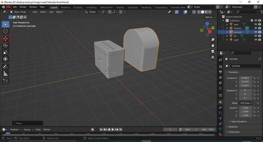
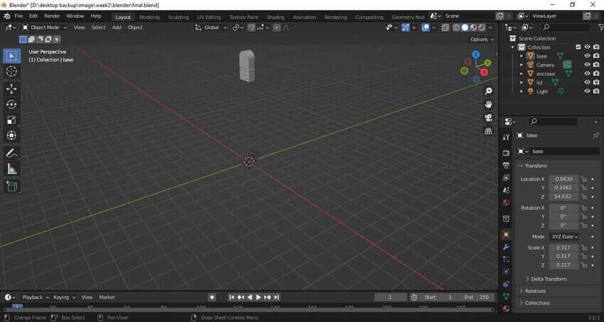
By using the move tool which is located on the left hand side bar (or pressing “g” on the keyboard) I separated them and arranged them on top of each other to look as a whole product, then moved them upwards on the z axis as shown in the picture.
Tip: while using the move tool I clicked on the middle mouse scroll button so that it would snap to the 3 axis and move according to it.
I Added a new plane by the origin point so that it is situated under the 3 parts, by pressing shift+A on the keyboard and then choosing mesh - plane. Or from the add menu on the top bar - mesh - plane.
By pressing the s key on the keyboard or the scale tool on the left side bar I scaled up the plane for more surface area.
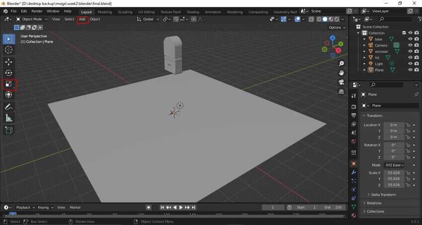
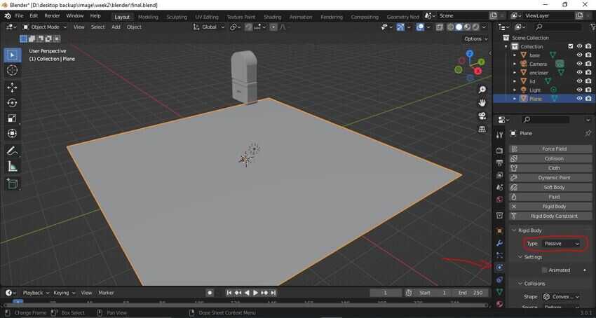
While the plane is still the only one selected, I navigated to the physics properties from the right bottom side, selected Rigid body constraints and changed the type into passive mode. While for the other parts I kept the type active mode so it activated the gravitational effect.
For appearance, I navigated to the appearance tools beneath the physical properties tab and changed the base color for each of the parts. I also checked the preview check box to see the changes on the part.
Tip:the colors will appear in the rendering workspace only , but due to technical issues with my laptop I could not work in the rendering workspace.
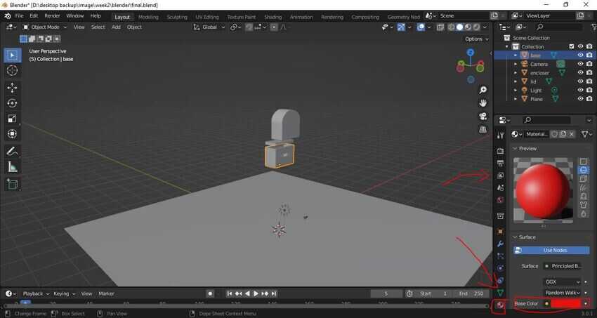
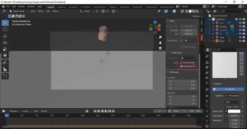
Next step was to set up the simulation camera view. To do that I entered the camera view by pressing ` key (located before number 1 key top left side of the keyboard beneath esc key) which nobody uses :)
Tip:Also it can be entered by clicking on the white camera icon which is visible on the right side of the workspace.
After entering the camera view I navigated to the view tab and checked on the “camera to view” check box to move and set the angle by using the same move tool keys.
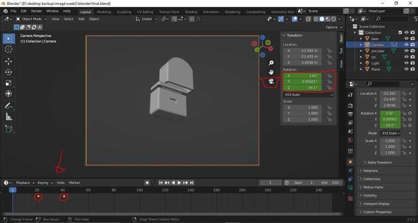
Since a wide angle view was needed to view the full simulation, instead I used the location animation tool on the camera itself so it can move with the parts falling down. I navigated to the item tab and moved the cursor on the rotation coordinates and pressed the I key on the keyboard to set a keyframe in the frames bar which is located under the workspace. The color of the coordinate will change into yellow and a point will be inserted in the frame bar. That means the first/ starting point is set. Then I clicked and dragged left on the x coordinate in the rotation, to move the angle from top to the bottom and pressed the I key again to set the end point of the animation.
Tip:I balanced the animation of the angle view with the simulation of the parts falling down by pressing the spacebar to start merging and simulating. I adjusted the keyframe accordingly.
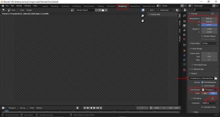
Before rendering I changed the output settings, so i navigated to the rendering workspace, clicked on the output settings tab on the right side and changed the resolution to 800 x 600, the export file path, the file format to ffmpeg and in the dropdown menu of the encoding i chose MPEG-4. Tip:change the lighting effect as well. I was too excited for this moment as I was doing this for the first time of my life, I clicked on the render tab on the top bar - render animation. The application started rendering. To my surprise, yes my laptop started heating up but it didn’t take much time. And finally it was done.
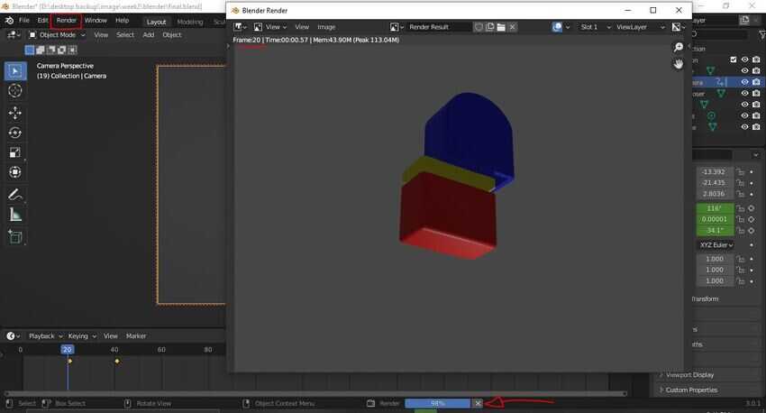
Enjoy the simulation as I did :)
Voila its done
#Challenges 1
Designing 3D with only watching tutorials that has no dimension sheets for me was very time consuming. It made me realize the importance of dimension sheets.
#Solution 1
I shared this issue with my friends / colleagues of fab academy so someone had the dimension sheets for toturials I was looking for and was shared with me.
#Challenges 2
I compressed a video for the first time and pushed it on the git repo. On the VS code live server the video works well, but actually on the web it is not working..
#Solution 2
It was a path mistake, the path starts with folder name directly but I may have accidently added “/” before the first folder path :).
