Development Tools
An overview of the platforms and tools used during my Fab Academy journey to support project development and documentation.
Documentation and Project Management
-
Web Development Environment
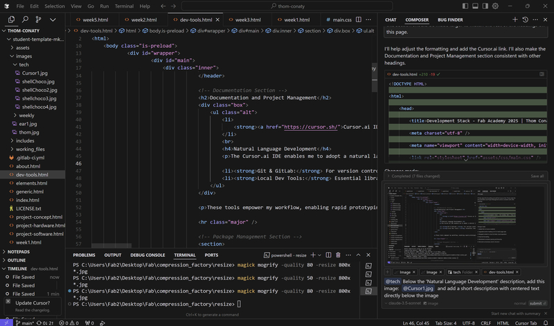
My primary unified development environment and AI coding assistant is Cursor.ai. Within Cursor, I primarily collaborate with **Google's Gemini 2.5 Pro** (specifically, the experimental version available as of April 30th, 2025) for the bulk of my development, documentation, and research tasks. Gemini's strong performance in reasoning, code generation, web search integration, and its ability to handle a **very large context window (up to 2 million tokens)** make it an exceptionally reliable and versatile partner for this project. Furthermore, its current availability at **no cost** is a significant advantage.
While I occasionally utilize other models like Anthropic's Claude for specific programming tasks, I find myself increasingly relying on Gemini 2.5 Pro for almost all aspects due to its integrated capabilities and reliability. Working within the `student-template-mkdocs` directory (based on the Editorial template from HTML5UP.com), I leverage the `elements.html` file as a component library for consistent styling across my documentation. This workflow allows me to focus on content while the AI assists with implementation.
Gemini's Deep Research Mode
A notable feature available through the Gemini application is its **Deep Research mode**. This mode conducts astonishingly thorough investigations into topics, providing detailed reports complete with cited references. These comprehensive research reports can be directly saved to Google Drive, proving invaluable for gathering in-depth background information and verifying technical details.
- notes.md - Contains interesting links, references, details for the Quick Summary section, assignments list, and general notes
- Process-Documentation.md - Outlines my detailed process documentation for the weekly assignments, including images, steps, and technical details
- File structure and naming conventions
- HTML template structure with proper component references
- Content organization patterns
- Tab system implementation
- Troubleshooting common issues
- Direct communication with an LLM model/AI agent using plain English
- Context-aware code suggestions and implementations
- Real-time code previews and explanations
- Version control integration for immediate commits
- Understanding the project's file structure and relationships
- Remembering previous edits and their purposes
- Recognizing HTML5UP template components and styling
- Tracking changes across multiple files
- Maintaining consistent formatting and documentation style
- Clear, Specific Requests: Provide well-defined tasks rather than vague directions. Go into as much detail on the task, the context, and any examples as possible.
- Relevant Context: Background information and project requirements are essential to maintain conherence. Ensure you are providing content that is relevant to the task at hand.
- Examples: When available, use similar code or designs as reference points
- Work step by step: Break down large tasks or code changes into smaller, sequential steps.
- Be aware of the context (length): Similarily, be aware of how large the LLM's content window is (in Cursor.ai). If you're asking it to do something that requires more than (max) 2000 tokens, you'll need to break it down into smaller steps. As the length of the chat gets longer, the LLM may start to repeat itself and the quality of the responses will decrease, so it may make sense to open a new Composer/Chat window.
- Test early and often: Implement testing strategies to validate the code and documentation This allows for better tracking of progress and easier debugging.
- Contextual Analysis: The AI analyzes the provided images to understand their content and relevance to the documented process steps (e.g., identifying a screenshot as showing a Blender setup for mould design).
- Automated Integration: Based on the analysis, the AI proposes and implements the necessary code to embed the images directly into the documentation (both HTML and source Markdown files) at the appropriate locations, using correct syntax and adding descriptive alt text and captions.
- Information Extraction: The AI can often extract key details directly from the images (like software settings visible in screenshots, material labels on packaging, or hardware components shown) and update the textual documentation accordingly, reducing manual data entry and ensuring accuracy.
- Image Provision: I provide the relevant images for a specific week, often attaching them directly or placing them in a designated folder and informing the AI agent of their location.
- AI Image Analysis: The AI agent (Gemini) analyzes the content of each image.
- Contextual Placement: Leveraging the analysis of the image content along with the provided source documents (primarily `notes.md` and `Process-Documentation.md`), the AI identifies the appropriate step or section within the documentation where the image should be placed for maximum relevance.
- Information Extraction: The AI extracts relevant details visible in the images (e.g., material names, brands, machine settings, specific actions being performed).
- Integration and Update: The AI integrates the image into the document using the correct syntax (Markdown image links or HTML `
` tags), generates descriptive alt text and captions, and updates the surrounding text to incorporate the extracted information.
- Assign IDs to Section Headings: Ensure each main section heading (e.g., `
`) has a unique `id` attribute (e.g., `
Research
`). - Create the HTML Box: Add a `div` near the top of the page content. Inside this `div`, create an unordered list (`
- `) where each list item (`
- `) contains an anchor link (``) pointing to a section ID (e.g., `Research`). **Note:** This list needs to be manually updated for each specific weekly page to reflect its unique sections.
- Add CSS Styling: Define CSS rules to style the box and position it appropriately, often floated to the right of the main content.
Web Page Creation Guide
To streamline the process of creating weekly documentation pages using our component-based architecture, I've developed a comprehensive guide specifically for the LLM (Claude-3.5-Sonnet) that I am collaborating with in Cursor.ai to build this website. The Weekly HTML Creation Guide provides step-by-step instructions for creating new weekly HTML pages with proper structure, component integration, and styling. This guide serves as both documentation for my own reference and as structured instructions for the AI to follow when we create new pages. We go into more details on this collaboration process in the Natural Language Development section below.
My content creation workflow utilizes two primary markdown files for each week:
These markdown files, along with other relevant context like previous weeks' documentation or specific style guides, serve as the primary source material provided to the LLM. The AI and I then collaboratively transform this input into properly structured HTML, incorporating the necessary styling and component integration as outlined in the guide.
The guide covers:
This standardized approach ensures consistency across all weekly documentation and significantly reduces development time for new pages.
Natural Language Development
The Cursor.ai IDE enables me to adopt a natural language approach to development, using conversational prompts in the 'Composer' tab to describe desired changes and updates to my documentation. This method, combined with a foundational knowledge of HTML, CSS, and JavaScript, has proven highly effective for rapid iteration and consistent documentation. Rather than writing HTML directly, I describe the intended changes in plain English, allowing the AI to handle the technical implementation while I focus on content and structure. Where needed, small adjustments or additions can be made to the codebase to achieve the desired result.
Using natural language input to describe desired changes while the AI maintains context of the project structure
Composer
The Composer tab in Cursor.ai serves as an intelligent interface for natural language programming. It enables:
AI Agent
The AI agent maintains context throughout the development session by:
This contextual awareness allows for more natural and efficient development conversations, as the AI understands both the immediate task and the broader project context.
Natural Language Input & Context
Working with AI tools required me to develop effective communication patterns to produce high-quality documentation consistently. I discovered that the results weren't just dependent on the capabilities of the AI, but significantly on how I structured my requests and provided context. When implementing the component-based architecture for this site, I used several key communication strategies that dramatically improved the quality of the generated code and documentation.
Through experimentation and iteration, I identified these essential elements for effective collaboration with AI coding assistants:
Image Integration with AI Assistance
A significant enhancement to the natural language workflow involves integrating visual documentation. By providing relevant images (e.g., attaching them directly in the chat or listing filenames), I can leverage the AI assistant's capabilities for more than just code generation:
This collaborative image integration technique, demonstrated effectively during the creation of the Week 13: Moulding and Casting documentation, streamlines the process of creating visually rich and informative documentation, further enhancing the efficiency of the natural language development approach.
Image Integration Workflow
A particularly effective workflow emerged for integrating visual documentation, complementing the text-based inputs (Markdown files, context). This process involves:
This collaborative workflow significantly streamlines the process of adding and describing images, ensuring they are placed contextually and that valuable information depicted visually is also captured textually in the documentation.
In-Page Navigation (Table of Contents Box)
For longer weekly pages with multiple sections, implementing an in-page navigation box (similar to a Table of Contents) greatly improves usability. This allows users to quickly jump to specific sections of interest without excessive scrolling. The approach involves using HTML anchor links (`#`) that correspond to `id` attributes on section headings.
Implementation Steps:
Example HTML Structure:
<div class="inpage-nav-box">
    <h4>On This Page</h4>
    <ul>
        <!-- Customize these links for EACH weekly page -->
        <li><a href="#research-section">Research</a></li>
        <li><a href="#design-section">Design</a></li>
        <li><a href="#build-process-section">Build Process</a></li>
        <!-- Add more links as needed -->
    </ul>
</div>
Example CSS Styling:
(Add the following rules to your main CSS file or within <style> tags in the <head> of the specific page. The rules for parent elements might be in a global CSS file like 'main.css'.)
.inpage-nav-box {
    float: right;             /* Allows content to flow to its left initially */
    position: -webkit-sticky; /* For Safari compatibility */
    position: sticky;         /* Makes the element sticky on scroll */
    top: 20px;                /* Distance from viewport top when sticky */
    width: 220px;             /* Fixed width for the navigation box */
    /* margin-left: auto; */  /* Removed as float handles right alignment */
    margin-bottom: 1.5em;     /* Space below the box */
    background-color: #f8f8f8;
    border: 1px solid #e0e0e0;
    padding: 15px;
    border-radius: 8px;
    box-shadow: 0 2px 4px rgba(0,0,0,0.05);
    font-size: 0.9em;
    z-index: 1000;            /* Ensures it stays on top of other content */
}

.inpage-nav-box h4 {
    margin-top: 0;
    margin-bottom: 12px;
    font-size: 1em;
    font-weight: bold;
    color: #3d4449;
    border-bottom: 1px solid #e0e0e0;
    padding-bottom: 8px;
}

.inpage-nav-box ul {
    list-style: none;
    padding: 0;
    margin: 0;
}

.inpage-nav-box ul li {
    margin-bottom: 8px;
}

.inpage-nav-box ul li:last-child {
    margin-bottom: 0;
}

.inpage-nav-box ul li a {
    text-decoration: none;
    color: #2980B9;
    display: block;
    padding: 3px 0;
}

.inpage-nav-box ul li a:hover {
    text-decoration: underline;
    color: #1c6691;
}

/* IMPORTANT: Parent container adjustments for sticky positioning */

/* 1. Immediate parent section of the content that loads into #content-container */
/*    This rule should be in the page-specific <style> block or a relevant CSS file. */
/*    The 'overflow: auto' was for float containment, ensure it's commented out or removed */
/*    if it interferes with sticky positioning relative to the viewport. */
#content-container > section:first-of-type {
    /* overflow: auto; /* Original for float, might conflict with sticky to viewport */ */
    /* No explicit overflow is often best for sticky, or 'overflow: visible;' */
}

/* 2. Style for #main > .inner (likely in your global main.css) */
/*    Any 'overflow' other than 'visible' on an ancestor can break sticky positioning */
/*    relative to the viewport. 'overflow-x: visible;' was key. */
#main > .inner {
    /* padding: 3em 3em 1em 3em ; */ /* Example padding */
    /* max-width: 68em; */          /* Example max-width */
    /* margin: 0 auto; */
    overflow-x: visible; /* Crucial for allowing sticky to work correctly */
    /* Other styles for #main > .inner ... */
}
Component-Based Architecture Implementation
I implemented a component-based architecture for this website to enhance maintainability and reduce duplication of code. This approach allows common elements like headers, footers, and page structure to be defined once and reused across multiple pages, making updates more efficient and ensuring consistency.
Architecture Design
The architecture uses a component loader system that dynamically injects HTML components into pages at runtime. This creates a modular structure where:
- Common elements (header, footer, sidebar, page structure) are defined in separate files
- Weekly content is isolated in dedicated files
- Pages become lightweight shells that load the appropriate components
The system follows these principles:
- Separation of concerns
- Don't Repeat Yourself (DRY)
- Progressive enhancement
- Graceful degradation
JS & HTMLComponent Code
The following code is used to load the components and content into the page.
Component Loader
document.addEventListener('DOMContentLoaded', function() {
    // Define openTab function globally so it's available for tab buttons
    window.openTab = function(event, tabName) {
        var i, tabcontent, tabbuttons;
        tabcontent = document.getElementsByClassName("tab-content");
        for (i = 0; i < tabcontent.length; i++) {
            tabcontent[i].style.display = "none";
        }
        tabbuttons = document.getElementsByClassName("tab-button");
        for (i = 0; i < tabbuttons.length; i++) {
            tabbuttons[i].className = tabbuttons[i].className.replace(" active", "");
        }
        const tabElement = document.getElementById(tabName);
        if (tabElement) {
            tabElement.style.display = "block";
        } else {
            console.error(`Tab content with id "${tabName}" not found`);
            const firstTab = document.querySelector('.tab-content');
            if (firstTab) firstTab.style.display = "block";
        }
        event.currentTarget.className += " active";
    };

    // Get base URL for proper path resolution
    const basePath = window.location.pathname.substring(0, window.location.pathname.lastIndexOf('/') + 1);

    // Get base path as a relative path that works in both development and production
    const relativePath = window.location.hostname === 'localhost' ? '../' : basePath;

    function loadComponent(elementId, componentName) {
        const element = document.getElementById(elementId);
        if (!element) {
            console.error(`Element with ID "${elementId}" not found`);
            return;
        }

        const url = `${basePath}includes/${componentName}.html`;

        const xhr = new XMLHttpRequest();
        xhr.onreadystatechange = function() {
            if (xhr.readyState === 4) {
                if (xhr.status === 200) {
                    // Fix paths in the loaded HTML content
                    let content = xhr.responseText;
                    if (content) {
                        // Handle various path patterns that might be used in components
                        content = content.replace(/href="\.\.\/assets\//g, `href="${basePath}assets/`);
                        content = content.replace(/href="assets\//g, `href="${basePath}assets/`);
                        content = content.replace(/src="\.\.\/assets\//g, `src="${basePath}assets/`);
                        content = content.replace(/src="assets\//g, `src="${basePath}assets/`);

                        element.innerHTML = content;

                        // Hide fallback content
                        const fallback = document.getElementById('fallback-content');
                        if (fallback) fallback.style.display = 'none';
                    }
                }
            }
        };
        xhr.open('GET', url, true);
        xhr.send();
    }

   // Process all component elements
   const componentElements = document.querySelectorAll('[data-component]');
   componentElements.forEach(element => {
       const componentName = element.getAttribute('data-component');
       loadComponent(element.id || generateId(element), componentName);
   });

   // Process all content elements
   setTimeout(function loadContent(retryCount = 0) {
       const contentElements = document.querySelectorAll('[data-content]');
       const contentContainer = document.getElementById('content-container');

       if (contentElements.length > 0 && contentContainer) {
           contentElements.forEach(element => {
               const contentName = element.getAttribute('data-content');
               loadComponent('content-container', contentName);
           });
       }
   }, 300);

   // Helper function to generate ID for elements without an ID
   function generateId(element) {
       const id = 'comp-' + Math.random().toString(36).substr(2, 9);
       element.id = id;
       return id;
   }
});
Main Component Loader
Description: This script handles the loading of all HTML components at runtime. It fetches component files from the server, adjusts any relative paths to ensure resources load correctly, and injects the content into the appropriate page elements. It also defines the tab functionality used across weekly pages.
Page Structure Component
<div id="wrapper">
    <div id="main">
        <div class="inner">
            <!-- Header -->
            <header id="header">
                <a href="index.html" class="logo"><strong>Fab Academy 2025 |</strong> Thom Conaty</a>
                <ul class="icons">
                    <li><a href="https://gitlab.fabcloud.org/academany/fabacademy/2025/labs/creativespark/students/thom-conaty" class="icon brands fa-gitlab"><span class="label">GitLab</span></a></li>
                    <li><a href="https://www.linkedin.com/in/thom-conaty-6801b944/" class="icon brands fa-linkedin"><span class="label">LinkedIn</span></a></li>
                    <li><a href="mailto:thomconaty@gmail.com" class="icon solid fa-envelope"><span class="label">Email</span></a></li>
                </ul>
            </header>

            <!-- Content will be inserted here -->
            <div id="content-container"></div>
        </div>
    </div>
    <!-- Sidebar placeholder -->
    <div id="sidebar"></div>
</div>
Page Structure Template
Description: This HTML structure defines the core layout for all pages. It includes placeholders for the header, content container, and sidebar. The component loader injects specific content into these placeholders based on the current page.
Sidebar Loader
document.addEventListener('DOMContentLoaded', function() {
// Allow some time for the page structure to load
setTimeout(function() {
// Check if sidebar already exists
let sidebarPlaceholder = document.getElementById('sidebar');
// If not, create it
if (!sidebarPlaceholder) {
console.log('Sidebar placeholder not found, creating one');
sidebarPlaceholder = document.createElement('div');
sidebarPlaceholder.id = 'sidebar';
const wrapper = document.getElementById('wrapper');
if (wrapper) {
wrapper.appendChild(sidebarPlaceholder);
} else {
console.error('Wrapper element not found, cannot create sidebar');
return;
}
}
// Fetch the sidebar content
const basePath = window.location.pathname.substring(0, window.location.pathname.lastIndexOf('/') + 1);
fetch(basePath + 'includes/sidebar.html')
.then(response => {
if (!response.ok) {
throw new Error(`HTTP error! status: ${response.status}`);
}
return response.text();
})
.then(data => {
document.getElementById('sidebar').innerHTML = data;
// Initialize sidebar functionality after content is loaded
if (window.$) {
// Initialize sidebar menu toggles
$('#sidebar .opener').on('click', function(event) {
event.preventDefault();
$(this).toggleClass('active');
$(this).next('ul').slideToggle();
});
}
})
.catch(error => {
console.error('Error loading sidebar:', error);
document.getElementById('sidebar').innerHTML = 'Error loading sidebar. Please check the console for details and refresh the page.
';
});
}, 500); // Wait 500ms for page structure to load
});
Navigation System
Description: This script handles the loading and initialization of the sidebar navigation. It fetches the sidebar HTML, injects it into the page, and sets up the interactive menu behavior for expandable navigation sections.
Content Component Example
<!-- Week Title and Overview -->
<section>
    <header class="main">
        <h1>Week 1: <span style="font-weight: normal;">Practices, Principles, and Project Management</span></h1>
        <h3 class="less-bold">Onboarding, website creation, and documentation practices</h3>
        <p class="week-date">Date: January 22 - January 29, 2025</p>
    </header>

    <!-- Main content sections -->
    <div class="tabs" id="week1-tabs">
        <div class="tab-buttons">
            <button class="tab-button active" data-tab="Notes">Notes</button>
            <button class="tab-button" data-tab="Assignments">Assignments</button>
        </div>

        <!-- Notes Tab -->
        <div id="Notes" class="tab-content active">
            <!-- Tab content here -->
        </div>

        <!-- Assignments Tab -->
        <div id="Assignments" class="tab-content">
            <!-- Tab content here -->
        </div>
    </div>
</section>
Weekly Content Structure
Description: This example shows the structure of a typical weekly content component. It includes a header with the week title and date, followed by tabbed content sections for Notes and Assignments. The content for each tab is dynamically loaded and styled within these containers.
Weekly Page Shell
<!DOCTYPE HTML>
<html>
	<head>
		<title>Week 1: Principles and Practices - Fab Academy 2025</title>
		<!-- Load common header component -->
		<div id="header-placeholder" data-component="header"></div>
		<!-- Fallback styles in case component loading fails -->
		<style>
			.fallback-message {
				max-width: 800px;
				margin: 100px auto;
				padding: 20px;
				background-color: #f8f8f8;
				border: 1px solid #ddd;
				border-radius: 5px;
				display: block;
			}
		</style>
	</head>
	<body class="is-preload">
		<!-- Fallback content that will be hidden when components load correctly -->
		<div id="fallback-content" class="fallback-message">
			<h2>Loading Page Content...</h2>
			<p>If you continue to see this message, the component system may not be loading correctly.</p>
			<p>Please check the browser console for any errors.</p>
		</div>

		<!-- Load page structure component -->
		<div id="structure-placeholder" data-component="page-structure"></div>

		<!-- Load week1 content -->
		<div data-content="week1-content"></div>

		<!-- Load common footer component -->
		<div id="footer-placeholder" data-component="footer"></div>

		<!-- Scripts -->
		<script src="assets/js/jquery.min.js"></script>
		<script src="assets/js/browser.min.js"></script>
		<script src="assets/js/breakpoints.min.js"></script>
		<script src="assets/js/util.js"></script>
		<script src="assets/js/main.js"></script>
		<script src="assets/js/path-corrected-loader.js"></script>
	</body>
</html>
Minimal HTML Framework
Description: This is the basic template for a weekly page. It's a minimal shell that includes placeholders for component loading. The actual content comes from separate component files, making maintenance much easier. Each weekly page follows this pattern with only the data-content attribute changing to load the appropriate content.
Development Process
- Component Identification: First, I identified common elements across pages that could be extracted into reusable components.
- Directory Structure: Created an 'includes' directory to store all component files:
- header.html - Common HTML head content
- footer.html - Scripts and common footer elements
- page-structure.html - Main page structure template
- sidebar.html - Website navigation sidebar
- week1-content.html, week2-content.html, etc. - Weekly content
- Component Loader: Developed a robust JavaScript component loader that:
- Resolves relative paths correctly in both development and production environments
- Handles error cases gracefully with fallbacks
- Ensures proper initialization order
- Provides debugging capabilities
- Path Resolution: Implemented a path correction system to ensure all assets load correctly regardless of where the component is included.
- Tab Functionality: Created a centralized tab system that properly initializes after dynamic content loading.
- Testing and Refinement: Thoroughly tested the component system across different pages and environments, addressing edge cases and improving performance.
Results
The resulting component architecture offers several benefits:
- Reduced Duplication: Common elements are defined once and reused across pages
- Simplified Maintenance: Updates to layout or structure can be made in one place
- Improved Performance: Pages load faster with optimized structures
- Enhanced Consistency: All pages maintain the same structure and styling
- Better Development Experience: Creating new weekly pages is now simpler with less code
Challenges and Lessons Learned
- Path Resolution: Relative paths within components required special handling to work correctly
- Loading Order: Components must load in the correct sequence for dependencies to work properly
- Content Preservation: Always preserve existing content when implementing structural changes
- Error Handling: Robust error handling is essential for component-based systems
- Browser Support: Different browsers handle dynamic content loading differently
- Documentation: Component systems require clear documentation for future maintenance
The component-based approach significantly improved the maintainability of the website while ensuring a consistent user experience across all pages.
These tools empower my workflow, enabling rapid prototyping, efficient debugging, and innovative project development. I will update this page as new tools are integrated into my process.
Package Management
Chocolatey is a powerful package manager for Windows that simplifies the installation and management of software. It eliminates the need for manual downloads, installations, and PATH configurations by automating these processes through simple command-line instructions.
Installing Chocolatey
Installation requires running PowerShell as Administrator and executing a single command:
Set-ExecutionPolicy Bypass -Scope Process -Force; [System.Net.ServicePointManager]::SecurityProtocol = [System.Net.ServicePointManager]::SecurityProtocol -bor 3072; iex ((New-Object System.Net.WebClient).DownloadString('https://community.chocolatey.org/install.ps1'))Step 1: Set Execution Policy and Initialize Installation
First, we need to set the PowerShell execution policy and start the Chocolatey installation process.
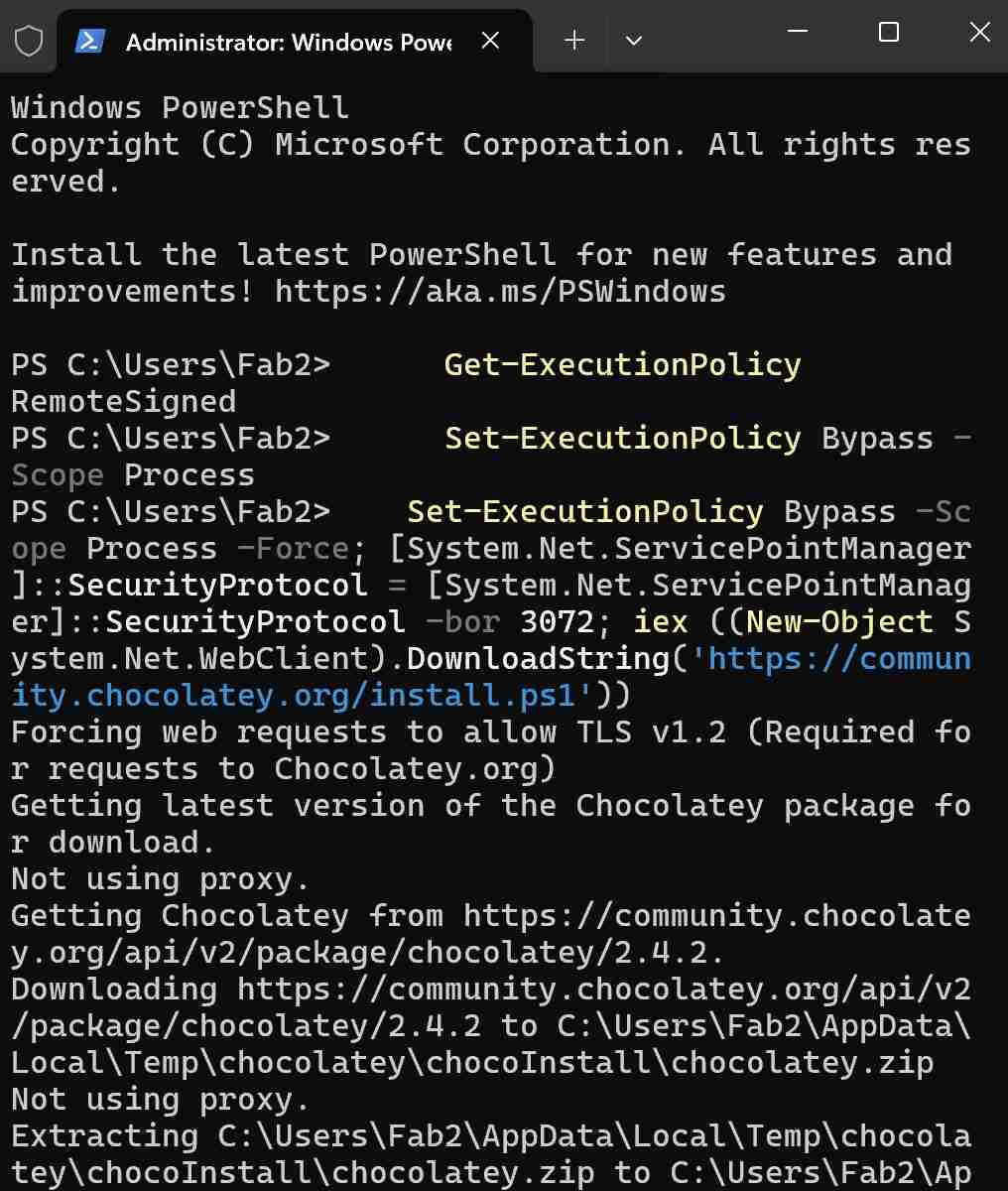
Step 2: Complete Chocolatey Installation
The installation script downloads and configures Chocolatey on your system.
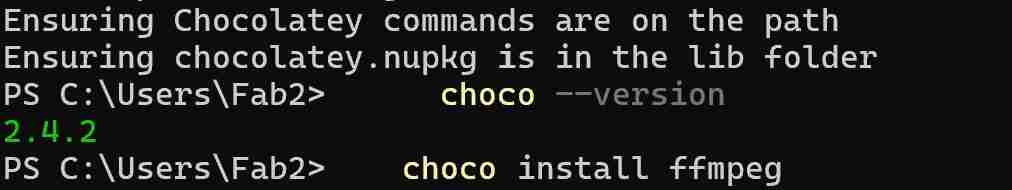
Installing FFmpeg with Chocolatey
FFmpeg installation becomes trivial with Chocolatey. Instead of manually downloading, extracting files, and configuring system paths, a single command handles everything:
choco install ffmpegThis command automatically:
- Downloads the latest stable version of FFmpeg
- Installs it in the appropriate location
- Configures system PATH variables
- Sets up necessary dependencies
Step 1: Run FFmpeg Installation Command
Execute the simple command to begin FFmpeg installation through Chocolatey.
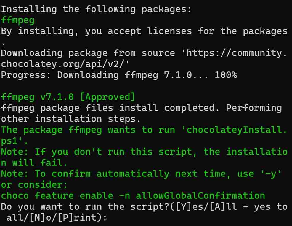
Step 2: Complete FFmpeg Installation
Chocolatey handles all the installation steps automatically, including PATH configuration.
Android
Termux
Termux is a powerful terminal emulator for Android that provides a Linux environment on your mobile device. It allows you to run a variety of Linux command-line utilities and even install additional packages using the APT package manager.
For a Fab Academy student, Termux is particularly useful because it enables you to:
- Access a full Linux shell on the go, making it easier to manage projects and repositories from anywhere.
- Run scripts and automate tasks directly from your phone, which is handy for quick edits or updates.
- Use SSH to connect to remote servers or your lab's network, facilitating remote work and collaboration.
- Experiment with Linux tools and commands in a mobile environment, enhancing your learning experience.

Termux running on an Android device
AI Tools
A collection of AI tools used throughout the documentation process.
Image Generation & Style Transfer
InstantStyle
InstantStyle - A style transfer tool hosted on Hugging Face that allows for artistic transformation of images.
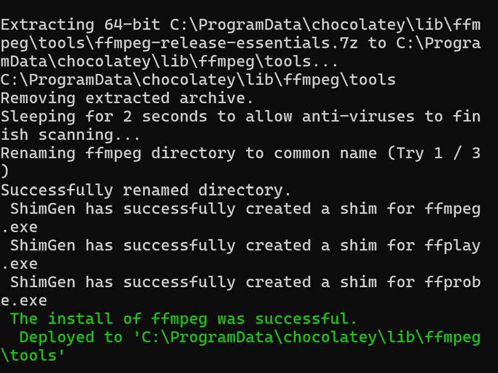
Usage Example: Week 4 Header Image
The header image for Week 4 (images\weekly\week4\theearhears.png) was created using InstantStyle with:
- Source Image: images\ear1.jpg
- Prompt: "The Ear hears"
- Settings: Default configuration
View Source and Result Images
Source Image:
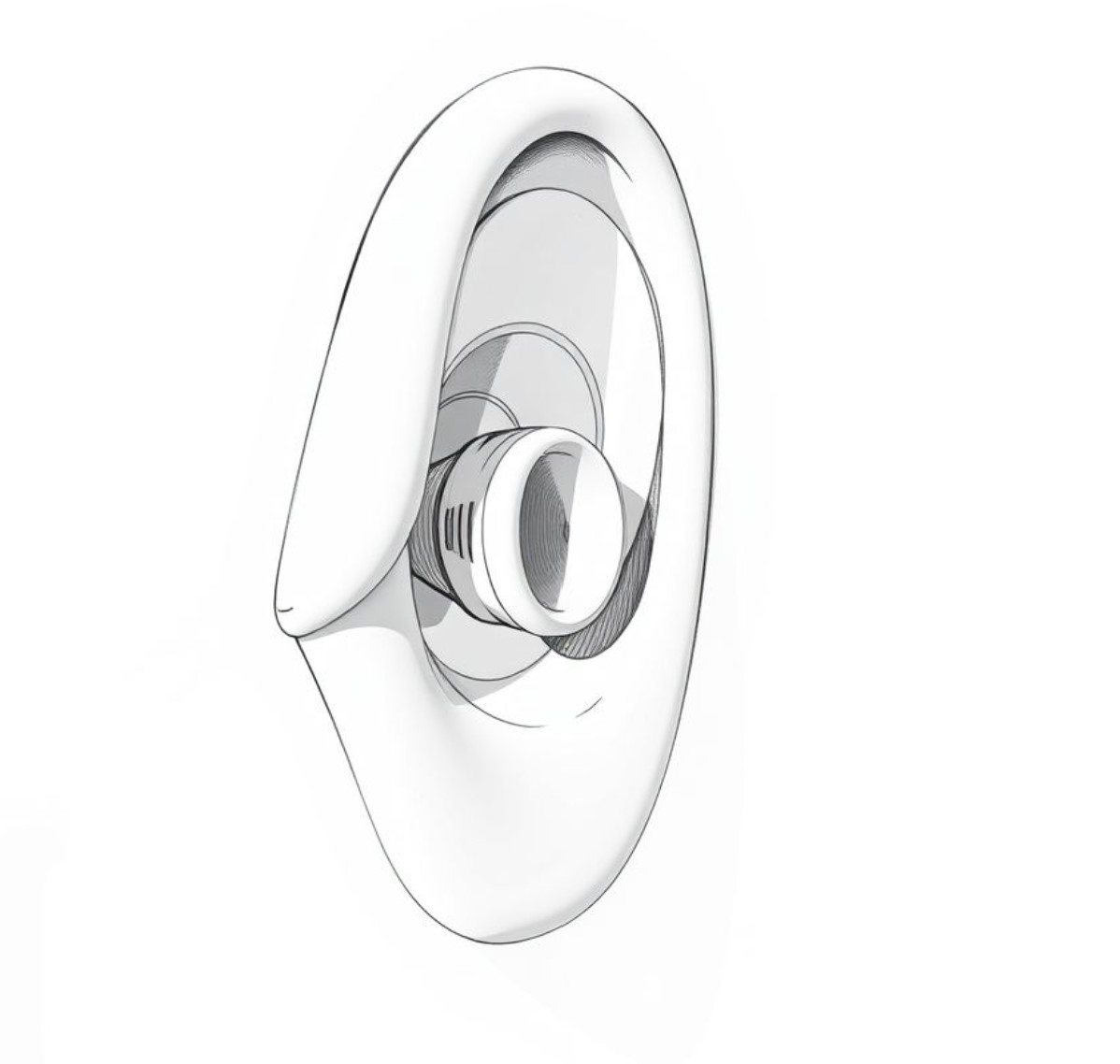
Result Image:
Stable Diffusion 3.5
Stable Diffusion 3.5 - A state-of-the-art text-to-image generation model hosted on Hugging Face. This latest version offers improved image quality, better text understanding, and enhanced creative control compared to previous versions.
Key Features
- High-resolution image generation
- Better understanding of text prompts
- Improved composition and detail
- More accurate representation of text in images
Usage Example: Sound Sensor Concept
Used Stable Diffusion 3.5 to generate a conceptual design for a bio-inspired sound sensor:
- Prompt: "Soviet constructivist technical drawing of a bionic ear sound sensor, minimalist line art, precision engineering sketch, white background"
- Settings: Default configuration
AI-generated concept sketch for bionic sound sensor
Video Compression (FFmpeg):
# Compress MP4 video to very small size while maintaining reasonable quality
ffmpeg -i input.mp4 -vf "scale=320:-2" -c:v libx264 -crf 30 -preset veryslow -c:a aac -b:a 32k output_tiny.mp4

# Speed up video by reducing duration to 1/3
ffmpeg -i input.mp4 -filter_complex "[0:v]setpts=0.333*PTS[v]" -map "[v]" -c:v libx264 output_fast.mp4

# Parameters explained:
# scale=320:-2     - Resize to 320px width, auto-height (must be even number)
# crf=30           - Quality (18-28 normal range, 30+ for smaller files)
# preset=veryslow  - Best compression (takes longer but smaller file)
# b:a 32k         - Audio bitrate (32k for smallest size)
# setpts=0.333*PTS - Speeds up video to 1/3 of original duration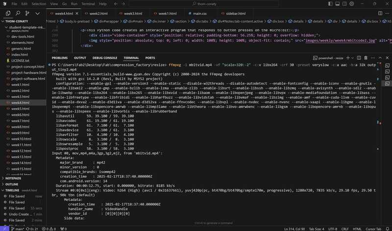
Deploying FFmpeg to compress and resize an MP4 video
Lessons Learned: Collaborating with an LLM on Web Development
Lessons provided by LLM (Gemini-2.0-pro-exp-0827) on 2025-02-23 15:12 UTC, based on collaborative experience with Thom Conaty in converting existing weekly project html to a new template, including challenges with duplicated content and maintaining structural integrity.
Start with a Solid Template
Provide a clear, well-structured HTML template from the beginning. This gives the LLM a consistent framework and reduces the risk of structural errors.
Be Extremely Specific with Instructions
Use precise language. Clearly state the file being modified, the exact location for changes (e.g., "within the 'Notes' tab, after the 'Introduction' section"), and the desired outcome. Ambiguity leads to mistakes.
Small, Incremental Changes
Request changes in small, manageable steps. Avoid large, complex modifications. Test frequently after each change.
Use Diffs, Not Full Code
Communicate changes using the "diff" format. This shows exactly what needs to be added, removed, or modified, reducing the chance of misinterpretation. The LLM is designed to work with diffs.
Double-Check the Diffs
Always carefully review the diffs provided by the LLM *before* applying them. Look for errors in file paths, line numbers, and unintended changes.
Understand the LLM's Limitations
Be aware of the LLM's context window limitations. Very large files or extensive back-and-forth conversations can lead to errors. Break down tasks accordingly.
Prioritize Deletion Over Addition (When Fixing Errors)
If the LLM introduces duplicate content, focus on *removing* the duplicates in small steps, rather than trying to rearrange large sections of code. Deletion is less prone to errors.
Maintain a "Mental Model" of the File
Keep track of the overall structure of your HTML file as you make changes. This helps prevent accidental misplacement of content or incorrect nesting.
Validate Frequently
Use an HTML validator regularly to catch structural errors early. This is especially important when working with complex layouts.
Patience and Persistence
Collaborating with an LLM can be powerful, but it also requires patience and a willingness to troubleshoot. Don't be discouraged by errors; learn from them.