Week 01: Principles and practices, project management

Ssh key setup

I am currently using the Linux Sub System in its version 2 with Ubuntu Focal, this allows me to have access to all the functionalities of a Linux operating system from my Windows 10 computer.

To configure the ssh key it is necessary to open our terminal and type the command.

                           ssh-keygen -t ed25519
                        

that command allows us to generate an ssh key with ED25519 specification which is more secure and efficient than RSA keys.

Now it is necessary to copy the generated key, for that we can open the file containing the key using the command

                           cat ~/.ssh/id_ed25519.pub
                        

Once you have copied the key you must go to the fabcloud account, and in the top right access the Settings.

Then in the left panel in the section SSH Keys.

That will show us a box where we must paste the key that we copied previously, gitlab allows us to assign a name that works as a personal reference in case we have several computers we can identify which computer that key belongs to.

We just need to add the key and check that everything is working correctly, we can verify that by typing the following command

                           ssh -T git@gitlab.fabcloud.org
                        

If everything went well the result should be a welcome from our gitlab user.

Git

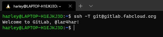
Now that we have the SSH key configured and working correctly, it's time to use some git to update our personal repository.

First you must open a terminal and using the command cd change to the address of your repository in my case it looks something like this.

If you don't have your remote repository on your local computer yet you can use.

                           git clone <address-of-your-repository>
                        

this downloads your remote repository to your computer at the location where you are currently located in the terminal.

You can now make some changes to the repository ...

After a while of making modifications it is necessary to add our files so that git can track the changes being made by using the command.

This means GIT ADD to the tracking all the files located in this folder (the dot means in the current folder), so it is important that the terminal is in our main repository directory.

To make sure that everything is included in the git tracking system there is a command that we can use

                           git status
                        

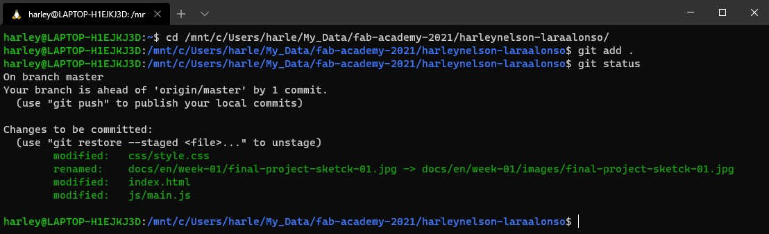
Here it is showing us the files that were modified and that git is tracking.

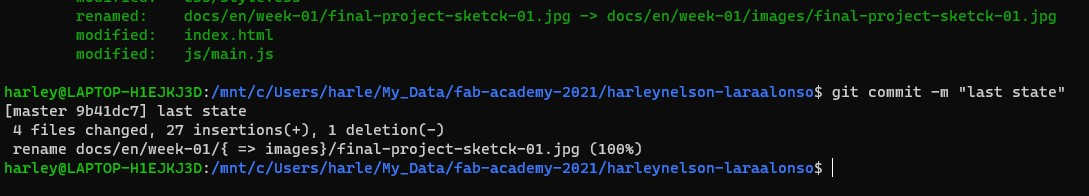
Now we need to save the current status of our local repository, this is known as commit, to do that task we use the command

                           git commit -m "Commit message"
                        

it is important to add a message using the -m argument, the message must be in quotes and briefly describe the last modifications.

We just need to send the current state of our local repository on our computer to the remote version in GitLab, as we have already configured our SSH Key this is an easy task, just type the command

                           git push origin master
                        

And that's it! our repository is updated with the latest changes we have made. It is important to mention that these changes sometimes take a few minutes to be visible on our website.

Website Design

This website was designed from scratch by me, I challenged myself to use only HTML CSS and Javascript without any external library, template or anything else and so far I think I'm on the right track.

In this section I will explain the steps I followed to make it although it is still in process so this section will be constantly updated. An important disclaimer is that I am NOT a designer or web developer and probably the methodology I describe below is probably not the best technically speaking, but beyond a technical point of view I took it as a more creative creation process, so those who are designers and are watching this section please don't be so rude with me hahaha. But despite that I hope it will be of much use for those who want to make their website from scratch or who want to insert some functionality that they see in this website.

Color selection

The group of colors that are used in a design process is known as color palette, it is important from the beginning to define a color palette because it brings consistency and coherence to the design, basically makes all the colors look harmonious with each other.

I do not plan to go into the subject of color psychology as that involves many topics so we will jump directly to the practical part.

On the internet there are many tools that allow us to create our own color palette or use an existing one. A website that I like a lot to create a color palette is Adobe Color-Wheel where we can select the type of description we want to give to our colors, whether they are analogous colors (meaning they are continuous on the color wheel), complementary (meaning they are at opposite ends), monochromatic (these are based on a single heat changing its intensity from light to dark), and many more distributions. If the goal is not to create a color palette or you are looking for an already created palette that you like I recommend you to visit the website Color Hunt there you will find a huge collection of color palettes that you can organize by popularity, new, trends or random. I decided to select a color palette based on the colors used by the Fab Academy because for me they convey modernity, fun, variety and innovation.

BUT selecting the color palette is not everything, the next step is to define how the colors will work together, which will be the main color and how it will interact with the rest of the colors, here is a matter of testing the combination that we like, this can be done with small figures in which each is a color of the color palette and start testing which color works better on another and which complement the main one. After trying some combinations I decided to use blue as the main color and the way it interacts with the rest is shown in the following image.

Typography selection

Another important aspect in a design is the selection of the typography since it will be responsible for conveying our message so it must be clear and easy to read, a good recommendation is to select a single typeface and play with different variants of thickness as regular, black or light, you can even get to use two fonts where the second is a complement to emphasize some titles or certain words, three or more fonts of course you can use all you want but it is increasingly complicated that all work together.

First I started with the main banner of the page as it would be the most complex since it must look good on all devices, for this I made an image that shows me the visible area available for each device.

Based on that I chose to design something where the main object would be in the center so that when viewed from a mobile phone it would not get lost in the non-visible area. If the design of the main banner contains many objects or has several points of interest depending on the device can be visible one area or another. The result of my design with the image of the different superimposed formats looks like this.

You can see that even if the page is visited from a mobile phone the character will always be visible.

After designing the main banner I designed an image to represent each section.

The Content

The content of the website at least in the main area I decided to keep it short and concise, there is not much mystery in this part.

The Code

Here I won't go into too much depth since the complete code is completely visible and can be visited whenever you want, besides you are welcome to ask if you have any specific question or you would like to implement something you saw in this or another website you can ask me how to do it, I probably don't know how to do it either hahaha but I would love to learn together with you.

HTML

A web page is essentially composed of 3 files, one the HTML that defines the structure and content of the page, then the CSS this defines the style of the page, colors, sizes, margin separations and many more things, and finally a Javascript file, the latter allows us to add interactivity to our website (although you can also add some interactivity with CSS but it is somewhat limited compared to Javascript).

The HTML of this web is distributed in sections, remember that previously we defined the sections and the distribution of the content here is where that is very useful. Then the different parts of the section like the image, the text or the buttons are inside a <div> tag.

The HTML is really quite simple.

CSS

This is where the main part of the matter is, it is in these files where we must insert our typography, the colors to use, the spacing and many other things.

In an HTML code you can add CSS directly but that way it is difficult to debug and maintain, a good practice is to create an external file and import it into our HTML, this is done by adding the line inside the <head> tag of our HTML code.

                           <link rel="stylesheet" href="./css/style.css">
                        

This tells our HTML file to import the CSS from an external file we specify.

For the design of the website I decided to use the concept of web design known as Mobile First in which the first design of the web page is made for mobile phones and from that design is re-adjusted to other screen sizes, a few years ago the most common was to design the web thinking that will be visited from a desktop computer or laptop, but with the rise of mobile devices the concept of Mobile First has gained popularity. So the main CSS of this website was made that way, but that does not mean that it does not transform to look good on other screen sizes, to achieve this transformation must take into account what is known in CSS as breakpoints, as the name implies are breakpoints where the design is transformed as necessary to adapt to the new size, usually if you go from a mobile format to a desktop spacing are usually larger, titles and text in general can be a little larger, the distribution of the elements of the page are re organized and some more things.

I do not intend to delve too much into CSS breakpoints because it would make this too long, but basically it is a code statement where we define the minimum size, maximum size or combination of both to define the breakpoint, the CSS code looks like this.

                           @media only screen (min-width: 768px){
                              ...
                           }
                        

That means that if the device width is greater than 768px you must add the style rules defined between the square brackets, that means that you can overwrite the ones defined in the main style or add new rules.

Animations with CSS

The animations that you can see in the main page were made using only CSS code without any external library, I am still debugging some things of the animations so when they are ready I will update this section with the process of how they were made and I will add some extra examples so that everything is clear.

Project description

Everyone knows that a Fab Lab is a beautiful collaborative work area distributed in different sections for different tasks, my final project idea is to build an autonomous wheeled robot to transport objects inside the Fab Lab.

The autonomous mobile robots are booming more and more common in industrial environments to facilitate the work of transporting objects or materials, even transporting train wagons and even parts of airplanes, incredible right! ... that made me come up with the idea of making a fabbable robot with the ability to transport objects from one point to another within the Fab Lab, and why not maybe in the future it can do more things.

My idea is that the robot has a friendly look (as shown in the conceptual design image) and not look like a cube with wheels, for that I plan to print on a 3D printer the chassis of the robot as that will give me more freedom to make curved surfaces that would be difficult to achieve by other means such as acrylic, wood or metal, but of course the robot internally needs some support for that I plan to make a frame with aluminum profiles and in turn serve as support for the motors.

For mobility I would like to use omnidirectional wheels specifically Mecanum Wheels since these will allow him to move better in narrow roads since he should not change his orientation to move in another direction, it sounds a little confusing doesn't it? but the truth is quite simple imagine that it moves forward and after a while wants to move to the left, in a car you must turn the steering wheel to the left to start moving in that direction (this type of movement is known as Ackermann drive), in other robots with differential wheels (this movement is known as Differential drive) the wheels on one side turn in one direction and those on the other side turn in the opposite direction that causes the robot to start moving on its axis and once it is pointing to the left it can move forward, on the other hand in a robot with omnidirectional wheels it can move to the left directly! that is known as Omni Drive ... without the need to rotate its wheels as in a vehicle or rotate on its own axis as in a differential, it's awesome! ... if it is still not clear I share some videos for you to have a visual reference, Ackermann drive, Differential drive and Omni Drive.

For the robot brain at the moment my idea is to use a Raspberry Pi 4 running ROS. But what is ROS? Well it stands for Robot Operating System, it is not exactly an operating system but it works similar (for the more advanced ROS is a Middleware) is more like a piece of middleware that is responsible for communicating the operating system with other applications, my idea of using ROS is because being a development tool for robotics projects have many packages that allow to implement work quite fast, in this case functions for autonomous navigation, obstacle avoidance and route planning, because if I write the code from scratch for these tasks will be impossible to complete the project in 19 weeks.

One of the things that inspired me to do this project is that by documenting the whole process, maybe it creates a community around the project and in the future each Fab Lab can make its own version and create modules to do many more functions than just transporting objects.

By the way, the name ALFRED BOT is inspired by the character Alfred Pennyworth, Batman's butler.